This Week From the Desk

Week 40, 2017


Get a glimpse into the future. Future Fonts, announced this week, is a new experimental platform that lets you license new typeface designs while they’re still in progress, completely reinventing the relationship between type designer and type user. Think of it as being able to sit next to the type designer as they build these tools, giving feedback and financial support to the projects you find useful and interesting. Future Fonts is the brain child of Scribbletone’s Lizy Gershenzon and Travis Kochel, alongside James Edmondson of Ohno Type Co.  Read more about Future Fonts on their spiffy intro site, and await the innovative bliss of the future. 


Dropbox Drops the Box, and Gets Some New Type

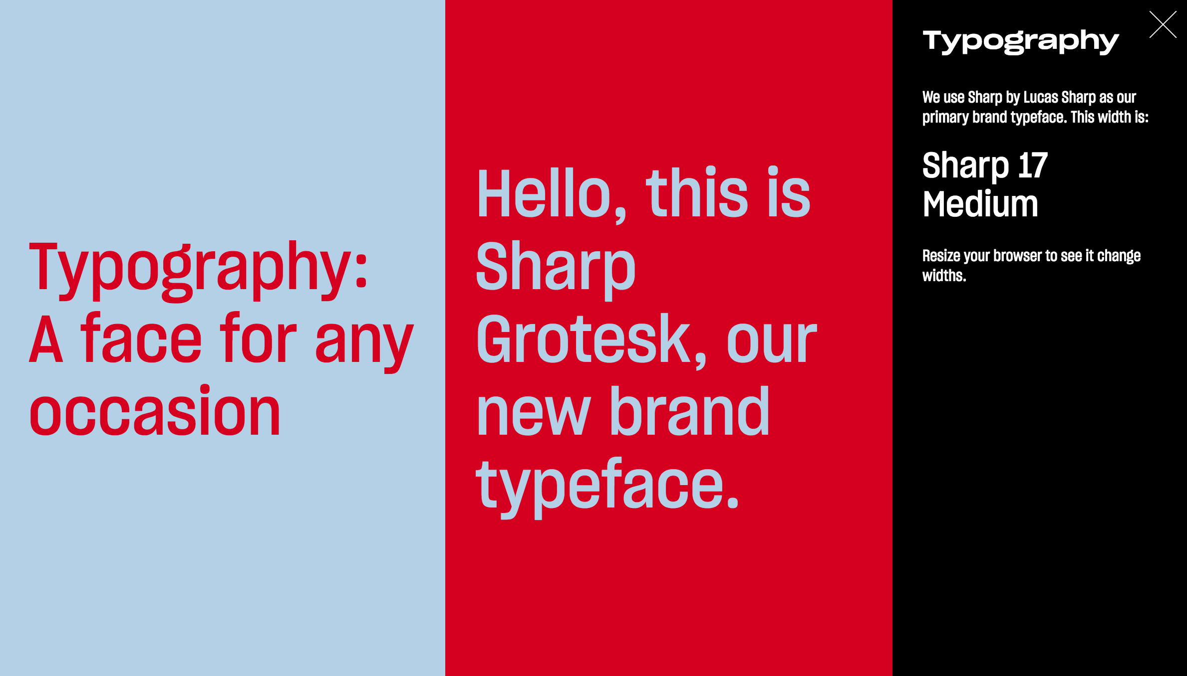
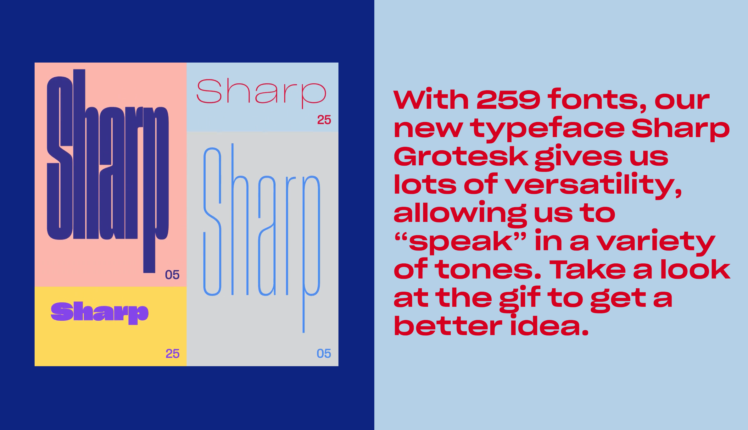
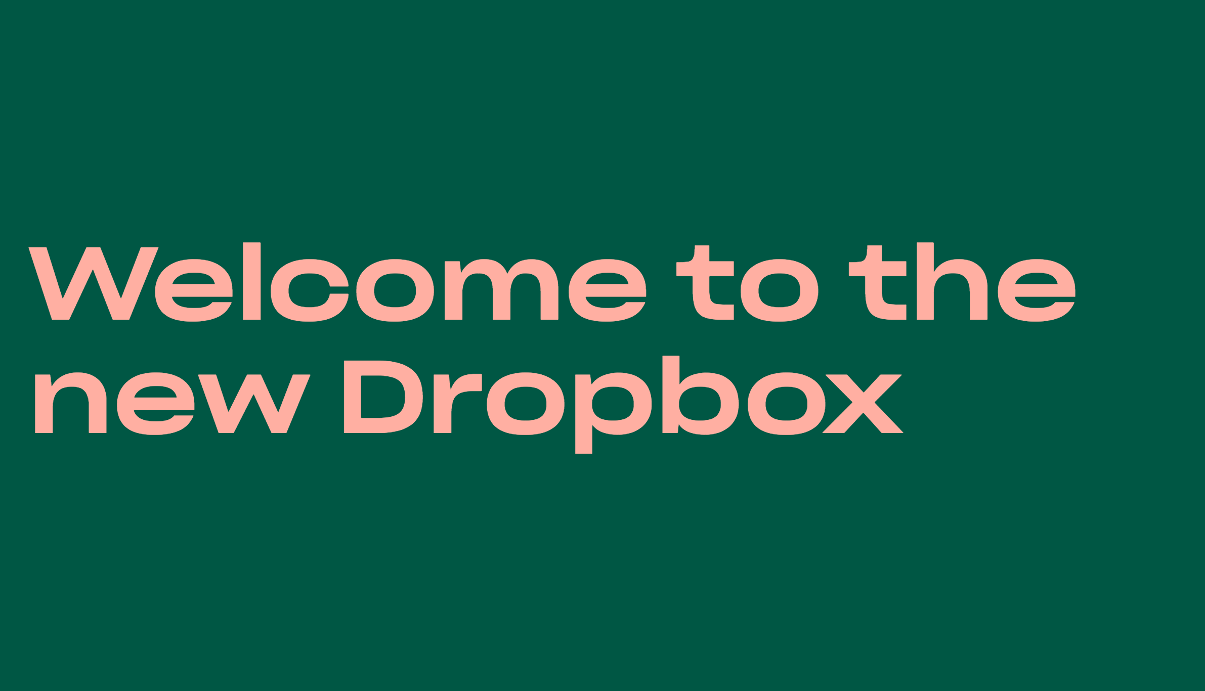
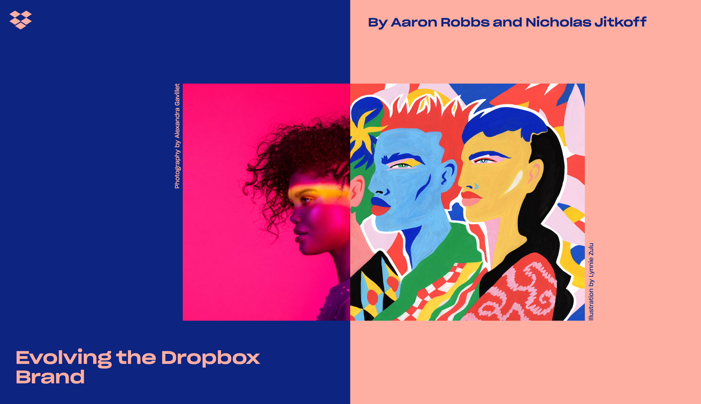
It’s doubtful you have, but in case you missed it, Dropbox revealed a major brand overhaul this week. Although the reception to the new branding has been a little lukewarm for a slurry of different reasons and opinions, their new logo, new colors, and new outlook present progress for the brand. Their expo page is a real in-depth look at what went into the rebrand, and the tools that make it happen. One of the most engaging elements of this rebrand, executed by COLLINS and the Dropbox in-house creative team, is the innovative use of Sharp Grotesk—the behemoth super family from Sharp Type. The team uses several weights and widths through some fancy coding to create a sort of proto-variable fonts effect. (Making it pretty clear that there is an appetite for variable fonts amongst big multi-platform clients.) This is the first real big deployment of Sharp Grotesk we’ve seen, and it does not disappoint. 


Elephant magazine has stood strong by their art direction and branding since issue one, benefiting from the time and attention of some incredible art directors over the years. It only took 32 issues before they started to think about a change. Casual, fun, a little chalky, but not bad... Can’t say it’s an improvement, but it’s certainly progress. Explore the new Elephant Magazine here


The lauded and iconic Emigre quietly posted a new website this Friday. Not only does it showcase their extensive catalog of types, but delivers a new form of accessing the incredible archive of Emigre Magazine, and their printed specimens. The site is simple, but concise and fit for the digital age... something Emigre has always been good at. It’s great to see Emigre update their web home, as there is so much value in their legacy and we can now all experience it a little better. Shop and search the entire world of Emigre here


TDC64 is Now Open

The annual Type Director’s Club Competition, this year in its 64th iteration, is now open for entries. Think you've made some pretty great stuff this last year? Think you’ve got the type thing locked up (excuse this terrible pun), then enter your designs and see them travel the globe. 


The Latest Specimen From TypeTogether is 👌🏼.

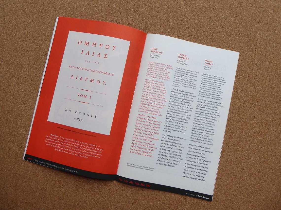
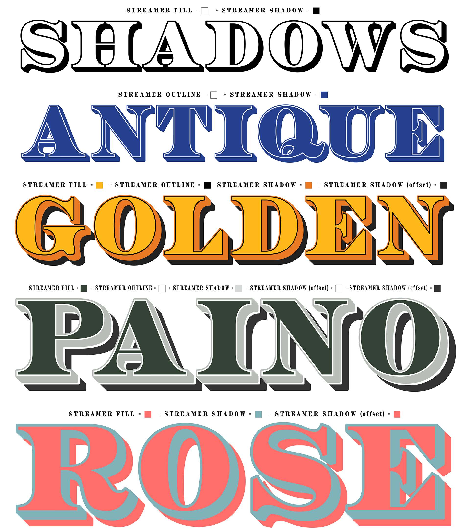
TypeTogether has always been synonymous with quality and earnest fonts families. (They’ve been slaying it since 2006.) Their latest specimen is a 32 page group portrait of about a dozen of their notable book types released up until 2016. The specimen was designed by several designers, including Tereza BettinardiVerena GerlachHoracio F. Gorodischer, and Laura Meseguer, along with TypeTogether’s Roxane Gataud, and José Scaglione who come together to create a vibrant and engaging showing of each of the families. Grab this historic specimen in the TypeTogether Online shop, and never be clueless for quality book types again. 


A Good Read: An interview with Thierry Blancpain

Co-founder of Grilli Type and emerging leader in the type world Thierry Blancpain shines in this quick interview with Raphael Roake on the ethics of type design, Thierry’s approach to the craft, and what happens to fonts after they’re released out in the world. (They even mention the dreaded EULA once or twice.) A quality interview filled with useful insight.  Read on here


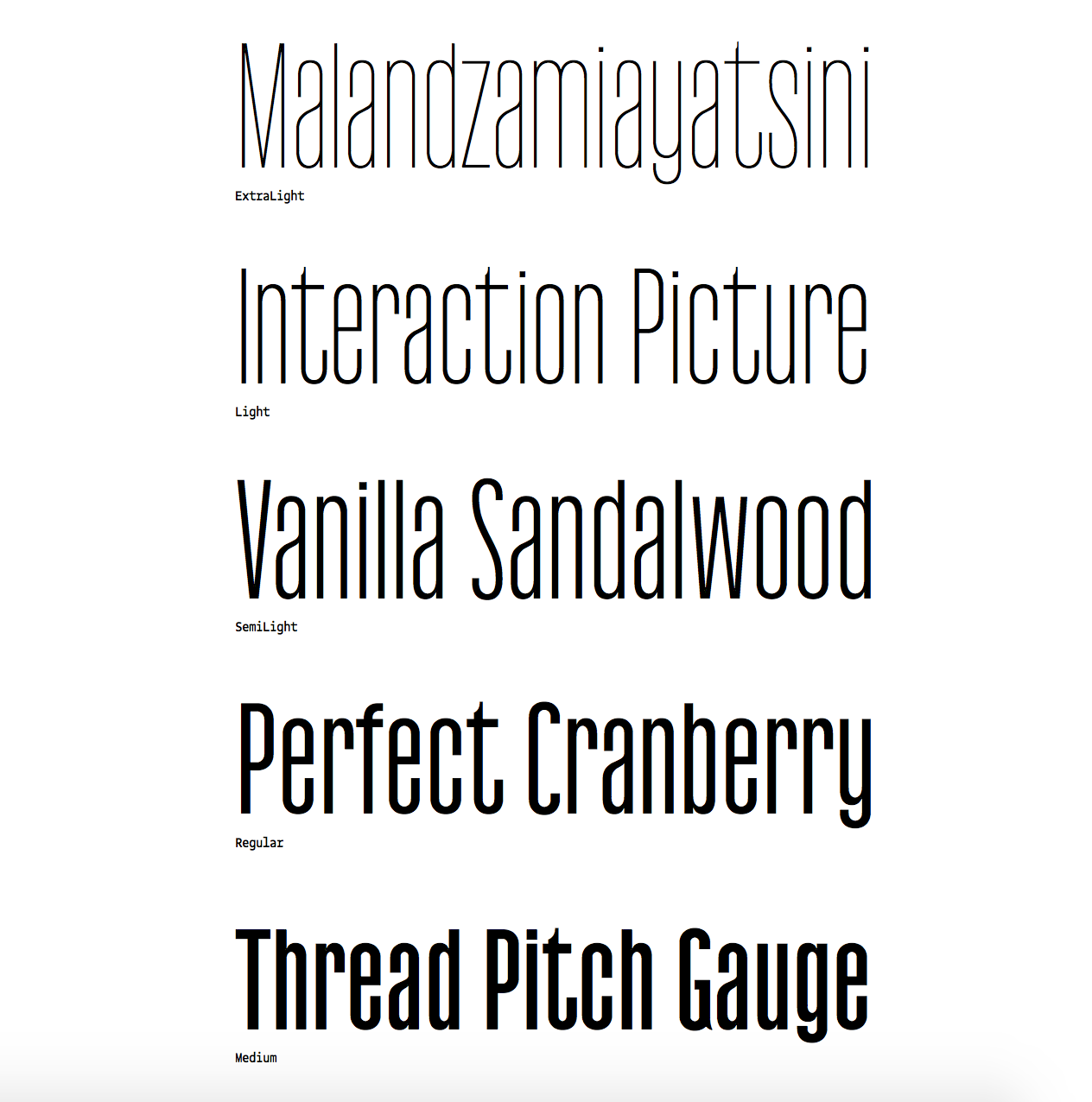
Release Radar: Zico Sans & Zico Sans Condensed

The Zico Family is growing. This week, Typotheque has released two companion sans families to their already released Zico Slab: Zico Sans and Zico Sans Condensed. One of Zico's designers Marko Hrastravec puts it like this: “By dropping the robust serifs, Zico becomes a natural high-performance typeface with low contrast and plenty of optical compensations that make even the darkest weights work at small sizes.” There is a great collection of information and digital specimens available that truly showcase the new additions that's not be missed. Also, be sure not to overlook the additional release of Zico Hebrew


Fontstand Goes for Two!

Fontstand released major updates to their innovative Type Marketplace platform this week with Version 2.0. It’s more robust, sleeker, and packed with new features that benefit not only those who buy/rent fonts, but the foundries that sell them too. If you haven’t discovered what Fontstand is all about, then now is a great time to jump in. Congratulations to Fontstand on Version 2.0! 


Frere-Jones Opens Up... The Archive That Is...

Heads Up, if you've ever seen the Helvetica Movie and felt as though you could hang out with Tobias Frere-Jones for hours, pouring through his archive of type specimens and ephemera, well this is the closest you’re likely to ever get. Available now for pre-order on Amazon is “Fifty Type Specimens: From the Collection of Tobias Frere-Jones” — a boxed collection that basically says it all in the title. Everyone knows that Frere-Jones has one of the most discerning eyes for type, and his taste is one-of-a-kind. This curated collection, to be formally released November 7, is the best way to get a piece of that on your shelf. 


This article by Sean Adams over on The Design Observer is the perfect injection of grounding history and lofty printed inspiration. 


TWFTDKyle Read
This Week From the Desk

Say hello to five of the more interesting typefaces you're likely to meet for a while. Released by Monotype, The Wolpe Collection is a group of five typefaces by Berthold Wolpe, revived by @toshiomagari. In true Monotype Fashion, there is a glorious-looking exhibit of original Wolpe work, specimens, and ephemera that you should check out if you have the chance. Congratulations Toshi and Monotype, the work of Berthold Wolpe is due for more exposure. 


Contemporary Design Studio Two Points has released a new side to their business this week: Type Design. The Hamburg, Germany based design studio has been creating custom typography for their branding and graphic design clients since before the studio formally started in 2007, and worked with several notable names in type to extend that catalog. Now you can purchase their collection of modern and eclectic display types through an assortment of distributors like MyFonts and FontShop. Will more design studios begin to leverage their assets by opening type shop arms of their businesses? Only time will tell. 


Find yourself with an extra 20 minutes this weekend? Get inspired to find the fun in type design with this good read from Type Thursday. Don’t be Afraid of the Ugly is an interview with Type Designer Dries Wiewauters, a Belgium Type and Graphic Designer about his typeface ‘MAD’ released by Colophon Foundry. Read the full Medium Post here


A stunning type family with a curious name appeared on the market this week... Dr. by Production Type is a quirky yet aggressive geometric sans serif that is thoroughly contemporary and unapologetic in style. Quirky details litter the six weights with small caps and matching italics like the arm of the lowercase r, the bar of the Capitol G, or how the capital C closes just enough to not be an O. Dr. is the kind of family that will get better and more surprising the more you use it. Frankly, it just looks fun to use. Discover and buy the eccentric Dr. family at Production Type


A post shared by OCD (@ocdagency) on

The classic advertising magazine Advertising Age revealed a brand new look (and shortened moniker) this week, designed by Bobby C. Martin of OCD. It's quite a change, but in each of those changes you can see the reason and discussion that went into them. The most high profile change must be the beloved masthead. Bobby has designed into a graphic yet sophisticated solution. Read more on this design here


Studio Project Inspiration: Flokk by Heydays Olso

A post shared by Heydays (@heydaysoslo) on

Isn’t it nice when a design studio can play and experiment and have that process result in effective and original final solutions for clients? This level of play and fun is evident in this wordmark for Flokk by Heydays Oslo.  


This interview article posted on It's Nice That this week presents a great perspective on what the meaning of design could be in today’s times, from the esteemed Michael Bierut. This article labels Micahels Bierut as Design's Poet Laureate.... I think that's pretty accurate. 

TWFTDKyle Read Comment
This Week From the Desk

The magnitude of this week’s release of the complete Graphik Collection is almost too big for words, but there are several places we can point you to to see what this release really means. Commercial Type released Graphik, a sleek and elegantly neutral sans type family, nearly ten years ago. This week, the foundry released the full circle completion of the original vision for Graphik: a deep super-family of multiple condensed widths that keep the tame spirit of the original types while supplying an unthinkably expressive new future of editorial and text uses. It’s large, it’s well documented, and it’s available now. Get acquainted with the new Graphik, as it will undoubtedly be popping up in award catalogs and best-of lists for 2017 and beyond. 


Take a quick jaunt over to the new website for Signal Type which was published this week. The new site is a handsome new home for the quality typography and lettering created by Max Phillips, who operates out of Dublin, Ireland. The new website comes with a new release as well: Pressio. An edgy condensed slab with plenty of straight lines and aggressive character. Check out Pressio while it’s on introductory sale


James Puckett, the man at the helm of Dunwich Type Founders, has had a few successes in his career already, but he's certainly not resting on his laurels. His latest release is Antarctican, released this week through Fontspring. Antarctican leans into the Display Sans genre with gusto, featuring 10 weights of the Display Style, and 8 weights of a Monospace translation. The types do a fantastic job of marrying the strength of typical workhorse sans faces with the style and elegance of something designed more for editorial and screen graphics. You can buy all 18 styles of Antarctican through Fontspring


It's been in the works for a long time, and finally here. MCKL Type, run by the talented Mr. Jeremy Mickel, has relaunched their web home with stunning grandeur. Color, interaction, and of course, the highest quality typefaces. There's so much to explore on the new site, including an all new family release: Specter. Stunning, fun, and here to stay. Congratulations, Jeremy. 

Learn more about the design of this site with this talk by Quinn Keaveny given at ATypI Montreal this year. 


Take a moment’s break with this visual presentation of the history and evolution of the Forbes Logo with Roger Black. I wish some of the images were better quality, but its still a great visual treat. 


Release: A Stylistic Pair... Centra No. 1 & 2 by Sharp Type

Lucas Sharp has had a busy 2017—working from his Brooklyn type office to bring new releases to his foundry Sharp Type. This week, Sharp Type released Centra No 1 and Centra No. 2; typographic step-sisters designed by Josh Finklea. In releasing Centra as two separate styles, Sharp Type is trying to say something about the nature of sans serif types, dropping us into a conversation already in progress between stylistic origins and what makes a sans a sans. Discover the interesting things going on with Centra and more about the pair of type families at Sharp Type


Michael Cina has long been a design icon working away on the periphery of the typical media fervor, but with his latest monograph “A Century of Artifice” he steps into the spotlight. Published in conjunction with VSCO Artist Initiative, the book features 100 album covers designed by Michael Cina and the accompanying concept art he has created over the years for the record label Ghostly International. It’s a beautiful deep dive into the seldom seen archives of Cina Associates over 240 pages, and available now through the Cina Associates website


Steven Heller and Angela Riechers with SVA have brought together an incredible group of type designers and practitioners in a new kind of type education online: a course called The Complete Typographer. It looks like it will teach lettering, type history, and the basics of typography in its design AND use, which is something the world could use more of. With folks like Tobias Frere-Jones, Victoria Rushton, Claudia de Almeida, and Richard Kegler, learning typography has never been easier to start, or more appealing. Learn more at the course’s host, Kadenze


TWFTDKyle Read
This Week From the Desk

The annual ATypI Conference happened this week in Montreal. The truly international association for Typography presented talks by designers, type designers, and typographers of all kinds. If you weren’t able to make it, ATypI has graciously posted all of the talks from this year’s conference to this YouTube playlist so you can binge watch the 3 day event, Netflix-style. Thank you, ATypI. 


Here’s one to put on your calendar. TypeThursday is doing something they’ve come to be very good at: fostering a community around the design and discussion of typography; this time in the for of a Gallery show. The show features selected works from 5 type designers who are making a name for themselves with original and forward thinking designs. “What You See Is Not What You Get” is currently on display at Farmingdale State College in Long Island, NY until November 15th, with a lecture and show reception event on October 3rd. Curious what the future of type design is shaping out to be? Well, here’s a good idea. Learn More about the show and Lecture Event at TypeThursday


The Adobe company from the west, Typekit, has launched early access to its latest product: a Font ID Tool they’re calling Visual Search. It does precisely what the name implies, searching the deep Typekit catalog of web typefaces by your own uploaded image. This ability to search by found image is not exactly anything new—it’s a move to match MyFonts’ ‘What the Font’ visual search tool—but it does seem to be a helpful way to discover quality typefaces you may not have otherwise landed on. Check out the complete tool on Typekit. 


Typewriter fonts have certainly found an audience in the last few years. Typefaces for coding, for display, historical accuracy, or just nostalgia. This week, Feliciano Type Foundry released the newest addition to the Typewriter genre with Marcin Typewriter: a 6 weight family with italics designed to sit with the rest of Feliciano’s Marcin Families. They’re edgy, and a little crude at times, but provide a certain air of authenticity when set in long text. It feels like a typewriter typeface. See more about the family here


In a follow-up to her successful Font Purchasing Habits Survey, Mary Catherine Pflug is dipping back into the world for more data with the Type Designer Survey. Pflug states in her description of the project, “If you’re a type designer, I invite you to share your thoughts on the hard-hitting topics facing type designers and the type industry today like discounting, plagiarism, challenges of selling, and threats to our industry.” This kind of data is essential, and so needed in our industry. If you are a type designer, please make your way over to the Type Designer Survey to lend your answers. 


The typographic gymnastics performed by Herburg Weiland are something to take notice of. His work—comprised of zines, editorial designs, posters, and experimental pieces—is profiled by It’s Nice That. It’s certainly worth a minute or two. 


P22 has been creating historically inspired typefaces for well over 20 years. Their latest release is Aetna, a [type description here in 4 widths]. If the name sounds familiar, you’re not alone, go into how its a revival. Designed by Aaron Bell, this type is wily, thorough, and perfect for your wood type project needs as it packs in so much of the useability of the original wood type into this digital package. Did you see the family includes a ‘Streamer’ collection for full chromatic type capabilities on this thing?

The real value here, aside from buying a quality typeface, is that 100% of each purchase benefits the Hamilton Wood Type Museum in Two Rivers, WI. Read more about Aetna and buy it here. Also, don’t forget to check out the physical font cut into wood type for the museum by Virgin Wood Type. Incredible.


The Hamilton Wood Type Museum, favorite mecca for the Wood Type aficionados among us, has announced dates for their 2017 Wayzgoose. “Now in its ninth year, the Hamilton Wood Type & Printing Museum annual Wayzgoose Type Conference hosts designers, printers, typographers and letter geeks of all stripes from across the globe.” The conference will take place November 3, 4 and 5 and has lined up some can’t miss speakers, including Gail AndersonJonathan HoeflerBrian & Kim FrenchBrad VetterCarolyn PorterJulie SolaJenny WilksonPatterson Clark and more. Check here for the Wayzgoose schedule and see more about the speakers here


Inspirational printed matter this week comes from Blok Design and their catalog for the Toronto International Film Festival. If anyone knows how to get your hands on this catalog, let us know, we certainly wouldn’t mind a copy floating around the office. 


TWFTDKyle Read
This Week From the Desk

This week, we find our desk in a different location. We have moved our office from the trees and rocks of Denver, Colorado to the palms and sands to San Diego, California. We’re happy to have moved to the West Coast, and can’t wait to continue to bring the world of type to you from a new perspective. 

This week, however, has been distracting for several reasons besides our move west. With hills and mountains from LA to Colorado engulfed in several wild fires, an earthquake off the coast of Mexico, devastating floods in India, Hurricane Harvey having drowned out lower Texas and another hurricane, Irma, leveling the Caribbean Islands and gunning for Florida and the southern US... it seems like the world is quite literally out to get us. It’s been hard to focus on the importance of fonts and the business of making letters. But there has been a lot to celebrate this week in the world of typography, and that’s part of what this briefing is here for: to bring a bit of calm and interest amidst weeks of distracting news and heartbreaking events. 

Be sure to sign up for the email dispatch of This Week From the Desk, where you’ll find even more insight and news form the world of type. Have a great weekend everyone, and good luck. 


Klim Releases National 2

Building on top of what was already a momentous design, Kris Sowersby of Klim Type Foundry has updated his National Type Family in almost every way, and expanded it's ability and scope. Now containing 64 fonts over 4 widths, National 2 is a “comprehensive expansion of National’s original aesthetic concept.” As is the case with most Klim releases, you can get a more insightful read into the origins and details of the complete project on the Klim Blog


Typotheque released a set of Devanagari companion fonts to their seminal Greta Type system this week, in explosive fashion. “Greta Sans Devanagari is the largest typeface system of interrelated styles produced for any Indic language, suitable for small text and headlines.” says Typotheque. The family consists of 80 styles for Devanagari, which aids in Greta's far reaching language representation. Read more about what Greta Sans Devanagari has to offer and explore the colorful specimens (designed by Shiva Nalluperumal) at Typotheque


Production Type released a type family this week that has been in the works for a long time, and springs from fashionable roots. Antique Gothic is Production Type's commercial offering of a private type system created for Louis Vuitton back in 2014. This new expression of Antique Gothic is delivered with three light weights, a regular, and medium weight. The lack of bolder weights is a tasteful choice here, honoring the origin of the types themselves. Buy and discover more about Antique Gothic at Production Type


It looks like our friends from Across the Atlantic are headed this way for a whirlwind trip through Canada and the USA, bringing goodies and toys for us all. Their Roller Coaster Tour is bringing 5 lectures and 2 workshops to 4 cities in 6 days in the month of September. A roller coaster indeed. Learn how you can get connected to all the tour's events on their own event page


Optimo Type Foundry released a sturdy condensed Sans this week called Next. On first look, it seems rather devoid of anything worth writing home about, however the character does start to emerge with a little time spent. The turned out flares, of the lowercase a, the strange cuts on c's and g's, and then the alternates which seem to have no restraint when it comes to the rules set by the other glyphs.... Interesting things happening here. See the full family on the Optimo site


The home to display fonts both famous and infamous, Virus Fonts, has a new site, and a fresh take on their deep catalog of display and text typefaces. Perfect for the rebel, protest sign maker, or counter-culturalist in you, the work of Barnbrook Studio has got you covered. See all the Virus Fonts in a new light on their redesigned site


Type Network announced this week that it has partnered with Garage Fonts to bring the famed type family Freight to it’s ever-growing collection. Freight is a design produced by Darden Studio that has found success in wide distribution through Garage Fonts. Garage Fonts’ partnership with TN means that the 4 style family can reach an even larger audience. Freight is a masterstroke of type design (we use it on this site). Check it out for yourself at Type Network.

TWFTDKyle ReadComment
This Week From the Desk

Having been in the works for few years now, Positype has finally released Scotch, a slender and wily Scotch Roman in 3 varieties. Neil Summerour has injected a bit of a new wind to this genre—populated with other well known families like Miller or Harriet—by adding a “Deck” expression to the family... something between Text and Display. Its handsome, expressive, and reminiscent of a bygone era of mid-mod furniture and weekend drives in the Cadillac. Scotch is available through MyFonts


It’s rare on this platform that we would talk about something before it is officially released, but this is just too exciting to leave unmentioned. Bethany Heck has been working away at creating a platform for intelligent discourse on quality fonts since she saw a need after attending the Typographics Conference this year:

“We need more discourse and analysis around the usages of typefaces by designers, for designers. So, I’m going to start the Font Review Journal, where I will be talking about the general aesthetics and historic influences of typefaces while spotlighting unique letterforms or characters and breaking down what a font excels at and what it has a harder time with.” —Bethany Heck

The Font Review Journal will launch next week, and you can be sure we’ll be sharing it here. For now, see a few previews of what the FRJ could be on Bethany’s Dribbble.


Creative Mornings has always been a source of inspiration. This list of 12 Talks from Founders on Big Ideas and Humble Beginnings is a great resource to help you recharge this weekend. 


Online publishing platform Medium has done another about-face on their logo, to lukewarm reception. It's easy to see why when you examine the reasons or needs for this change. Medium has always had a fantastic eye for typography on the web, making it a central part of their product. Perhaps this new wordmark shift is in homage to that, but it's unlikely. Read more about Medium’s change on Brand New, or see how the new identity plays out on the redesigned site itself.


The annual typography conference put on by SoTA is happening right now (Aug 23-27) in Boston. Of course, nothing beats actually attending this conference, but if you’re not able to be there this year you can follow along on twitter and instagram under the hashtags #typecon and #typecon2017


Monotype’s trade publication The Monotype Recorder has been a cornerstone of the company’s outreach and education initiatives for a few years now. The publication has been filled with everything from typographic eye candy to thought provoking long form articles on type history. This week, Monotype opened up the Monotype Recorder Issue #5 for sale—to be shipped August 25th. Grab a copy here. 


TWFTDKyle Read