This Week From the Desk
The annual ATypI Conference happened this week in Montreal. The truly international association for Typography presented talks by designers, type designers, and typographers of all kinds. If you weren’t able to make it, ATypI has graciously posted all of the talks from this year’s conference to this YouTube playlist so you can binge watch the 3 day event, Netflix-style. Thank you, ATypI.
Here’s one to put on your calendar. TypeThursday is doing something they’ve come to be very good at: fostering a community around the design and discussion of typography; this time in the for of a Gallery show. The show features selected works from 5 type designers who are making a name for themselves with original and forward thinking designs. “What You See Is Not What You Get” is currently on display at Farmingdale State College in Long Island, NY until November 15th, with a lecture and show reception event on October 3rd. Curious what the future of type design is shaping out to be? Well, here’s a good idea. Learn More about the show and Lecture Event at TypeThursday.
The Adobe company from the west, Typekit, has launched early access to its latest product: a Font ID Tool they’re calling Visual Search. It does precisely what the name implies, searching the deep Typekit catalog of web typefaces by your own uploaded image. This ability to search by found image is not exactly anything new—it’s a move to match MyFonts’ ‘What the Font’ visual search tool—but it does seem to be a helpful way to discover quality typefaces you may not have otherwise landed on. Check out the complete tool on Typekit.
Typewriter fonts have certainly found an audience in the last few years. Typefaces for coding, for display, historical accuracy, or just nostalgia. This week, Feliciano Type Foundry released the newest addition to the Typewriter genre with Marcin Typewriter: a 6 weight family with italics designed to sit with the rest of Feliciano’s Marcin Families. They’re edgy, and a little crude at times, but provide a certain air of authenticity when set in long text. It feels like a typewriter typeface. See more about the family here.
In a follow-up to her successful Font Purchasing Habits Survey, Mary Catherine Pflug is dipping back into the world for more data with the Type Designer Survey. Pflug states in her description of the project, “If you’re a type designer, I invite you to share your thoughts on the hard-hitting topics facing type designers and the type industry today like discounting, plagiarism, challenges of selling, and threats to our industry.” This kind of data is essential, and so needed in our industry. If you are a type designer, please make your way over to the Type Designer Survey to lend your answers.
The typographic gymnastics performed by Herburg Weiland are something to take notice of. His work—comprised of zines, editorial designs, posters, and experimental pieces—is profiled by It’s Nice That. It’s certainly worth a minute or two.
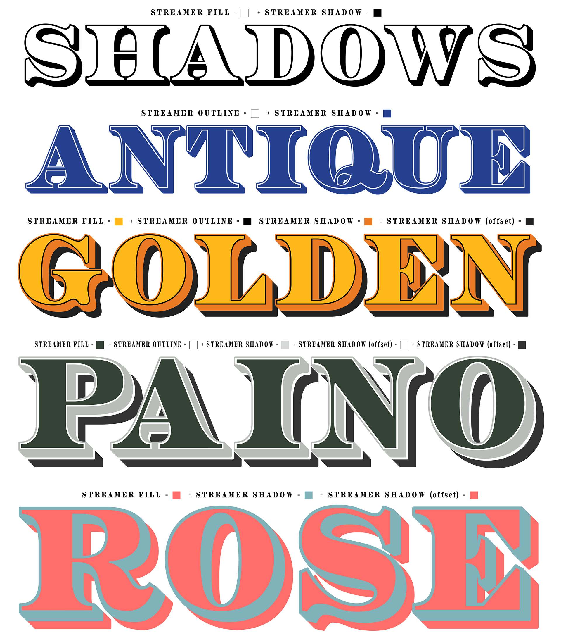
P22 has been creating historically inspired typefaces for well over 20 years. Their latest release is Aetna, a [type description here in 4 widths]. If the name sounds familiar, you’re not alone, go into how its a revival. Designed by Aaron Bell, this type is wily, thorough, and perfect for your wood type project needs as it packs in so much of the useability of the original wood type into this digital package. Did you see the family includes a ‘Streamer’ collection for full chromatic type capabilities on this thing?
The real value here, aside from buying a quality typeface, is that 100% of each purchase benefits the Hamilton Wood Type Museum in Two Rivers, WI. Read more about Aetna and buy it here. Also, don’t forget to check out the physical font cut into wood type for the museum by Virgin Wood Type. Incredible.
The Hamilton Wood Type Museum, favorite mecca for the Wood Type aficionados among us, has announced dates for their 2017 Wayzgoose. “Now in its ninth year, the Hamilton Wood Type & Printing Museum annual Wayzgoose Type Conference hosts designers, printers, typographers and letter geeks of all stripes from across the globe.” The conference will take place November 3, 4 and 5 and has lined up some can’t miss speakers, including Gail Anderson, Jonathan Hoefler, Brian & Kim French, Brad Vetter, Carolyn Porter, Julie Sola, Jenny Wilkson, Patterson Clark and more. Check here for the Wayzgoose schedule and see more about the speakers here.
Inspirational printed matter this week comes from Blok Design and their catalog for the Toronto International Film Festival. If anyone knows how to get your hands on this catalog, let us know, we certainly wouldn’t mind a copy floating around the office.


