This Week From the Desk
Week 40, 2017
Get a glimpse into the future. Future Fonts, announced this week, is a new experimental platform that lets you license new typeface designs while they’re still in progress, completely reinventing the relationship between type designer and type user. Think of it as being able to sit next to the type designer as they build these tools, giving feedback and financial support to the projects you find useful and interesting. Future Fonts is the brain child of Scribbletone’s Lizy Gershenzon and Travis Kochel, alongside James Edmondson of Ohno Type Co. Read more about Future Fonts on their spiffy intro site, and await the innovative bliss of the future.
Dropbox Drops the Box, and Gets Some New Type
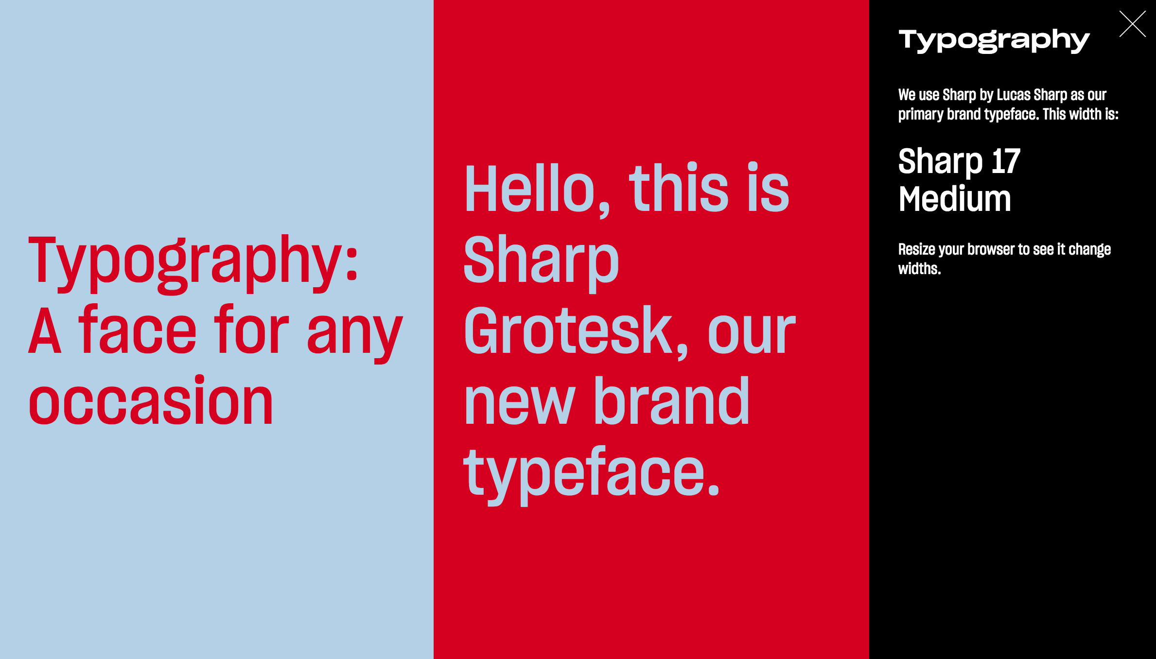
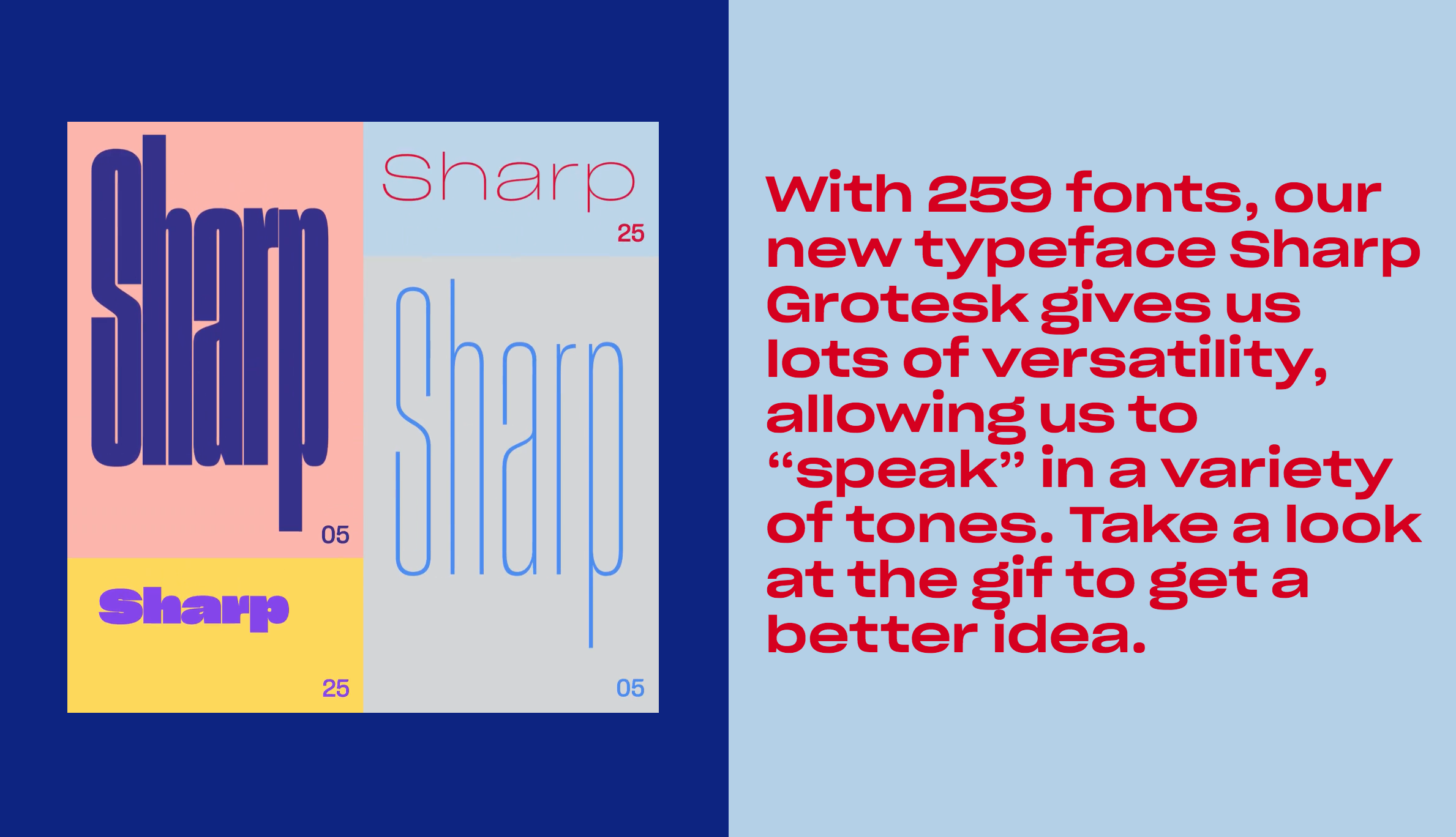
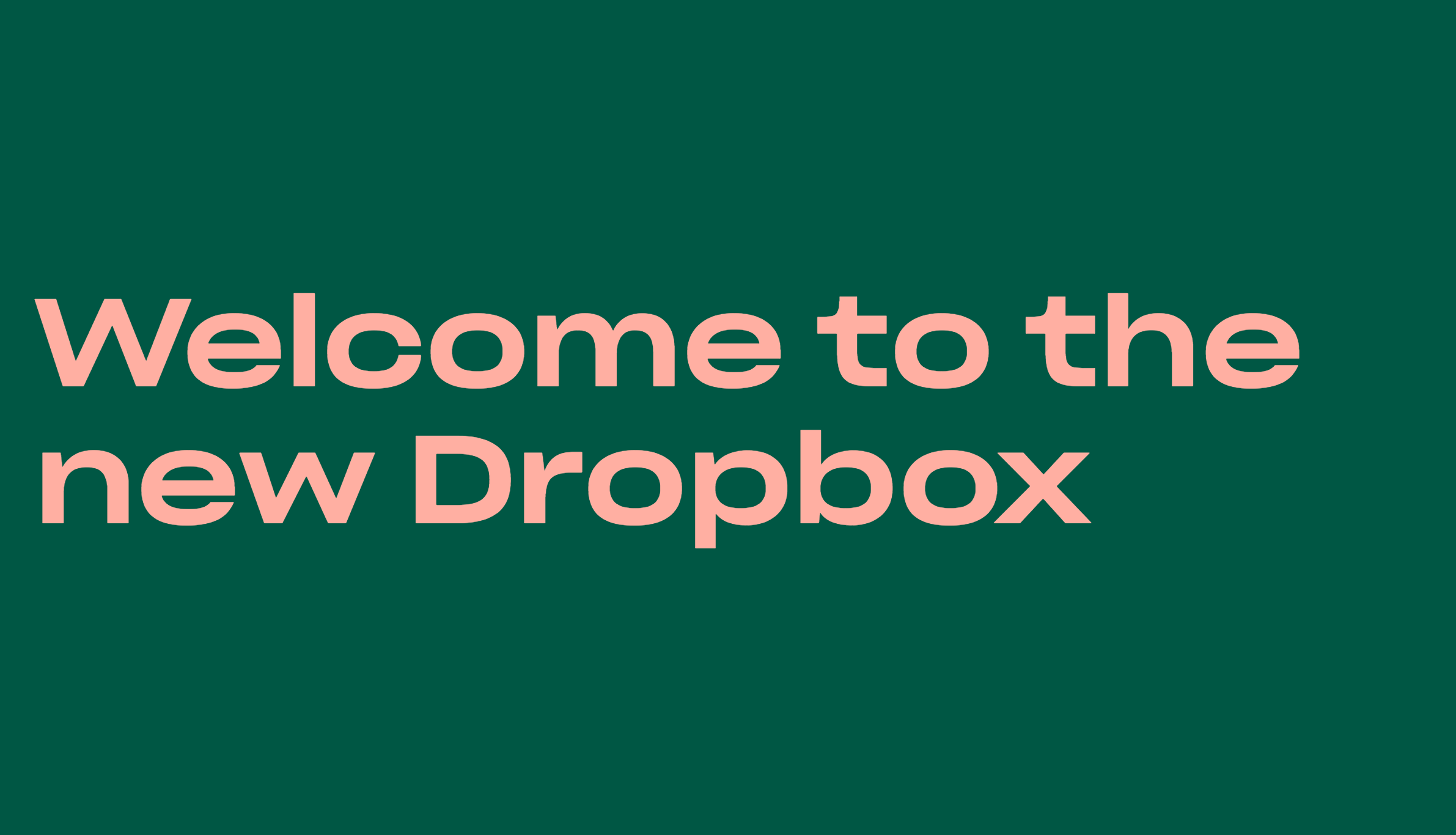
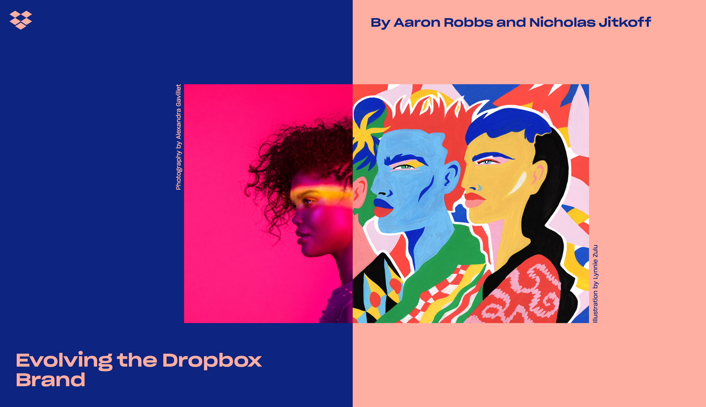
It’s doubtful you have, but in case you missed it, Dropbox revealed a major brand overhaul this week. Although the reception to the new branding has been a little lukewarm for a slurry of different reasons and opinions, their new logo, new colors, and new outlook present progress for the brand. Their expo page is a real in-depth look at what went into the rebrand, and the tools that make it happen. One of the most engaging elements of this rebrand, executed by COLLINS and the Dropbox in-house creative team, is the innovative use of Sharp Grotesk—the behemoth super family from Sharp Type. The team uses several weights and widths through some fancy coding to create a sort of proto-variable fonts effect. (Making it pretty clear that there is an appetite for variable fonts amongst big multi-platform clients.) This is the first real big deployment of Sharp Grotesk we’ve seen, and it does not disappoint.
Elephant magazine has stood strong by their art direction and branding since issue one, benefiting from the time and attention of some incredible art directors over the years. It only took 32 issues before they started to think about a change. Casual, fun, a little chalky, but not bad... Can’t say it’s an improvement, but it’s certainly progress. Explore the new Elephant Magazine here.
The lauded and iconic Emigre quietly posted a new website this Friday. Not only does it showcase their extensive catalog of types, but delivers a new form of accessing the incredible archive of Emigre Magazine, and their printed specimens. The site is simple, but concise and fit for the digital age... something Emigre has always been good at. It’s great to see Emigre update their web home, as there is so much value in their legacy and we can now all experience it a little better. Shop and search the entire world of Emigre here.
TDC64 is Now Open
The annual Type Director’s Club Competition, this year in its 64th iteration, is now open for entries. Think you've made some pretty great stuff this last year? Think you’ve got the type thing locked up (excuse this terrible pun), then enter your designs and see them travel the globe.
The Latest Specimen From TypeTogether is 👌🏼.
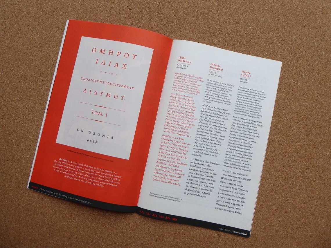
TypeTogether has always been synonymous with quality and earnest fonts families. (They’ve been slaying it since 2006.) Their latest specimen is a 32 page group portrait of about a dozen of their notable book types released up until 2016. The specimen was designed by several designers, including Tereza Bettinardi, Verena Gerlach, Horacio F. Gorodischer, and Laura Meseguer, along with TypeTogether’s Roxane Gataud, and José Scaglione who come together to create a vibrant and engaging showing of each of the families. Grab this historic specimen in the TypeTogether Online shop, and never be clueless for quality book types again.
A Good Read: An interview with Thierry Blancpain
Co-founder of Grilli Type and emerging leader in the type world Thierry Blancpain shines in this quick interview with Raphael Roake on the ethics of type design, Thierry’s approach to the craft, and what happens to fonts after they’re released out in the world. (They even mention the dreaded EULA once or twice.) A quality interview filled with useful insight. Read on here.
Release Radar: Zico Sans & Zico Sans Condensed
The Zico Family is growing. This week, Typotheque has released two companion sans families to their already released Zico Slab: Zico Sans and Zico Sans Condensed. One of Zico's designers Marko Hrastravec puts it like this: “By dropping the robust serifs, Zico becomes a natural high-performance typeface with low contrast and plenty of optical compensations that make even the darkest weights work at small sizes.” There is a great collection of information and digital specimens available that truly showcase the new additions that's not be missed. Also, be sure not to overlook the additional release of Zico Hebrew.
Fontstand Goes for Two!
Fontstand released major updates to their innovative Type Marketplace platform this week with Version 2.0. It’s more robust, sleeker, and packed with new features that benefit not only those who buy/rent fonts, but the foundries that sell them too. If you haven’t discovered what Fontstand is all about, then now is a great time to jump in. Congratulations to Fontstand on Version 2.0!
Frere-Jones Opens Up... The Archive That Is...
Heads Up, if you've ever seen the Helvetica Movie and felt as though you could hang out with Tobias Frere-Jones for hours, pouring through his archive of type specimens and ephemera, well this is the closest you’re likely to ever get. Available now for pre-order on Amazon is “Fifty Type Specimens: From the Collection of Tobias Frere-Jones” — a boxed collection that basically says it all in the title. Everyone knows that Frere-Jones has one of the most discerning eyes for type, and his taste is one-of-a-kind. This curated collection, to be formally released November 7, is the best way to get a piece of that on your shelf.
This article by Sean Adams over on The Design Observer is the perfect injection of grounding history and lofty printed inspiration.


