Posts in TWFTD
This Week From the Desk

Week 43


New Release: Peristyle by Hoefler & Co. 

H&Co. released Peristyle this week—a family of 9 fonts including a stencil style and color font capability—with a look as if out of another era. H&Co have a certain eye for delivering fonts that designers want to use, and Peristyle seems to carry that torch well. Perfect for all kinds of display uses, Peristyle brings even more versatility to the H&Co. library. Discover more about the design process and potential of H&Co.’s latest release on their website here


MyFonts Fontacular

Today, Friday the 27th of October, is the last day of MyFonts' annual Fontacular event, where a large collection of fonts available on the site are offered at large discounts and new prices. Regardless of how you feel about discounted font sales, the Fontacular is a great way for you to refresh your font lists and get inspired for new projects. One of the more interesting ways this event presents its deals is in the form of bundles by foundry (there are 50 represented in the sale). So, if there’s a certain foundry you’ve been waiting to grab fonts from, now is your chance


Butterick Checks in on Variable Fonts

Matthew Butterick revisits his predictions from 2016 on Variable Fonts. The original article is still a fantastic ‘how did we get here’ primer to Variable Fonts, and his follow up published this week at the end of the article gives a great touch base on how things have gone since. It’s worth your time to catch up and read the entire piece on Matthew Butterick’s solid and often entertaining blog Practical Typography


Release: Two New Additions to the Duplicate Family from Commercial Type

The gents at Commercial Type have expanded their Duplicate Family this week with the addition of two new styles, bringing the total number in this collection to 5: Ionic, Sans, Slab, and now Soft and Round. The Soft and Round Styles of Duplicate are particularly notable because of the inclusion of a few unconventional details not usually found in rounded sans styles in their design. Ball terminals and casual stroke endings bring these new typefaces into a realm of possibility that branding agencies will love. Purchase the entire Duplicate Type Collection, or just your favorite style, at Commercial Type


Release: Newson from Revolver Type

Lukas Schneider who heads up the Revolver Type Foundry has been on a tear of great type releases this year, the latest of which is Newson: a solid humanist sans with a stoic professionalism. You can envision using each of Newson’s 7 weights in roman and italics for everything form corporate identities to web blogging in style. Read on about Newson and buy the family at Revolver Type.


Stumptown Evokes the Power (and Wrath) of Hobo

Perhaps you saw the rebranding efforts put forth by LAND for Stumptown Coffee Roasters’ new packaging this week. Perhaps you noticed the toned colors and tattoo-worthy graphic illustrations peppering the design. Perhaps you even noticed the not-so-subtle use of Hobo illuminating the name of the beans inside. If you did, surely you have formed an opinion about it. The design world has seemingly lost its mind over this one type choice and split those in it into two camps... Hobo, or no Hobo.

We wanted to take a minute to stand up for this design and praise its rejection of the easy solution: one of expected slickness and digital cleanliness. These are coffee bags, and deserve to have a little fun. The use of Hobo is always a deliberate choice—no one ever uses Hobo by accident. This is a perfect example of how type choice can communicate deeper than the words ever could.

Read more opinions and details in the Brand New Review of the rebranding. 


Linotype releases Rosella by Sabina Chipară

Rosella is a family of layered fonts inspired by the classic Engravers Style serif but engineered for display uses in the modern age, designed by Sabina Chipara. Rosella consists of 6 styles that you can mix and match to achieve all new levels of typographic expression. Published by Linotype this week, Rosella is a great way to help your font library break out of the habit of neutral sans serif types and text faces. You can buy Rosella at Linotype


Swiss Typefaces Releases SangBleu

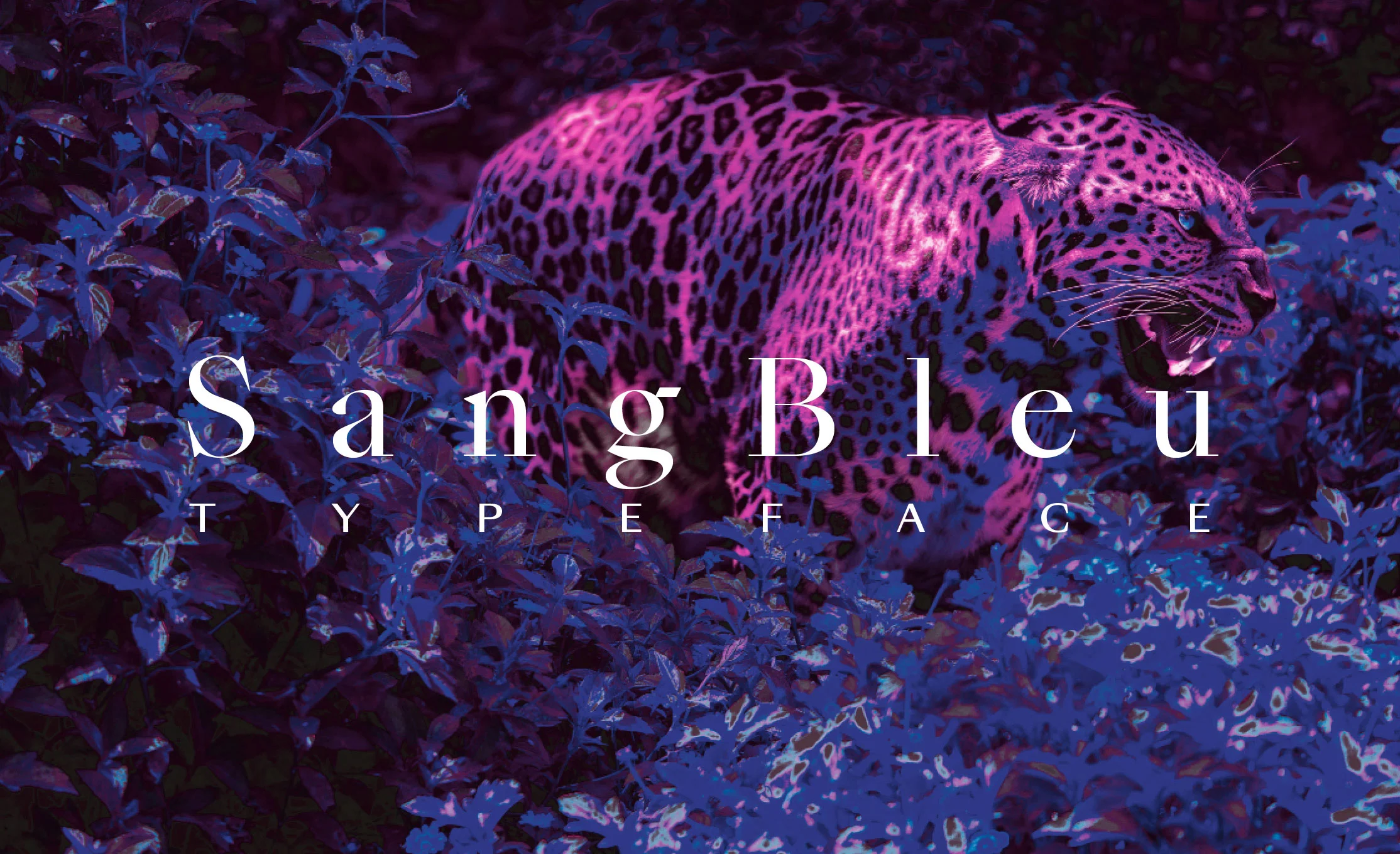
Swiss Typefaces, perhaps best known for creating future-forward, modern type designs such as Simplon and Euclid, dropped a major collection of typefaces this week in the form of SangBleu. SangBleu is a font collection that encompasses 5 different styles built on the same chassis making a total of 45 new fonts. Empire, Kingdom, Republic, Versailles, and Sunrise each have a different typographic genre in their sights and each seem to exude the same brash spirit and ambition. It’s really a masterful work.

If the name seems a little familiar, you’re not wrong. Swiss Typefaces had released a family under the same name a few years back, but the release this week is intended to completely replace it.

“The new SangBleu supersedes our previous typeface of the same name, which, together with Romain, has been discontinued. It is not an update, but a completely new design, consisting of five full-featured collections: Empire, Kingdom, Republic, Versailles, and Sunrise. Each one comes in four or five weights, all of which are accompanied by matching italics. At 45 styles in total, it is our most ambitious release so far.”

It’s sharp, it’s packed with attitude, and aims to be the “Everything Font” collection you reach for no matter what you’re designing. Will SangBleu’s performance live up to the foundry’s track record of popular fonts? Only time will tell. Learn more about the entire SangBleu Collection at Swiss Typefaces.


TDC63 Judges Choice

The Type Directors Club has published their Judges’ choices for best in show from the TDC 63 and 2017 Typeface Design Competitions. The choices do not disappoint. This year there were a total of eleven judges that came on to pick their favorite pieces from both competitions. Judge Berton Hasebe’s selection (and pictured above) of Salvaje, originally designed by Cristian Vargas as a Type Media project, is a particularly nice pick. Read more from the Type Directors Club, or wait for these results to be published in the next Type Directors Club Annual. 


Release: The Minotaur Lombardics

In case you haven’t seen any type this week that fills that void of ‘weirdness’, Production Type is prepared to help you out. This week saw the release of 6 new fonts from Production Type: Minotaur Lombardic and Minotaur Sans Lombardic. The two sets are the latest additions to Production Type’s decisively weird (and decisively awesome) Minotaur Collection—fonts designed exclusively with straight lines. 

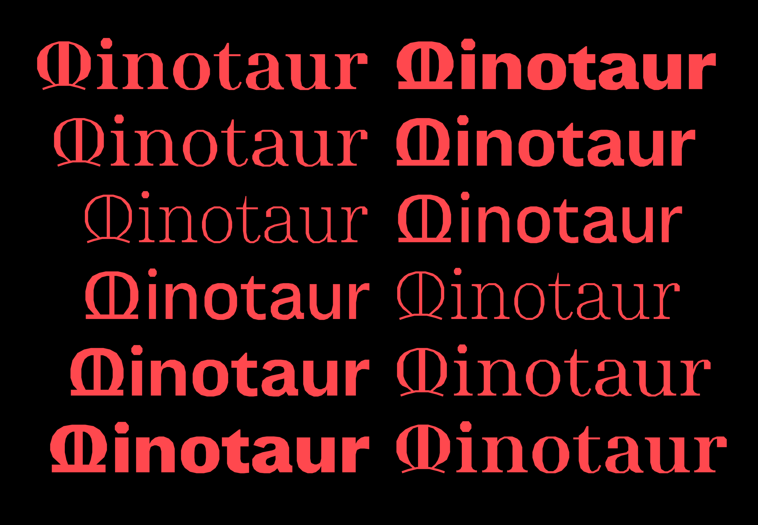
So, what does Lombardic Mean? Well, the Lombardic Style is one of expressive Capitols and letterforms not afraid to expose their origins in the pen. The fact that Production Type saw a need to throw these styles into the Minotaur Collection says a lot about the disruptive nature of the foundry and designers. 

Explore what the heck is going on with these captivating fonts from Production Type.


TWFTDKyle Read
This Week From the Desk

Week 42


Say Hello to IBM Plex

A post shared by IBM (@ibm) on

A post shared by IBM (@ibm) on

IBM has an all new face, rolled out by the large Technology and Business giant this week. IBM Plex is their first bespoke typeface, built specifically to drive the company away from the Helevetican crutch they’d been dependent on for decades. (This actually might be the the most interesting part: the clear cultural statement moving away from Helvetica and into types that represent more contemporary design perspectives.)

Plex was designed by Mike Abbink—the man behind major Corporate typefaces for clients such as USA Today, GE, and NBC Universal—and independent type founders Bold Monday with an expert touch for the needs of the global company but also the possibilities of the future with three versions: Plex Sans, Serif, and a quirky Mono. Keen readers may note that this type face has been out in the world for a few months now. IBM and the typeface designers decided to put it out in the world for free. You can discover more about the typeface and download the collection in this helpful instructional page

Need more? This IBM “Eyes On” video clip shows a little process behind the development of IBM Plex. (The IBM Plex feature is really in the first 5 minutes of this video.) 


Now You See It, Now You Don’t.

Can you believe it’s been over two years since we saw the last book release form the eponymous Pentagram Designer? The wait is over, as you can now pre-order Michael Bierut’s latest book Now You See It, Now You Don’t, a collection of essays on design—to be published Nov. 7. If you’re new to design and typography, this book will enlighten you. If you are a seasoned professional, this book will bring you back home. You will be able to purchase the book pretty much anywhere, but we recommend your local book shop. 


A New Colophon Specimen for Visuelt

Wind of the latest type specimen from Colophon Foundry flowed through the office this week, and thgouht it was worth a mention here. Colophon has always had incredibly high-quality specimens, and engaging ones at that. You can snag your copy from this limited edition here


The Mohawk Quarterly Issue Number 13

Disruption is an inescapable word these days, used to talk about everything from the latest tech out of Silicon Valley to marketing toilet paper. Mohawk Paper investigates what this means in the latest issue of their in-house magazine/newspaper The Mohawk Quarterly.  Lucky number 13 is packed with beautiful moments only possible in print, visual inspiration for designers and creatives of all types, stirring writing, and not to mention a deep showcase of what’s possible in print on several Mohawk Papers. Discover more about The Mohawk Quarterly and order a copy here.

Note: Mohawk did not pay for this write up. We just think that anything pushing the bounds of print and typography is worth a mention.


A Good Read: “Behind Simoncini’s Glasses”

This piece by Antonio Cavedoni on Francesco Simoncini is insightful, well put together, and just plain ol' fascinating. Learn more about the type designer and mid-century Italian mogul on Medium


Never Use Futura

A post shared by Doug Thomas (@_doug_thomas) on

Books about singular typefaces have long relished in the dark and dusty shelves of old libraries and private collections. That is to say, they rarely see a tremendous amount of use. ‘Never Use Futura’ by Doug Thomas aims to break that mould. As more of a cultural study of the famous typeface with lengthy and storied history, Doug is able to approach and present Futura in a way that you may not have considered before. 

The book’s publisher Princeton Architectural Press puts it this way: “Never Use Futura is illuminating, sometimes playful, reading, not just for type nerds, but for anyone interested in how typefaces are used, take on meaning, and become a language of their own.” We’re sold. The book is available now through PA Press or on Amazon


Paul Sahre is the Two-Dimensional Man

Paul Sahre is one of the design world’s favorite characters, having worked for all the “fun” clients and creating some incredible work over his 30+ year career (so far). He’s written a book about it all. Stories from his life and experience told in the witty way Paul Sahre does. This one is worth picking up if only for the insight into his process and work, but there’s so much more than that. Pick up the book from Abrams Press. 


FPO is Closing Shop

Underconsideration’s blog FPO, devoted to the craft and art of printed matter, is shuddering, and we’re only a little bit bummed. (Kidding, we’re very bummed.) FPO, or For Print Only, was a beacon of light for print nerds and students the world over, in a time where the world was becoming more and more digital every day. The blog felt as though there was “a certain repetition in the content — which is not a critique on the quality of the work but a reflection of the type of projects being put out into the world — that we feel does not match the early output of the blog.” The archives of over 2,400 posts will remain online to access. FPO, you will be missed! 


TWFTDKyle Read
This Week From the Desk

Week 41, 2017


Release Radar: Ivar by Letters From Sweden

This week saw the release of Ivar, Letters From Sweden’s latest type family, and the industry’s newest Times-killer. Ivar is a sturdy and modern kit of parts with no shame about it’s roots and place in history. Letters From Sweden started the design as a seriffed companion to their Siri Family, which makes Ivar a great study in the ‘sibling’ relationship between types. (Something that has come up more often lately.) Ivar comes in three optical sizes, with each sub-family consisting of four weights with matching italics, for a total of 24 fonts. We especially love the tribute to where the family got its name.

See, test drive, and buy Ivar at Letters From Sweden


Granshan Competition Winners Announced

Granshan is a truly global organization for typography, charged with spreading exposure to non-latin scripts, and engaging with the challenges they face in our industry. 2017 marked the completion of its 10th Annual Typography Competition, who’s winners were announced this week. Feel like you don’t get a change to hear more about the ‘little guys’, or what’s the latest in non-latin type design, or who is doing work for underserved languages worldwide? This is your place to start. View the list of Granshan Competition winners here

You can also learn more about Granshan, their competition, conference, and mission at their website here


Type For Good: Aid for Mexico

In light of the earthquake in Mexico last week, we all are scrambling for more ways we can help out or get involved. 9 Latin type foundries have come together to offer a special font bundle, with all proceeds going to aid for the earthquake victims and relief efforts. Its actually in incredible deal: 29 fonts containing 75 styles, for only $29. Purchasing this bundle is an outstanding show of support for our global neighbors, and a fabulous statement of unity by the Latin Type community. The 9 foundries coming together here are Just in Type, Dootype, HarborType, Type Senses, Letritas, Rodrigo Type, Peggo Fonts, TipoType, and Latino Type.

Buy the bundle and show your support here.


Released: Massive YSans Collection from Typofonderie

Watch out Fashion, Typofonderie has your number.  Jean François Porchez’s Ysans Collection was released this week, comprised of Ysans — a new sans serif family “influenced by Cassandre lettering pieces and the geometric sanserif style from the inter-war period”— and Ysans Mondrian, an intricate layered font family inspired by the classic Mondrian Dress by Yves Saint Laurent.  The collection is extensive, well researched, and well presented with the story of the design’s roots, inspiration, and development process. Discover more about Typofonderie’s Ysans Collection here


Letterform Archive Puts AIGA Medalists On Display

Here’s one for your calendar: The Letterform Archive has an exhibition of pieces from their extensive archive surrounding AIGA Medalists going on this week and weekend at the AIGA Design Conference in Minneapolis. If you find yourself at this conference, do not miss a chance to see the historical (some incredibly recent!) pieces on display.

Thu–Sat, Oct 12–14, 2017 

8:00am–6:30pm


Enviable Print: Type Life

Although this was initially published a few weeks ago, it only floated past the desk this week, and we can't stop thinking about it. Type Life is a new series of printed publications about design, typography and lifestyle by Swiss Typefaces. Issue #1 is focused on ideas surrounding new and future fonts. You can pick up a copy at Draw Down Books


A Good Read from the Letterform Archive

There were several good reads about Type published this week, but this one from the Letterform Archive on Emory Douglas and his design work for The Black Panther.


TWFTDKyle Read
This Week From the Desk

Week 40, 2017


Get a glimpse into the future. Future Fonts, announced this week, is a new experimental platform that lets you license new typeface designs while they’re still in progress, completely reinventing the relationship between type designer and type user. Think of it as being able to sit next to the type designer as they build these tools, giving feedback and financial support to the projects you find useful and interesting. Future Fonts is the brain child of Scribbletone’s Lizy Gershenzon and Travis Kochel, alongside James Edmondson of Ohno Type Co.  Read more about Future Fonts on their spiffy intro site, and await the innovative bliss of the future. 


Dropbox Drops the Box, and Gets Some New Type

It’s doubtful you have, but in case you missed it, Dropbox revealed a major brand overhaul this week. Although the reception to the new branding has been a little lukewarm for a slurry of different reasons and opinions, their new logo, new colors, and new outlook present progress for the brand. Their expo page is a real in-depth look at what went into the rebrand, and the tools that make it happen. One of the most engaging elements of this rebrand, executed by COLLINS and the Dropbox in-house creative team, is the innovative use of Sharp Grotesk—the behemoth super family from Sharp Type. The team uses several weights and widths through some fancy coding to create a sort of proto-variable fonts effect. (Making it pretty clear that there is an appetite for variable fonts amongst big multi-platform clients.) This is the first real big deployment of Sharp Grotesk we’ve seen, and it does not disappoint. 


Elephant magazine has stood strong by their art direction and branding since issue one, benefiting from the time and attention of some incredible art directors over the years. It only took 32 issues before they started to think about a change. Casual, fun, a little chalky, but not bad... Can’t say it’s an improvement, but it’s certainly progress. Explore the new Elephant Magazine here


The lauded and iconic Emigre quietly posted a new website this Friday. Not only does it showcase their extensive catalog of types, but delivers a new form of accessing the incredible archive of Emigre Magazine, and their printed specimens. The site is simple, but concise and fit for the digital age... something Emigre has always been good at. It’s great to see Emigre update their web home, as there is so much value in their legacy and we can now all experience it a little better. Shop and search the entire world of Emigre here


TDC64 is Now Open

The annual Type Director’s Club Competition, this year in its 64th iteration, is now open for entries. Think you've made some pretty great stuff this last year? Think you’ve got the type thing locked up (excuse this terrible pun), then enter your designs and see them travel the globe. 


The Latest Specimen From TypeTogether is 👌🏼.

TypeTogether has always been synonymous with quality and earnest fonts families. (They’ve been slaying it since 2006.) Their latest specimen is a 32 page group portrait of about a dozen of their notable book types released up until 2016. The specimen was designed by several designers, including Tereza BettinardiVerena GerlachHoracio F. Gorodischer, and Laura Meseguer, along with TypeTogether’s Roxane Gataud, and José Scaglione who come together to create a vibrant and engaging showing of each of the families. Grab this historic specimen in the TypeTogether Online shop, and never be clueless for quality book types again. 


A Good Read: An interview with Thierry Blancpain

Co-founder of Grilli Type and emerging leader in the type world Thierry Blancpain shines in this quick interview with Raphael Roake on the ethics of type design, Thierry’s approach to the craft, and what happens to fonts after they’re released out in the world. (They even mention the dreaded EULA once or twice.) A quality interview filled with useful insight.  Read on here


Release Radar: Zico Sans & Zico Sans Condensed

The Zico Family is growing. This week, Typotheque has released two companion sans families to their already released Zico Slab: Zico Sans and Zico Sans Condensed. One of Zico's designers Marko Hrastravec puts it like this: “By dropping the robust serifs, Zico becomes a natural high-performance typeface with low contrast and plenty of optical compensations that make even the darkest weights work at small sizes.” There is a great collection of information and digital specimens available that truly showcase the new additions that's not be missed. Also, be sure not to overlook the additional release of Zico Hebrew


Fontstand Goes for Two!

Fontstand released major updates to their innovative Type Marketplace platform this week with Version 2.0. It’s more robust, sleeker, and packed with new features that benefit not only those who buy/rent fonts, but the foundries that sell them too. If you haven’t discovered what Fontstand is all about, then now is a great time to jump in. Congratulations to Fontstand on Version 2.0! 


Frere-Jones Opens Up... The Archive That Is...

Heads Up, if you've ever seen the Helvetica Movie and felt as though you could hang out with Tobias Frere-Jones for hours, pouring through his archive of type specimens and ephemera, well this is the closest you’re likely to ever get. Available now for pre-order on Amazon is “Fifty Type Specimens: From the Collection of Tobias Frere-Jones” — a boxed collection that basically says it all in the title. Everyone knows that Frere-Jones has one of the most discerning eyes for type, and his taste is one-of-a-kind. This curated collection, to be formally released November 7, is the best way to get a piece of that on your shelf. 


This article by Sean Adams over on The Design Observer is the perfect injection of grounding history and lofty printed inspiration. 


TWFTDKyle Read
This Week From the Desk

Say hello to five of the more interesting typefaces you're likely to meet for a while. Released by Monotype, The Wolpe Collection is a group of five typefaces by Berthold Wolpe, revived by @toshiomagari. In true Monotype Fashion, there is a glorious-looking exhibit of original Wolpe work, specimens, and ephemera that you should check out if you have the chance. Congratulations Toshi and Monotype, the work of Berthold Wolpe is due for more exposure. 


Contemporary Design Studio Two Points has released a new side to their business this week: Type Design. The Hamburg, Germany based design studio has been creating custom typography for their branding and graphic design clients since before the studio formally started in 2007, and worked with several notable names in type to extend that catalog. Now you can purchase their collection of modern and eclectic display types through an assortment of distributors like MyFonts and FontShop. Will more design studios begin to leverage their assets by opening type shop arms of their businesses? Only time will tell. 


Find yourself with an extra 20 minutes this weekend? Get inspired to find the fun in type design with this good read from Type Thursday. Don’t be Afraid of the Ugly is an interview with Type Designer Dries Wiewauters, a Belgium Type and Graphic Designer about his typeface ‘MAD’ released by Colophon Foundry. Read the full Medium Post here


A stunning type family with a curious name appeared on the market this week... Dr. by Production Type is a quirky yet aggressive geometric sans serif that is thoroughly contemporary and unapologetic in style. Quirky details litter the six weights with small caps and matching italics like the arm of the lowercase r, the bar of the Capitol G, or how the capital C closes just enough to not be an O. Dr. is the kind of family that will get better and more surprising the more you use it. Frankly, it just looks fun to use. Discover and buy the eccentric Dr. family at Production Type


A post shared by OCD (@ocdagency) on

The classic advertising magazine Advertising Age revealed a brand new look (and shortened moniker) this week, designed by Bobby C. Martin of OCD. It's quite a change, but in each of those changes you can see the reason and discussion that went into them. The most high profile change must be the beloved masthead. Bobby has designed into a graphic yet sophisticated solution. Read more on this design here


Studio Project Inspiration: Flokk by Heydays Olso

A post shared by Heydays (@heydaysoslo) on

Isn’t it nice when a design studio can play and experiment and have that process result in effective and original final solutions for clients? This level of play and fun is evident in this wordmark for Flokk by Heydays Oslo.  


This interview article posted on It's Nice That this week presents a great perspective on what the meaning of design could be in today’s times, from the esteemed Michael Bierut. This article labels Micahels Bierut as Design's Poet Laureate.... I think that's pretty accurate. 

TWFTDKyle Read Comment
This Week From the Desk

The magnitude of this week’s release of the complete Graphik Collection is almost too big for words, but there are several places we can point you to to see what this release really means. Commercial Type released Graphik, a sleek and elegantly neutral sans type family, nearly ten years ago. This week, the foundry released the full circle completion of the original vision for Graphik: a deep super-family of multiple condensed widths that keep the tame spirit of the original types while supplying an unthinkably expressive new future of editorial and text uses. It’s large, it’s well documented, and it’s available now. Get acquainted with the new Graphik, as it will undoubtedly be popping up in award catalogs and best-of lists for 2017 and beyond. 


Take a quick jaunt over to the new website for Signal Type which was published this week. The new site is a handsome new home for the quality typography and lettering created by Max Phillips, who operates out of Dublin, Ireland. The new website comes with a new release as well: Pressio. An edgy condensed slab with plenty of straight lines and aggressive character. Check out Pressio while it’s on introductory sale


James Puckett, the man at the helm of Dunwich Type Founders, has had a few successes in his career already, but he's certainly not resting on his laurels. His latest release is Antarctican, released this week through Fontspring. Antarctican leans into the Display Sans genre with gusto, featuring 10 weights of the Display Style, and 8 weights of a Monospace translation. The types do a fantastic job of marrying the strength of typical workhorse sans faces with the style and elegance of something designed more for editorial and screen graphics. You can buy all 18 styles of Antarctican through Fontspring


It's been in the works for a long time, and finally here. MCKL Type, run by the talented Mr. Jeremy Mickel, has relaunched their web home with stunning grandeur. Color, interaction, and of course, the highest quality typefaces. There's so much to explore on the new site, including an all new family release: Specter. Stunning, fun, and here to stay. Congratulations, Jeremy. 

Learn more about the design of this site with this talk by Quinn Keaveny given at ATypI Montreal this year. 


Take a moment’s break with this visual presentation of the history and evolution of the Forbes Logo with Roger Black. I wish some of the images were better quality, but its still a great visual treat. 


Release: A Stylistic Pair... Centra No. 1 & 2 by Sharp Type

Lucas Sharp has had a busy 2017—working from his Brooklyn type office to bring new releases to his foundry Sharp Type. This week, Sharp Type released Centra No 1 and Centra No. 2; typographic step-sisters designed by Josh Finklea. In releasing Centra as two separate styles, Sharp Type is trying to say something about the nature of sans serif types, dropping us into a conversation already in progress between stylistic origins and what makes a sans a sans. Discover the interesting things going on with Centra and more about the pair of type families at Sharp Type


Michael Cina has long been a design icon working away on the periphery of the typical media fervor, but with his latest monograph “A Century of Artifice” he steps into the spotlight. Published in conjunction with VSCO Artist Initiative, the book features 100 album covers designed by Michael Cina and the accompanying concept art he has created over the years for the record label Ghostly International. It’s a beautiful deep dive into the seldom seen archives of Cina Associates over 240 pages, and available now through the Cina Associates website


Steven Heller and Angela Riechers with SVA have brought together an incredible group of type designers and practitioners in a new kind of type education online: a course called The Complete Typographer. It looks like it will teach lettering, type history, and the basics of typography in its design AND use, which is something the world could use more of. With folks like Tobias Frere-Jones, Victoria Rushton, Claudia de Almeida, and Richard Kegler, learning typography has never been easier to start, or more appealing. Learn more at the course’s host, Kadenze


TWFTDKyle Read