This Week From the Desk

It’s certainly been a week. This is the first This Week From the Desk post that coincides with the new email dispatch published at the same time. For this week, and all the weeks in September, we'll be publishing full edition TWFTD posts here on the Blog in concurrence with the inbox dispatch. However, once October hits, the blog edition of TWFTD will become the abridged version! We would love for you to sign up now to get our beloved weekly review in your inbox every Friday to make sure you get ALL the news and stay connected to the latest in the world of typography.


Louise Fili announced her latest type release at the beginning of this week: Marseille. Louise Fili's lauded studio has been able to bring true international design style to her work, and lately to type design. Fresh off the heels of the Italian delicacy Montecatini, Marseille takes us to France with its traditionally French Art-Deco character and alternates that practically put the croissants and chocolates in front of you. You can buy Marseille on MyFonts


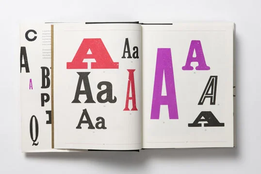
Since releasing the “Untitleds”, Klim Type Foundry has been on a tear of making type real for so many. This week we saw this taken to the extreme in a stroke of brilliance for a gallery show of the types and related works at Object Space in New Zealand. It’s hard to argue that the most enticing parts of the exhibition are the sculptural periods, or full stops, from Untitled Sans and Untitled Serif. Original, and beautiful. If you find yourself on that side of the globe, stop and see the show soon; it runs until September 17th. 


Pelago. It’s Crystal Clear. 

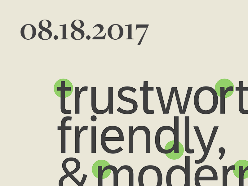
The Adobe Originals Team has released their latest lab creation—Pelago—to Typekit. Adobe describes the new family as this: “Pelago is a semi-formal sans-serif type family by Adobe Principal Designer Robert Slimbach. The family has a crisp contemporary appearance and an understated elegance.” No kidding. We’d like to translate this into easier language... It’s clear as hell. Pelago is absolutely at the top of the digital readability game, and I hope to see this design become well used and well loved out over the coming decades. See for yourself at the full Typekit specimen page


The work of Studio Panorama blitzed across the desk this week in a streak inspirational flash, fresh with posters and experimental graphic design to keep the conversation going for a while. The work is a glimpse of the future, while bringing a note or two in from the past, culminating in a statement of where the studio thinks the world of graphic design is headed. We're inclined to start listening. Read more about their studio feature on It's Nice That


Landa is the latest release from prolific type foundry Sudtipos billed as “A rendez-vous between Nicolas Jenson, Oldrich Menhart, and nature itself”. Although the foundry is usually known for well crafted and inventive script fonts, you would be foolish to forget their ability to create a text face that will knock your socks off. Landa is filled with quirks, breaks, angles, and corners. The italic looks like still photos of someone with a snake in their suit. But terrible similes aside, Landa is a masterfully fun text family from a master of type design. Landa is available now at MyFonts.


Norwegian graphic designer Johanne Lian Olsen’s Due Display type popped up this week as the latest addition to the tall sans for editorial trend, and it's worth a deeper look. Olsen injects subtle quirks into this design to break out of what most of the tall sans projects inevitably end up being. The real spark in this typeface comes out in the specimen she designed to promote Due. See the full specimen Johanne Lian Olsen’s website


It was announced this week that global type company Monotype’s recent type project ‘72’ for SAP was awarded a Red Dot Award. After looking up what a Red Dot Award is, and reading up on the design process for this custom type family, it’s safe to say that this award is well deserved. The evidence is in the details of this design. Sometimes corporate level font projects can be rushed or turn out to more thumbs down than up, but designer Terrance Weinzierl designed a sturdy product for SAP here. Congrats on your Red Dot, Monotype. Read about the entire 72 Project here


The instagram account @thecheesefanman (Anthony Millard) flew by the desk this week with some colorful and cheerful vintage type eye candy. Vintage Cheese Labels. Enjoy. 


TWFTDKyle Read
New Look, New Future

This is a rather important week for us here at Badson. We’ve had a bit of a change. We’re proud and excited to present not only a refreshed website for our work and passion, but a renewed approach to business altogether.

Our little corner of the internet was in need of a little renovation, and our growing business was becoming unclear in its direction. We needed to change tack and get some new wind in our sails. This week marks the charting of a new course—we’re moving forward as a media company, serving the world of typography.


What do you mean “Media Company”?

We love type. We love type so much that we’ve got love to share. Establishing ourselves as a media company allows us to broaden our horizons and create the projects and work we want to. It gives us more freedom to create meaningful design for our clients. It empowers us to produce and release new boutique typeface families at the right pace. And it helps us reach further and introduce more people to the world of typography.

Badson is still a company of parts. The Studio, Type Foundry, Shop, and now Publishing House are all crucial components of what we’re referring to as the Badson Media Family. The biggest note here is that they’re all moving in the same direction, with energy, towards a singular mission: “Quality typography for all”.


Here’s what’s changed.

The most visceral evidence of our new direction is in the visual refresh of our website. The new badsonstudio.com allows for quick access to new and classic work from the studio, setting up easier access to our young font catalog, a new shopping experience for typographic goodies, and updating the way we present the world of type.

It’s not all aesthetic however, our refresh in look comes with a refresh in mentality. We want to be your trusted source for access and understanding in the rapidly changing universe of typography. We aim to earn that trust over time by providing consistent and insightful access to the current type universe. Right now, that universe holds a confusing solar system that could use a guide. 

At the center of it, there is a vibrant industry of talent, history, and incredible value to design and economics... people who create type, push design forward, and shape visual culture. We’re here for those folks. We’re here to help bring your work to more people through the Studio, Publishing House, and new weekly dispatch.

Orbiting this rich sun of type and culture are people on a sliding scale of familiarity with fonts and type: fans and aficionados spinning tightly around the industry, to newcomers and outsiders who may not know as much. We’re here for those folks, too. Through the Type Foundry, printed works from Badson Press, and new goods in the Shop, we’re creating new ways to get closer to the sun at the center of it all. 

We want to help bridge the gap between the people who make type and the people who use type. We want to bring more people in from the fray and expand the bounds of the type world. We aim to make type accessible to all. 


Here’s what you can expect from us. 

New work, products, types, and content will be popping up on the site more frequently. Badson Studio has been hard at work on branding and art direction projects for some great clients, and can’t wait to have more show and tell. The Badson Type Foundry is working hard to bring more retail types to market in the coming months. There are new products in the Shop, from pins to design goods—and more coming every month. And, we’ve opened up our weekly type review This Week From the Desk to your inboxes in the form of an email dispatch sent out every Friday. Sign up and never be out of the loop. 


There’s a lot going on here, and we’re just getting started. If you have any questions, want to work with us, or just want to reach out and say hi, please give us a shout, we love hearing from you.  


Here’s to good sailing, 

Kyle Read

Founder, Badson

Badson NewsKyle Read
This Week From the Desk

Type Network has been keen on capitalizing on the recent evolution in font technology: Variable Fonts. But it's going to take a little more education to make the promise of this new technology a reality. David Berlow, writing on behalf of Font Bureau, expresses his view of variable fonts published the second installment in a series on variable fonts: Opentype Font Variations. 

It's a helpful guide to getting up to speed with everything that's been going on in this arena (as well as a thorough plug for Amstelvar, Font Network's highly visible variable collaboration with Google). Read about it all on the Type Network Blog.  


A Whirlwind Tour Through the History of Monograms

The Illustrious Nancy Sharon Collins offered up this quick but fascinating walk through the history of monograms and cyphers on the Print Magazine blog, complete with plenty of visual fodder—enough to give Pinterest a run for its money. Read and see all the historical splendor here


Regardless of how you feel about the world needing another large grotesque sans family, Marcin Antique was released this week and it's worth checking out. Feliciano Type Foundry presents their new 16-style family with historic context, design process, and a deep PDF Specimen. It's always fascinating to see how designers step up to the plate to take a swing at the Grotesques... this at-bat by Feliciano is worth a watch. Discover and buy Marcin Antique here


Just a little visual inspiration this week: this instagram video posted by @klassethomas. Warning, you might get stuck watching this several times over.  


It was announced this week that Paul McNeil of Muir McNeil will be publishing a reference compendium and review of printing types with Laurence King Publishers in September. McNeil describes the book as “a comprehensive, detailed survey of the major typefaces produced since the advent of printing with movable type in the mid-fifteenth century to the present day.” The book is now taking pre-orders. Can't wait to see what is presented in this volume.


The Loveliest Living Fossil Indeed

H&Co and been publishing a deeper look into some of the characters that don't often get their day in the sun. This week, the company focused on the Numero sign, presenting all you'd ever want to know about it—and a few other similarly obscure characters— in order to impress your friends at trivia night. A good read, and looking forward to more, H&Co. 


TWFTDKyle ReadComment
This Week From the Desk

Schriftlabor has just entered the retail market with four font families: Attorney, Galata, Lawabo, & Traction. The release marks the launch of a new retail site for Schriftlabor and a move towards more font releases. You can try them for free, buy one, or buy all four families as a package. 

*Note: Rainer made a presentation on the early stages of Galata at TypeCpn a few years back showing off the built in games you can create with Open Type. Its great to see this concept come to market. 


This week and next, Badson is a guest editor for Ello, curating a collection of posts on the current state of poster design. Some historical, some iconic, but mostly new hotness. If you're not on Ello, sign up now. 


We received a few goodies int he mail from Colophon this week, one of them being their Bespoke Newspaper Catalog. It's a worthwhile buy, and special addition to the archive of newspaper specimens. (We're collecting, so if you have one or know of any others, let us know!) Grab your own copy here.  


Type@Paris, 2017

The latest graduates form Type@Paris program have their work up for presentation on the Type@Paris website this week. There is a consistently high standard for student projects established in this program, and the hard work shows. See all student projects here


A Renewed Constitution

Steven Heller's weekly column for Print Magazine this week presented a project by ThoughtMatter has gotten a few gears turning... The Constitution of the United States, designed and published in print like never before. It's actually a kickstarter and worth a look. The paper and ink colors are a bit too trendy for me, but I'm more than excited to pick up a copy anyway. 


This Week From the Desk

The Type Director's Club of New York awarded their 2017 Medal to the lauded Dutch type designer Gerard Unger on Tuesday night the 18th. Dr. Gerard Unger is one of the most accomplished type designers working today. (Type Designers don't retire.) Unger now joins the ranks of an incredible list of type and graphic designers who have received the medal, but he is undoubtedly the most stylish


Type Together's Ulrik Holgrebe typed up an interview with the freshest dudes in town: Jesse Ragan and Ben Kiel  on the birth and early life of their type foundry XYZ Type. Its got a few insights, and good ideas from the two type designers that is worth a read. 


I agree with Quipsologies, I don't know why I like it, but its a great motion study that's hella fun to stare at. 


Everything You Need to Know About Fonts

No File

Kris Sowersby of Klim Type Foundry gave a radio interview to New Zealand Radio where he brings a public light to type designers. This is a half hour well spent. 


Alan Kitching's A-Z

One of the more covetable items to float by the desk this week was Alan Kitching's volume of Letterpress 'founts' (as the Aussies put it) “Alan Kitching's A—Z of Letterpress”. Printed in plain specimens, Kitching's collection of wood and letterpress-able type compiled in this way is a boost to any printer's or designer's bookshelf. The book is available from Laurence King Publishers


This week, the work of Andreas Gursky came up again, and if you're unfamiliar with his body of work filled with large scale photography and experiements in forma and landscape, then here's your change to study up. His work is worth seeing in a gallery if ever you get an opportunity. 


The esteemed 50/50 List of accomplished and deserved book and book cover designs for 2016 came out this week, take a look at some of your favorites, and poke around Design Observer for more design treats. 

TWFTDKyle ReadComment
This Week From the Desk

Left a little light this week for type releases and conferences (The summertime usually starts explodes with activity at the beginning and the end but lulls in the middle), this week saw a lot of much needed visual inspiration float across the desk. From paintings to books to more books, take a look a few of the more imPRESSionable (sorry)  pieces we found noteworthy this week. 


Althoguh The Letterform Archive's site and identity have been live for a little while now, it's worth directing a few moments to the interview published by the Archive with Tânia Reposo (the site's designer) and Nick Sherman (the site's developer) to read about the process of bringing a fresh new face to the Letterform Archive. The Archive is such an incredible library, space, and resource that a creating a web home for it is no easy task, but check out the Archive here to really get into it. 


Taking the title of "Desireable Book of the Week" is this beaut from Duplo Press on the most thorough presentation of Risograph printing available. "Exploriso: Low Tech Fine Art". This thorough exploration of the history, capabilities, and historical significance of the Riso Printer is a can't miss for anyone interested in print or independent publishing. Grab it while you can at Duplo Press.


The paintings and publications of Richard Gorman are spacious, bold, and engaging. Explore all of his work at the Kerlin Gallery


Graphisme En France, the thorough and engaging Periodical, came available online this week for download. If you've been feeling light on your design reading lately, here's your chance to get back into the game. Download the latest digital issue—a deep dive into of Logos & Visual Identities— here

TWFTDKyle ReadComment