Posts in TWFTD
This Week From the Desk

The Type Director's Club of New York awarded their 2017 Medal to the lauded Dutch type designer Gerard Unger on Tuesday night the 18th. Dr. Gerard Unger is one of the most accomplished type designers working today. (Type Designers don't retire.) Unger now joins the ranks of an incredible list of type and graphic designers who have received the medal, but he is undoubtedly the most stylish


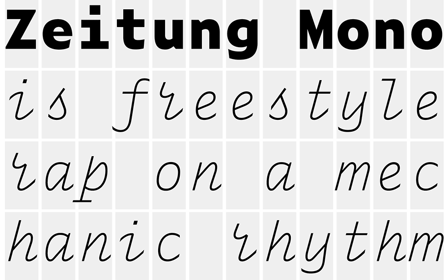
Type Together's Ulrik Holgrebe typed up an interview with the freshest dudes in town: Jesse Ragan and Ben Kiel  on the birth and early life of their type foundry XYZ Type. Its got a few insights, and good ideas from the two type designers that is worth a read. 


I agree with Quipsologies, I don't know why I like it, but its a great motion study that's hella fun to stare at. 


Everything You Need to Know About Fonts

Kris Sowersby of Klim Type Foundry gave a radio interview to New Zealand Radio where he brings a public light to type designers. This is a half hour well spent. 
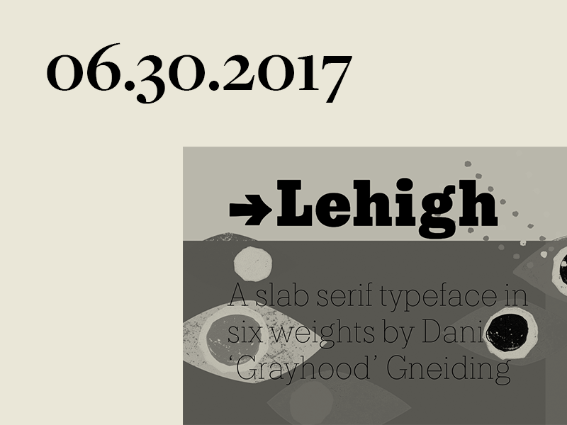
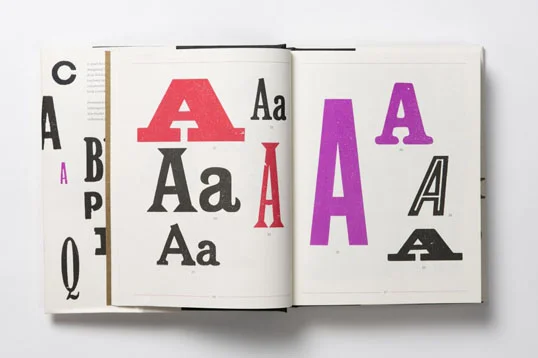

Alan Kitching's A-Z

One of the more covetable items to float by the desk this week was Alan Kitching's volume of Letterpress 'founts' (as the Aussies put it) “Alan Kitching's A—Z of Letterpress”. Printed in plain specimens, Kitching's collection of wood and letterpress-able type compiled in this way is a boost to any printer's or designer's bookshelf. The book is available from Laurence King Publishers


This week, the work of Andreas Gursky came up again, and if you're unfamiliar with his body of work filled with large scale photography and experiements in forma and landscape, then here's your change to study up. His work is worth seeing in a gallery if ever you get an opportunity. 


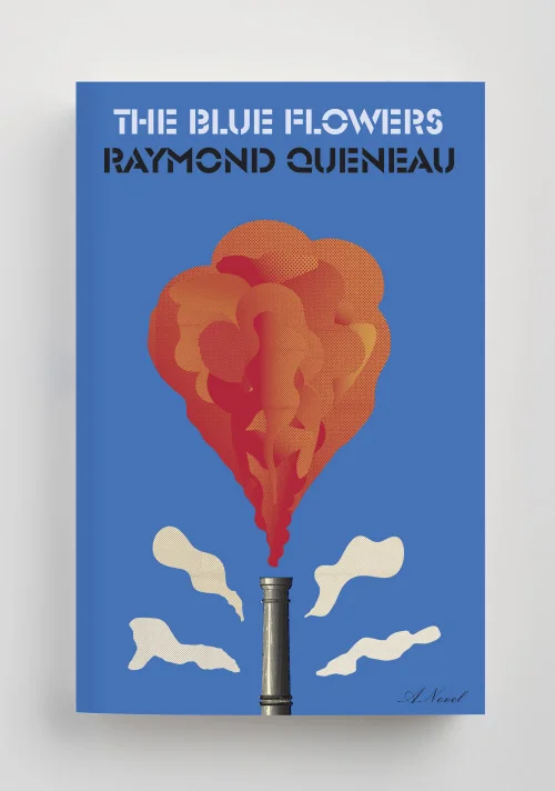
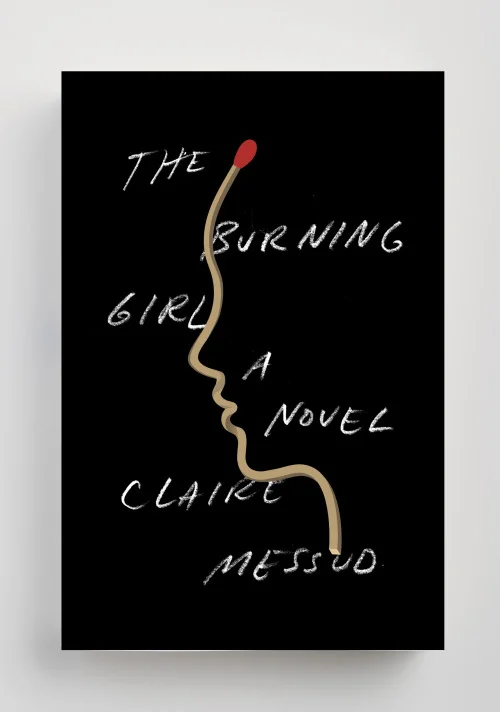
The esteemed 50/50 List of accomplished and deserved book and book cover designs for 2016 came out this week, take a look at some of your favorites, and poke around Design Observer for more design treats. 

TWFTDKyle ReadComment
This Week From the Desk

Left a little light this week for type releases and conferences (The summertime usually starts explodes with activity at the beginning and the end but lulls in the middle), this week saw a lot of much needed visual inspiration float across the desk. From paintings to books to more books, take a look a few of the more imPRESSionable (sorry)  pieces we found noteworthy this week. 


Althoguh The Letterform Archive's site and identity have been live for a little while now, it's worth directing a few moments to the interview published by the Archive with Tânia Reposo (the site's designer) and Nick Sherman (the site's developer) to read about the process of bringing a fresh new face to the Letterform Archive. The Archive is such an incredible library, space, and resource that a creating a web home for it is no easy task, but check out the Archive here to really get into it. 


Taking the title of "Desireable Book of the Week" is this beaut from Duplo Press on the most thorough presentation of Risograph printing available. "Exploriso: Low Tech Fine Art". This thorough exploration of the history, capabilities, and historical significance of the Riso Printer is a can't miss for anyone interested in print or independent publishing. Grab it while you can at Duplo Press.


The paintings and publications of Richard Gorman are spacious, bold, and engaging. Explore all of his work at the Kerlin Gallery


Graphisme En France, the thorough and engaging Periodical, came available online this week for download. If you've been feeling light on your design reading lately, here's your chance to get back into the game. Download the latest digital issue—a deep dive into of Logos & Visual Identities— here

TWFTDKyle ReadComment
This Week From the Desk

Typographica's Best of 2016

This week, the undoubted king of type news has to be the release of Typographica's Best of 2016 List. If you're new to the scene, or have been living under a rock, Typographica's Best Of Lists have become a joyously awaited tradition where top type minds get to talk type, design, and critique with passion and gusto, highlighting the most noteworthy typefaces of the last calendar year. This year's selections are not surprising, and if you've been following this blog, you'll probably recognize a lot of familiar faces. Many congrats go to Stephen Coles, the staff and writers of this year's list, and all the winners named. Spend a few hours—or if you're anything like me, a few days—pouring over the incredible work presented in the list, and get inspired to get on the list next year. 


As if there needed to be more ground breaking type industry news this week, Fontstore launched, and it demands a little attention. Fontstore is a new font subscription platform designed for designers with an exclusive library of fonts. With a slick interface and a tight sales pitch, Fontstore is looking to be a studio-hold name for only $15 a month. Will Fontstore become the go-to platform for designers to buy and handle fonts? Does Fontstore present more of a threat or a benefit to the type industry and type designers? We'll have to wait and see. 


Xavier Dupré released his most recent project this week: a 4 weighted family named Malis. Malis is an example of calculated risk in type design. In today's day in age, it's easy to give in to teh desire to interpolate 50 weights between barely-there hairlines, and supermassive black hole bolds. Malis comes in 4 weights, designed carefully for the digital world it will perform in. Well dont, Xavier. See and shop Malis on Fontstore.


This site is a must see: Typography that reacts to music, touch, and a slew of other things, all in the context of poster design. I can't get enough of this. 


Production Type (ballers) in association with Google Fonts launched a potentially earth-shifting project this week: Spectral. By far the best attempt to put Variable Fonts in the hands of actual customers, the Spectral Project is a type face, an app, and really more of an exhibition in Interaction Design than Type Design. Spectral's fun albeit intense minisite is part science lab, part type specimen, with no shortage of surprises to help you discover the ins and outs of this new-to-everyone parametric format. I hope to write more about Spectral here on the Badson Blog soon, as there are a lot of ideas at play in this project—both inspiring and worrisome—but for now let's just enjoy what a time to be alive it is with the release of Spectral!


Brand New featured the restoration of the Goode Co. branding on their blog this week. You can usually spot the lively lines of Jessica Hische'a work anywhere, and this is no different, its great to see her work out in the wild. Brand New describes the project as "the equivalent of finding a car in a junkyard and restoring it to shiny glory." Can't disagree.


In news regarding well designed editorial pieces, Kinfolk landed on the desk this week, and it's a stunner. Issue 24 highlights Art Direction easily humming along at 3000 RPM with no end in sight. Perhaps the best part about Kinfolk is how they marry their print and online platforms... seamless.  


The NBA is rolling out a logo and type refresh after almost 50 years. Commercial Type worked alongside Erik van Blokland to customize their Action Condensed for the NBA. Tall, strong, and sharp... if there's a more perfect match for the NBA, I don't know what it would be. Read the official press release from the NBA here

TWFTDKyle ReadComment
This Week From the Desk

An you thought the Monospace font thing was played out? Tisk Tisk. The talented crew from Amsterdam and Helsinki have released a Monospaced companion to their popular Zeitung sans family. It's packed with character and interesting solutions to customary rhythm issues. See the full Zeitung Mono release at Underware. Wanna really get blown away? Choose ASCII Mode.


This week, inspiration comes in the form of some gorgeous graphic work from artist Charlie Oscar Patterson. See his full site and shop for more. 


Yes, love this Anthony Burrill Print for Schoolhouse Electric. Buy it here


The lastest release from Lost Type is Lehigh, designed by Dan Gneiding. Lehigh is a handsome slab serif type family of six weights with all the bells and whistles that seems to be locked in a conversation with the Clarendon lifestyle. It has neutrality and tidy lines in the lighter weights, and a dirth of versatility and expression in the heavier weights. The type looks sharp, but honestly the specimen page for Lehigh on the Lost Type Site may eclipse it with charm and energy. Well done, Lost Type. 


Well known and loved Knopf book jacket designer Peter Mendelsund announced his departure from the company on his blog this week after 15 years of incredible work. His blog post quickly gets down to the details though, describing how he's not without things to do. Get ready for some amazing new things to look at and read from Mendelsund as he embarks on this next phase of his legendary career. Read the full announcement on his site


This is an interesting look at a Lettering Showereel. Opting out of a typical website of images, Jillian Adel took a page out of the motion graphics playbook and created a portfolio showreel of her work in 2016. This concept is super intriguing, and as lettering videos on Instagram and Facebook become more popular—and it becomes easier to produce process videos on iPads and other tablets—I wonder how the concept of lettering showreels will catch on. 


This week's Object of Desire had got to be the 47th issue of the Pentagram Papers designed by Luke Hayman and his team. The Museum Collection issue features the collection of museum tags and locker keys from Birnbaum. Its a stunning and quick piece of design that really just makes me drool. Read more about this issue in Pentagram's post


Emilie Rigaud (A is for Apple) has released Tongari, and spritely flared serif family with enormous potential. Tongari is the latest of Emilie Rigaud's work, adding to a growing portfolio of consistently high-quality bespoke fonts. Although there's not much descriptive information on the site about the family, you can make your own specimens for both Tongari and Tongari Italics. 


The TDC currently has a show in its hallowed halls telling the story of how the New York Times Magazine conquered a complete redesign starting in 2015, including a suite of new commissioned typefaces, and became one of the most innovatively designed magazines today. It turns out that the exhibition has a newspaper of its own—a specimen paper of all the types that went into making that redesign possible. If you're in New York, do not miss this exhibition! Also, if you make it to the show, be so kind as to send one of these papers to us here in Denver.  We will send you presents in return! See the details of the exhibition at the TDC Events Page


TWFTDKyle ReadComment
This Week From the Desk

It's been a hot week for type releases and change in the use of type around the globe! Riding the energy of a successful Typographics Conference in NYC last weekend, several foundries released new families and products, magazines took a turn at new expressions with type, and of course, lots of new inspiration. Let the summer heat continue. 


Recently independent Tobias Frere-Jones and his incredible crew of fellow type designers at Frere-Jones Type released their long-awaited third family release Exchange this week. Evoking the spirit and skills of elite typefounders past, and TFJ's visionary approach to the future of type design, Exchange is nothing short of a modern classic that is as useful as it is interesting to look at.

Tobias states “The strategy for word shape coherence comes from the early “Ionic” style of slab serifs, while Bell Gothic offers a lesson in reinforcing the individual identities of letters. Sure-footed sobriety, inherited from Victorian text faces, runs throughout.” Exchange is a treat to study for any type designer, and an achievement to be proud of for the entire Frere-Jones Type team. Explore the whole family on frerejones.com.


Bloomberg Business Week Makes a Refresh

Although the initial rollout of the new design direction for Bloomberg Businessweek happened two weeks ago, analysis and discussion around it's new look, process, and impact on the industry is just getting started. This process article from Creative Review, casts some fascinating light on the new direction for the Magazine. Or, if you prefer, this video:


H&Co. has doubled down on the influence of the hand in contemporary fonts. In fact, they bet on it 6 times. Inkwell is a family of 6 different styles all build on the same hand-written chassis. Each family has its own range of six weights to boost. Bottom line, if your looking for a handwriting style font, you'd be hard pressed not to find it in this family. The more unconventional drawn styles are a nice surprise, if anything adding marketing value for the more expected script and sans offerings. 

There is so much to unpack with Inkwell, but H&Co. has managed to pull together a cohesive and approachable presentation of every last character here. Read the entire story of Inkwell and explore the whole family on typography.com


A post shared by Print Magazine (@print_mag) on

Class-act and top-shelf letter-lady Jessica Hische lends her mug to the Typography Issue of Print Magazine, rolling out in the next weeks. The issue's cover was guest designed by Louise Fili, Jessica's first mentor and employer.... the awesomeness of this issue compounds on itself. If the cover headlines are anything to guide us, the issue itself looks to be a 'can't-miss' get. 


Type Media alum and Finnish All-star Hanna Hakala released Valiance this week with the Dutch Type Library. Hanna initially developed Valiance in 2014 where it won silver in the Finnish design competition Vuoden Huiput. Now, it can be yours. Your very own piece of Finnish Design History. Buy the handsome and linguistically deep Valiance from the Dutch Type Library


This edition of the Culture Podcast from Monocle features Paula Scher and Adrian Shaughnessy, where they have a nostalgic and engaging conversation about a few old things, a few new things, and the state of things. This is a half hour well spent. Listen on the Monocle site


TWFTDKyle ReadComment
This Week From the Desk

Rick Poynor (University of Reading) published a concise article on Creative Review this week talking about how Emigre still matters. He poses the idea that there is less public debate and discussion about Typography these days, and that should change. It is the hope of Badson that Shoe can one day make an attempt at filling this role, but for now, the blogosphere will have to carry the torch. This article is a great read and a reminder that there is a narrative in the type industry that still continues on. Read Rick Poynor's article here


TYPETR, part of the TypeNetwork family, released an innovative new pixel font this week: Bitcount. At first glance, it would be easy to pass over Bitcount as just another pixel font... what's so special about that. It appears that Dutch Wizard Petr van Blokland has packed this mind-bogglingly large super family of 300 font styles with some serious innovation. There are several pixel styles that can be stacked for a seemingly infinite number of expressions, the introduction of the 'contrast pixel', and matching italics which are usually forsaken in pixel fonts. There's a lot to unpack here, but TypeNetwork's information page is a great place to start. Congrats, Petr, on this mega release. 


The Typographics Conference held at the Cooper Union in New York City is taking place right now through this weekend. Sadly, Badson is not there, but there are lots of ways to follow along through Twitter and the Conference website. It looks to be another killer experience, cheers to all involved!  


Elephant Issue #31 looks rather stunning. 


Artifact Uprising launched the ability to create customized wedding invitations on their site this week. The invitations prominently feature Miller, the seminal Scotch Roman designed by Matthew Carter. You have the ability to select from a menu of 8 type styles (of which Miller is clearly the best). It's interesting to see how a company that relies so heavily on design in their business chooses to represent fonts in this arena. See how Artifact Uprising is doing here. 


They've been putting these brililiant gifs out for some time now, but they finally put them all in one place. DIA Studio and their typographic motion experiments are now on ELLO.


TWFTDKyle ReadComment