This Week From the Desk
Typographica's Best of 2016
This week, the undoubted king of type news has to be the release of Typographica's Best of 2016 List. If you're new to the scene, or have been living under a rock, Typographica's Best Of Lists have become a joyously awaited tradition where top type minds get to talk type, design, and critique with passion and gusto, highlighting the most noteworthy typefaces of the last calendar year. This year's selections are not surprising, and if you've been following this blog, you'll probably recognize a lot of familiar faces. Many congrats go to Stephen Coles, the staff and writers of this year's list, and all the winners named. Spend a few hours—or if you're anything like me, a few days—pouring over the incredible work presented in the list, and get inspired to get on the list next year.
As if there needed to be more ground breaking type industry news this week, Fontstore launched, and it demands a little attention. Fontstore is a new font subscription platform designed for designers with an exclusive library of fonts. With a slick interface and a tight sales pitch, Fontstore is looking to be a studio-hold name for only $15 a month. Will Fontstore become the go-to platform for designers to buy and handle fonts? Does Fontstore present more of a threat or a benefit to the type industry and type designers? We'll have to wait and see.
Xavier Dupré released his most recent project this week: a 4 weighted family named Malis. Malis is an example of calculated risk in type design. In today's day in age, it's easy to give in to teh desire to interpolate 50 weights between barely-there hairlines, and supermassive black hole bolds. Malis comes in 4 weights, designed carefully for the digital world it will perform in. Well dont, Xavier. See and shop Malis on Fontstore.
This site is a must see: Typography that reacts to music, touch, and a slew of other things, all in the context of poster design. I can't get enough of this.
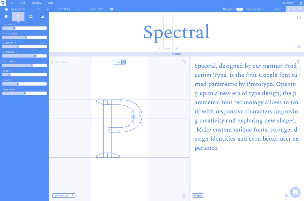
Production Type (ballers) in association with Google Fonts launched a potentially earth-shifting project this week: Spectral. By far the best attempt to put Variable Fonts in the hands of actual customers, the Spectral Project is a type face, an app, and really more of an exhibition in Interaction Design than Type Design. Spectral's fun albeit intense minisite is part science lab, part type specimen, with no shortage of surprises to help you discover the ins and outs of this new-to-everyone parametric format. I hope to write more about Spectral here on the Badson Blog soon, as there are a lot of ideas at play in this project—both inspiring and worrisome—but for now let's just enjoy what a time to be alive it is with the release of Spectral!
Brand New featured the restoration of the Goode Co. branding on their blog this week. You can usually spot the lively lines of Jessica Hische'a work anywhere, and this is no different, its great to see her work out in the wild. Brand New describes the project as "the equivalent of finding a car in a junkyard and restoring it to shiny glory." Can't disagree.
In news regarding well designed editorial pieces, Kinfolk landed on the desk this week, and it's a stunner. Issue 24 highlights Art Direction easily humming along at 3000 RPM with no end in sight. Perhaps the best part about Kinfolk is how they marry their print and online platforms... seamless.
The NBA is rolling out a logo and type refresh after almost 50 years. Commercial Type worked alongside Erik van Blokland to customize their Action Condensed for the NBA. Tall, strong, and sharp... if there's a more perfect match for the NBA, I don't know what it would be. Read the official press release from the NBA here.


