This Week From the Desk
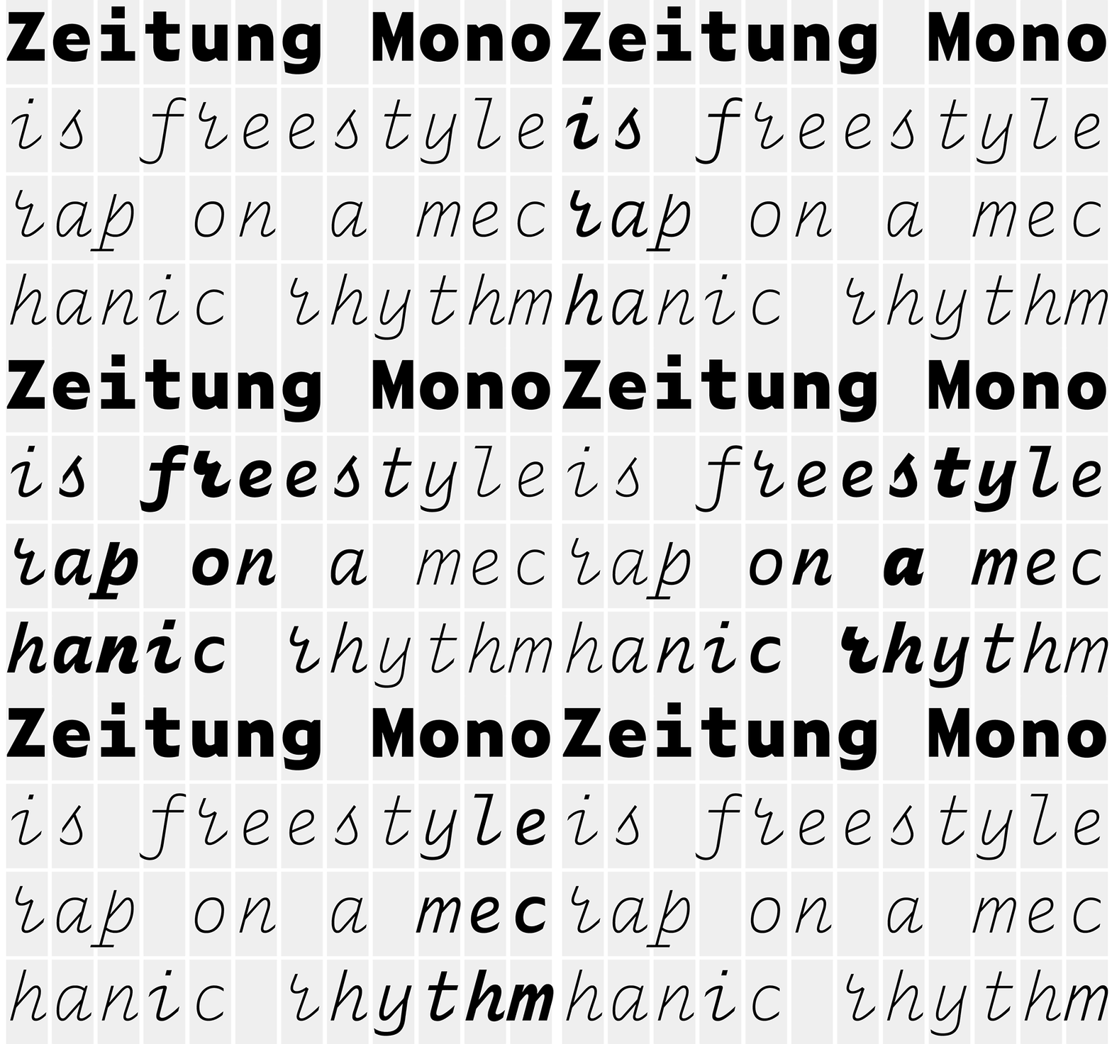
An you thought the Monospace font thing was played out? Tisk Tisk. The talented crew from Amsterdam and Helsinki have released a Monospaced companion to their popular Zeitung sans family. It's packed with character and interesting solutions to customary rhythm issues. See the full Zeitung Mono release at Underware. Wanna really get blown away? Choose ASCII Mode.
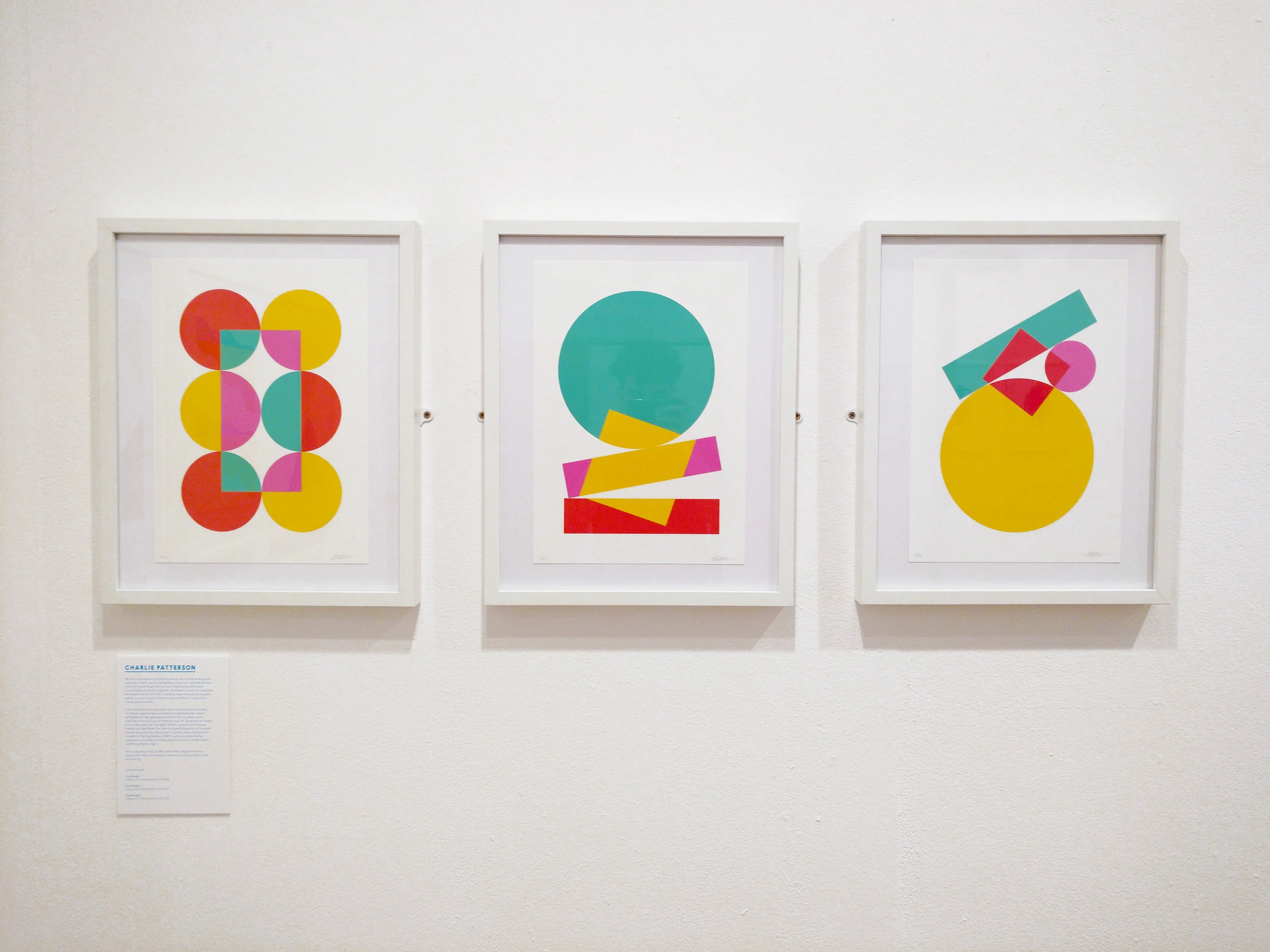
This week, inspiration comes in the form of some gorgeous graphic work from artist Charlie Oscar Patterson. See his full site and shop for more.
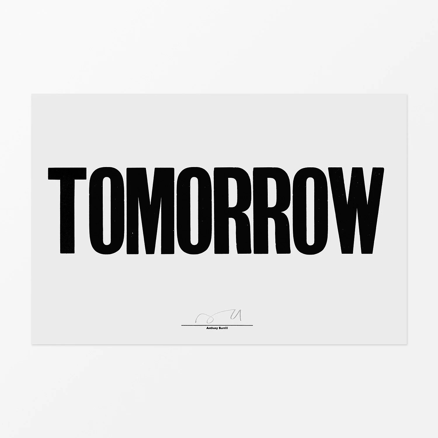
Yes, love this Anthony Burrill Print for Schoolhouse Electric. Buy it here.
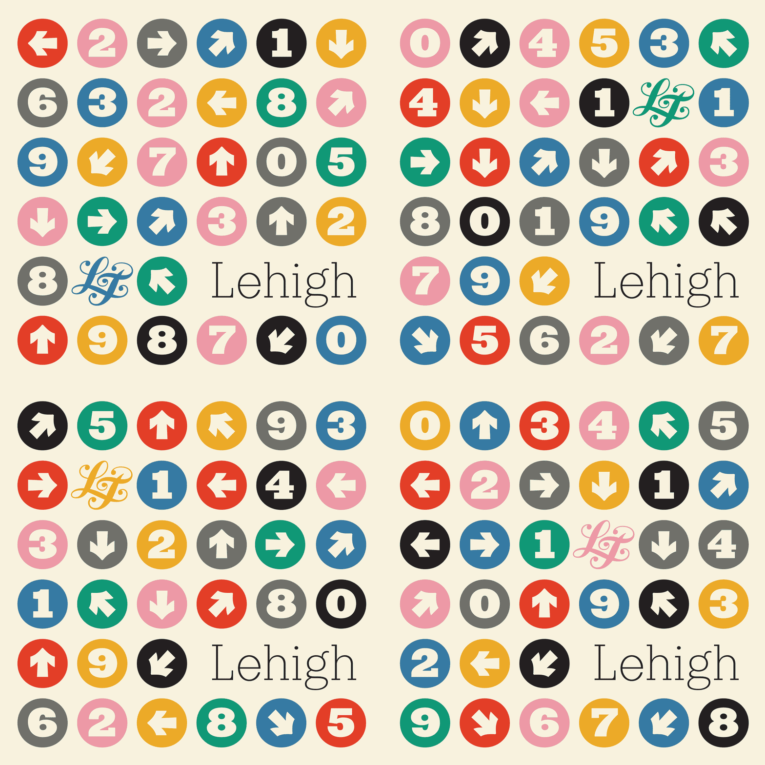
The lastest release from Lost Type is Lehigh, designed by Dan Gneiding. Lehigh is a handsome slab serif type family of six weights with all the bells and whistles that seems to be locked in a conversation with the Clarendon lifestyle. It has neutrality and tidy lines in the lighter weights, and a dirth of versatility and expression in the heavier weights. The type looks sharp, but honestly the specimen page for Lehigh on the Lost Type Site may eclipse it with charm and energy. Well done, Lost Type.
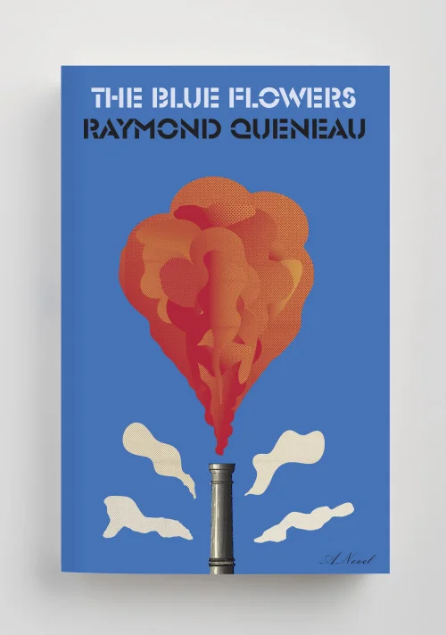
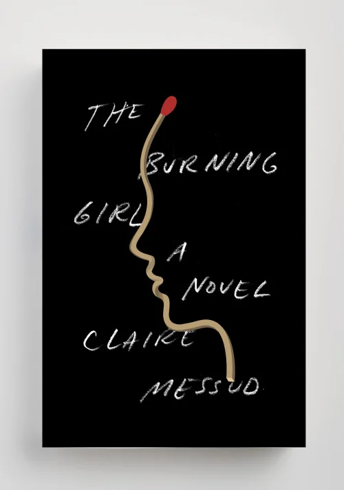
Well known and loved Knopf book jacket designer Peter Mendelsund announced his departure from the company on his blog this week after 15 years of incredible work. His blog post quickly gets down to the details though, describing how he's not without things to do. Get ready for some amazing new things to look at and read from Mendelsund as he embarks on this next phase of his legendary career. Read the full announcement on his site.
This is an interesting look at a Lettering Showereel. Opting out of a typical website of images, Jillian Adel took a page out of the motion graphics playbook and created a portfolio showreel of her work in 2016. This concept is super intriguing, and as lettering videos on Instagram and Facebook become more popular—and it becomes easier to produce process videos on iPads and other tablets—I wonder how the concept of lettering showreels will catch on.
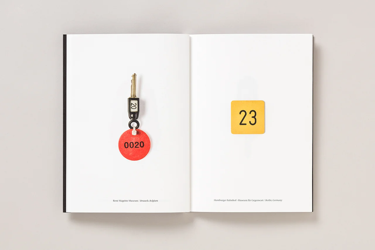
This week's Object of Desire had got to be the 47th issue of the Pentagram Papers designed by Luke Hayman and his team. The Museum Collection issue features the collection of museum tags and locker keys from Birnbaum. Its a stunning and quick piece of design that really just makes me drool. Read more about this issue in Pentagram's post.
Emilie Rigaud (A is for Apple) has released Tongari, and spritely flared serif family with enormous potential. Tongari is the latest of Emilie Rigaud's work, adding to a growing portfolio of consistently high-quality bespoke fonts. Although there's not much descriptive information on the site about the family, you can make your own specimens for both Tongari and Tongari Italics.
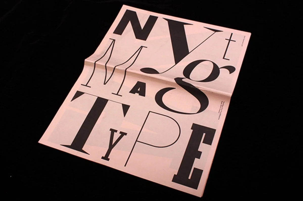
The TDC currently has a show in its hallowed halls telling the story of how the New York Times Magazine conquered a complete redesign starting in 2015, including a suite of new commissioned typefaces, and became one of the most innovatively designed magazines today. It turns out that the exhibition has a newspaper of its own—a specimen paper of all the types that went into making that redesign possible. If you're in New York, do not miss this exhibition! Also, if you make it to the show, be so kind as to send one of these papers to us here in Denver. We will send you presents in return! See the details of the exhibition at the TDC Events Page.

