This Week From the Desk

The shiny new Black Type Foundry—straight outta Paris, France—debuted their first major type release this week in the form of Vesterbro, a beautifully human serif with a wide range of talents. It looks great in text AND display (something a LOT of font families claim but few truly achieve) and shows off its features in a very thorough website specimen. Explore and purchase Vesterbro here. 


Can you believe that this this is a BOOK? Bibliophiles, you might want to sit down for this one.  This is the TDC 1000, a 1024 page book encompassing artwork that was received at the Tokyo TDC's 25th Annual Awards. Although this book was published in 2013, this is the first that i've seen it, and it made me do a double take. It's restocked at Counter Print Books this week


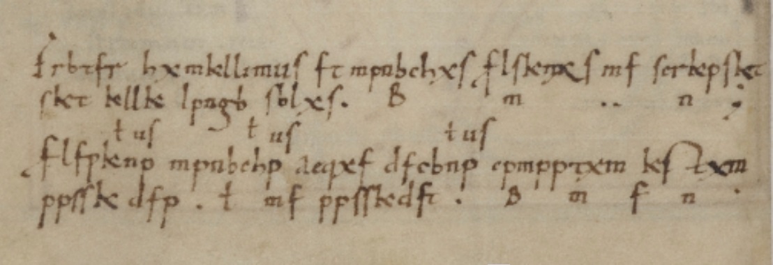
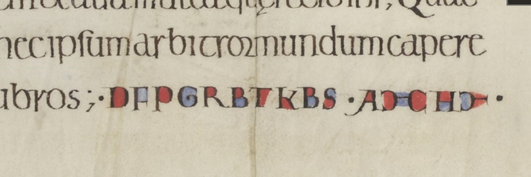
Type, scribes, cryptography, what's not to like? This article about coded texts in the era of illuminated manuscripts was circulating at the beginning at the week... a satisfying and thought-provoking read. 


An interesting write up on Mathias Clottu's redrawing of a Mies van der Rohe sans serif type named Allzweck, originally created by the famed architect in 1966. I'm really intrigued by these horizontal letterforms, and would love to see an even deep case study of this project. (via It's Nice That)
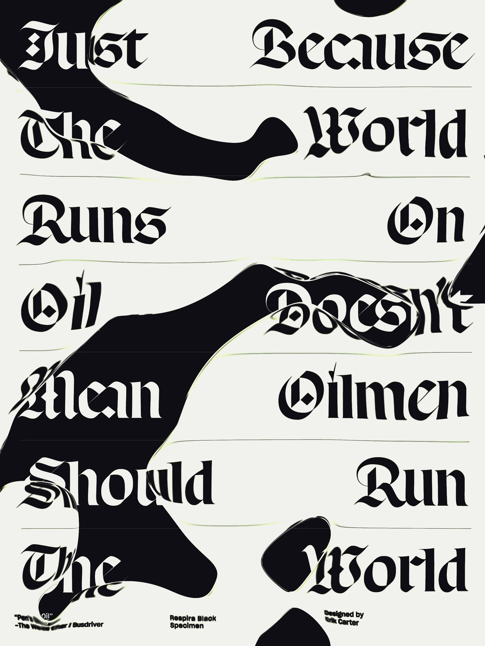

Klim's Hypothetical

“A dilemma! You now have to balance your personal ethics against potential income. So what are the possible scenarios?”

Take a moment to read this quick ‘hypothetical’ scenario posed on Klim's blog. The plight of selling digital files online is real. 


New letters from Louise Fili dropped this week. Say hello to Montecatini, a typeface that will transport you to a world of classic bygone fashion, espressos on the plaza, and fine Italian suits. Louise's studio packs as much character and life as you’ll ever find into this typeface. See the beautifully designed (of course) specimens on the Louise Fili site, or buy the font directly from MyFonts. 


Anthony Burrill and Michael Marriott are set to launch a collaborative collection of furniture for Design Undefined – the third edition of Clerkenwell London’s interdisciplinary design show at the annual event. The pair have created a ‘room within a room’ containing a unique collection of furniture that marries Burrill’s colourful design vision with Marriott’s utilitarian design style and material ingenuity. The event is a step outside of the 2D for Burrill, with the show described as “a celebratory showcase of his work to date.”. Read more about Design Undefined here.


There have been a few ...ill-received... typefaces this week, but Monokrom's expansion of Telefon was not one of them. Monokrom added three new weights with italics to the family, bringing the total to 12. Not sure if or when the love affair with Metro inspired styles will ever let up, but for now, it's fine with me. See more and buy the typeface here


TWFTDKyle ReadComment
This Week From the Desk

This rather interesting blog post by Daniel Benneworth-Gray floated past the desk this week about his typographic book cover designs for the Alien series. He mentions that books based on films rarely get enough attention. Well, sir, you have our attention now with these covers! (P.S. I wish these were real!) See the full post on Daniel's Blog.


Loved this short little window into the weird words that type designers use to test their fonts published on Wired this week. Personal favorite: "Högertrafikomlaggningen" from Jackson Cavanaugh at Okay Type. I have a few good ones myself that I think would make a great little book. 


Type Network continues to grow this week with their recent deal to present Monokrom in their roster. It's not THAT big of a deal I guess because Monokrom fonts are already available on FontShop, as well as on their own independent site. Read more about the aquisition (is this even the right term?) in the official TN announcement here


123 calling cards from an international roster of artists ranging from the 18th century to the present day have been facsimilied and inserted into new book Oracles by Pierre Leguillon and Barbara Fedier. Very excited to try to grab this one from Edition Patrick Frey. (via It's Nice That)


Check out this great little demo for Variable Fonts on the web, developed by Devon Govett using Typekit. It's a good way for everyone to start to get our hands dirty and demystify Variable Fonts a little. Try it out here.  


A post shared by COLLINS (@thisiscollins) on

Collins, an agency staffed with only incredible creatives, won a TDC Award for Type Design this week for Kernit—a type system based on the work of Jim Henson. The face is so unexpected and honest, very stoked to see it win. Looking forward to seeing ALL the TDC Type Design Competition winners. 


This poster from Seoul's Everyday Practice is one of my favorite pieces of design to float across the desk this week. Their entire approach and body of work is something to admire. Take a visit to their site here


The latest contribution to the world of typographic publications is Type Notes, a new periodical from Fontsmith focused on promoting typefaces, both theirs and others, and talking about typography. They've stacked up a few fantastic contributors, and it appears there's enough type exploded across the pages to put you in a coma for a while, but hey, there are worse ways to land in a coma, right? See all the details and order a copy on their website


I learned a new word this week: Scrollytelling. The art of telling stories in digital spaces through mastering the scroll. Its rather fascinating, really. Learn more about it from this blog post on The Pudding.

“The most important reason to preserve the scroll is if the transitions are truly meaningful, and not just something to make it pop.”


The Society of Publication Designers (this is non-solicited, but they're a great organization) is hosting an event in New York next week talking about the power and state of independent publications. The discussion will feature a collection of some of the most amazing people:  Matt Willey from Avaunt Magazine and the NYT Mag, Leo Jung from The California Sunday Magazine, Caitlin Thompson of Racquet, Tina Essmaker of The Great Discontent, and Christopher Isenberg from Victory Journal. If your'e in NYC, don't miss this. 


TWFTDKyle ReadComment
This Week From the Desk

It's Baaaaack! Mary Catherine Pflug has been hard at work on the second annual Font Purchasing Habits Survey. Last year, Mary presented the results of the survey to applause at TypeCon. This year's survey marks it as an annual event and gives a fascinating look into the type industry. This year, there is a reward of 9 free fonts to all who take the survey. Submit your answers here, and speak up for the industry. 


Say Hello to XYZ Type, the formal foundry for the type world's most underestimated dynamic duo Jesse Ragan and Ben Kiel. The two gents are not only two of the most talented type makers working today, but two of the most humble; working as passionate educators—on top of all the type work. Cortado, Aglet Slab, Export, these faces are just the beginning for XYZ Type. Watch this space for what is sure to be some list-topping type for years to come. Congrats Jesse & Ben!


Missed posting this last week, so it's in the mix for this one, Lucas Sharp is having fun again with his latest release Respira Black. This new-age blackletter is the font your font menu has been craving. The face releases with a fascinating set of posters for purchase, the proceeds of which all are donated to the NRDC.


Here's a 'must-have' book for you: "Strange Bird—The Albatross Press and the Third Reich". Published this week by Yale University Press, Strange Bird is the first book about the Albatross Press, a Penguin precursor that entered into an uneasy relationship with the Nazi regime to keep Anglo-American literature alive under fascism. It's got all the right things: a book about books and WWII era historical intrigue. Purchase on the Yale site here


Although it is easy to throw hateful critique at the success of big name designers like those at Pentagram, this branding program for QUAD Cinema in New York by Paula Scher and her team makes it very easy to love. I think its easy for people to insult good design because "it looks like the designer didn't try very hard"... well to that I say "That's the point." Good design should appear effortless if not transparent altogether. This project is a beautiful example of this. Lighting, signage, color, environment, architecture, typography, this project has all the hallmarks of a Paula Scher application and I'm rather in love. Read and see more at B P and O here.


David Johnathan Ross, in all his wizardry debuted his own Fonts of the Month Club this week, set to release one display font every month. You can subscribe to 3, 6, or 12 months wroth of fonts! For $6-$8 per font, you BEST be getting in on this new model. Discover more here! The first month's offering is Nickel, an all caps font inspired by banknotes. 100% fun. 


Estorick Collection of Modern Italian Art is holding an exhibition of the work of Franco Grignani (1908-1999), a designer and artist who anticipated the rise of Op Art. The show looks positively mind-bending. The opportunity to see how art and design intersect in this way is a rare opportunity. Anyone in London going to see this? I'll be looking out for photos.


This recently published project by Michael Bierut and his team at Pentagram for the Frank Lloyd Wright School of Architecture is a rather fascinating application of type. It seems as though several of the partners at Pentagram have an affinity for stretching type all over buildings, which will surely be fodder for lots of good branding and type debate for months to come. Looking forward to seeing a more formal case study, but for now, read the write up in Architect Magazine. 


I'll leave you with this absolutely delightful video from Japan of Rube Goldberg as storytelling. 


This Week From the Desk

The next life for Standards Manuals has manifested, this time presenting the Brand Standards Manual for the EPA, designed by Chermayeff & Geismar back in 1977. The logo design in itself is a thing of beauty, but the system developed to support the department at its formation is inspiring. The Kickstarter is officially open now. This book is a design nerd MUST. 


Ogilvy & Mather partnered with Fontself to create "Gilbert", a font inspired by Gilbert Baker—the creator of the rainbow Pride Flag who sadly passed away this month. See more of this colorfully layered font project on Creative Boom.


One of Colophon Foundry's latest types Montefiore now has a beautiful specimen book to accompany it. I've always been into Colophon's specimen booklets. You can snag a copy on their site here


Oh how I wish I could go to this. Gail Bichler will be speaking about the development of the New York Times Magazine from 2015 to present day at the TDC in June. If you're in town, GO. See the details and buy tickets on the TDC site here


Raise your hand if you still use tumblr... 🙋🏼‍♂️! I was reminded that Production Type's tumblr exists; and its beautiful, obviously. Enjoy the scroll here


TWFTDKyle ReadComment
This Week From the Desk

Commercial Type has been on a roll of spectacular releases lately. The most recent Algebra Display is no exception. Algebra Display is a companion to the successful Algebra family by its original designers Susana Carvalho and Kai Bernau. Well done, Commercial. 


These Books by Studio Frith & Visual Editions

This project floated past the desk this week and it made me look twice. Studio Frith created these books for WeTransfer, and you can see the play at work. They're a great example of a bespoke typeface having fun. 


Check out this cool collaboration between Briefcase Type and Lavmi that brings some of Briefcase's typefaces to wallpaper designs. Parson me while I go find a reason to buy a bunch of wallpaper. 


Spent a lot of time on Pampatype's website this week. The amount of work is only surpassed by its quality. Operating out of Argentina since 2001, Pampatype are proven masters of their craft. The best part is perhaps how varied and expressive their catalog is. Discover all of Pampatype's work on their site. Be prepared to lose a few hours of your day. 


This Video: 👍🏻


Thonik has a new site that launched this week. The studio has some incredible work in the public sphere, with a taste level reminiscent of the high modernists. Their project for the Power Station of Art in Shanghai is particularly good. See their new site here


Artsy published this fascinating exposé on some of the women who were involved in the Bauhaus School that have not gotten proper due or recognition. A good read worth a few read throughs and passing along. 


Just announced this week: a new lettering meet up in San Francisco, spearheaded by Erik Marinovich. The first one is scheduled for May 3rd. If your anywhere near SF, GO. Sign up here. Follow their Instagram too, which will surely be filled with amazing things very soon. 


Vocal Type Co was created to bring full life into iconic examples of lettering found in protest imagery from around the world. It's a fun project that has pproduced some interesting results. Personally, I like how much life of the original examples remains in the digital faces. 


Veeeeery tempted to click the buy button on this book from Counter Print. (It doesn't help that Badson already has a few other Counter Print Books in the Cart) Geometry is a powerful thing, it can help you and make your wildest dreams come true, or it can poison your thoughts and abilities and limit your potential. This book seems to be a wonderful guide through all of that. 

TWFTDKyle ReadComment
This Week From the Desk

In what may be one of the best marketing tools employed by a foundry in 2017 so far, Klim Type Foundry has released a Chrome Extension you can install to read the news without images, just text. The best part being you can read the news is a selction of Klim fonts. Love it. 


This cover form the upcoming New York Magazine is particularly well handled. 


Lettering artist Kyle Letendre's new site is a refreshing tour through some digital lettering you may not have seen before. 


TWFTDKyle ReadComment