This Week From the Desk
This rather interesting blog post by Daniel Benneworth-Gray floated past the desk this week about his typographic book cover designs for the Alien series. He mentions that books based on films rarely get enough attention. Well, sir, you have our attention now with these covers! (P.S. I wish these were real!) See the full post on Daniel's Blog.
Loved this short little window into the weird words that type designers use to test their fonts published on Wired this week. Personal favorite: "Högertrafikomlaggningen" from Jackson Cavanaugh at Okay Type. I have a few good ones myself that I think would make a great little book.
Type Network continues to grow this week with their recent deal to present Monokrom in their roster. It's not THAT big of a deal I guess because Monokrom fonts are already available on FontShop, as well as on their own independent site. Read more about the aquisition (is this even the right term?) in the official TN announcement here.
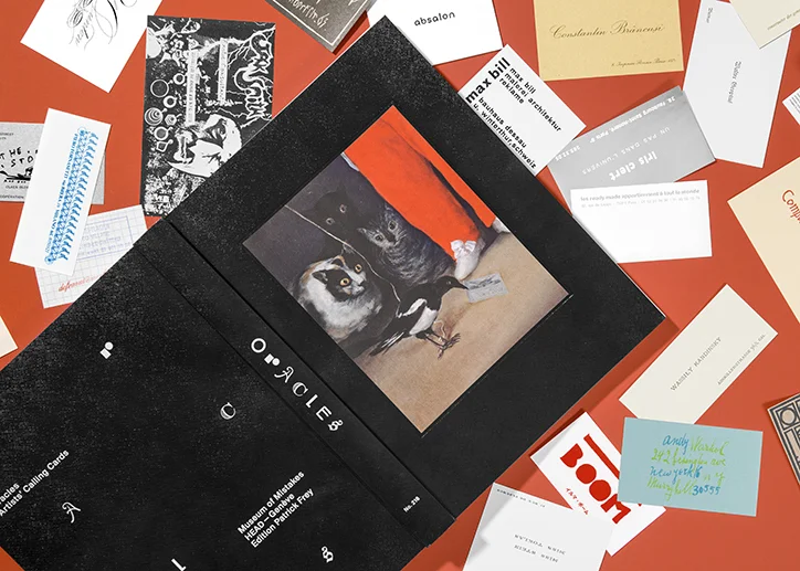
123 calling cards from an international roster of artists ranging from the 18th century to the present day have been facsimilied and inserted into new book Oracles by Pierre Leguillon and Barbara Fedier. Very excited to try to grab this one from Edition Patrick Frey. (via It's Nice That)
Check out this great little demo for Variable Fonts on the web, developed by Devon Govett using Typekit. It's a good way for everyone to start to get our hands dirty and demystify Variable Fonts a little. Try it out here.
This poster from Seoul's Everyday Practice is one of my favorite pieces of design to float across the desk this week. Their entire approach and body of work is something to admire. Take a visit to their site here.
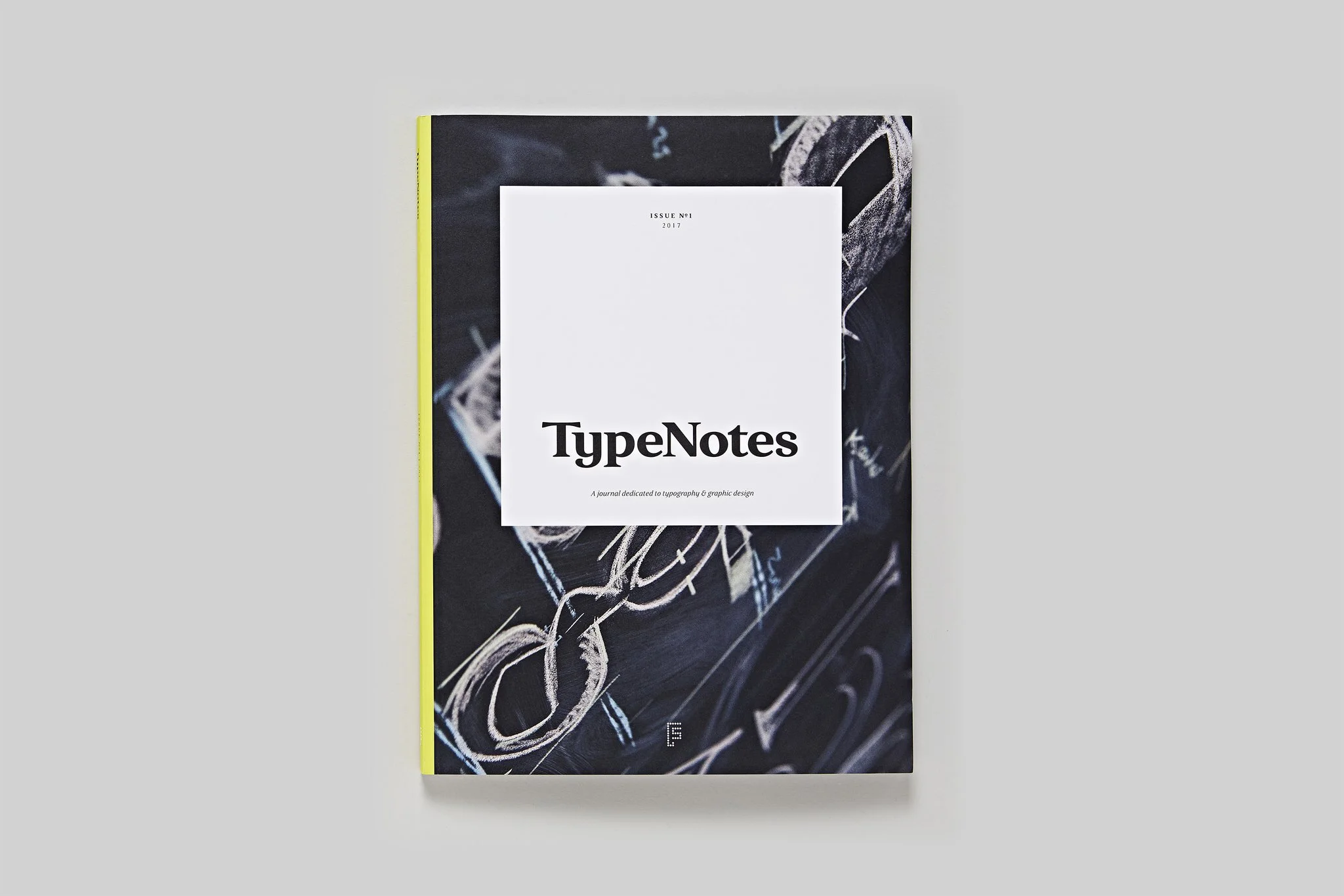
The latest contribution to the world of typographic publications is Type Notes, a new periodical from Fontsmith focused on promoting typefaces, both theirs and others, and talking about typography. They've stacked up a few fantastic contributors, and it appears there's enough type exploded across the pages to put you in a coma for a while, but hey, there are worse ways to land in a coma, right? See all the details and order a copy on their website.
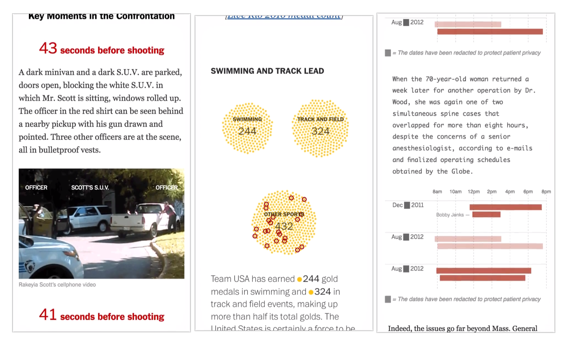
I learned a new word this week: Scrollytelling. The art of telling stories in digital spaces through mastering the scroll. Its rather fascinating, really. Learn more about it from this blog post on The Pudding.
“The most important reason to preserve the scroll is if the transitions are truly meaningful, and not just something to make it pop.”
The Society of Publication Designers (this is non-solicited, but they're a great organization) is hosting an event in New York next week talking about the power and state of independent publications. The discussion will feature a collection of some of the most amazing people: Matt Willey from Avaunt Magazine and the NYT Mag, Leo Jung from The California Sunday Magazine, Caitlin Thompson of Racquet, Tina Essmaker of The Great Discontent, and Christopher Isenberg from Victory Journal. If your'e in NYC, don't miss this.


