This Week From the Desk
The shiny new Black Type Foundry—straight outta Paris, France—debuted their first major type release this week in the form of Vesterbro, a beautifully human serif with a wide range of talents. It looks great in text AND display (something a LOT of font families claim but few truly achieve) and shows off its features in a very thorough website specimen. Explore and purchase Vesterbro here.
Can you believe that this this is a BOOK? Bibliophiles, you might want to sit down for this one. This is the TDC 1000, a 1024 page book encompassing artwork that was received at the Tokyo TDC's 25th Annual Awards. Although this book was published in 2013, this is the first that i've seen it, and it made me do a double take. It's restocked at Counter Print Books this week.
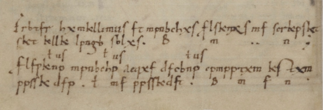
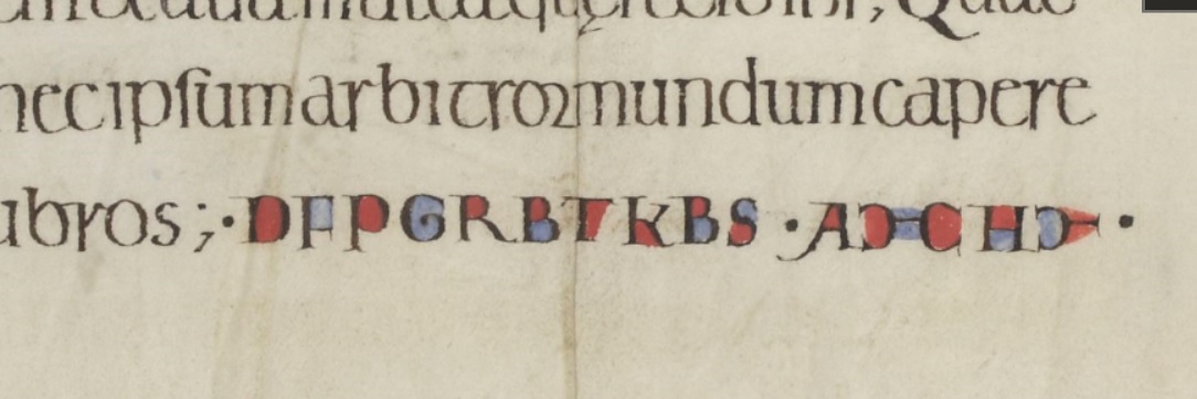
Type, scribes, cryptography, what's not to like? This article about coded texts in the era of illuminated manuscripts was circulating at the beginning at the week... a satisfying and thought-provoking read.
An interesting write up on Mathias Clottu's redrawing of a Mies van der Rohe sans serif type named Allzweck, originally created by the famed architect in 1966. I'm really intrigued by these horizontal letterforms, and would love to see an even deep case study of this project. (via It's Nice That)
Klim's Hypothetical
“A dilemma! You now have to balance your personal ethics against potential income. So what are the possible scenarios?”
Take a moment to read this quick ‘hypothetical’ scenario posed on Klim's blog. The plight of selling digital files online is real.
New letters from Louise Fili dropped this week. Say hello to Montecatini, a typeface that will transport you to a world of classic bygone fashion, espressos on the plaza, and fine Italian suits. Louise's studio packs as much character and life as you’ll ever find into this typeface. See the beautifully designed (of course) specimens on the Louise Fili site, or buy the font directly from MyFonts.
Anthony Burrill and Michael Marriott are set to launch a collaborative collection of furniture for Design Undefined – the third edition of Clerkenwell London’s interdisciplinary design show at the annual event. The pair have created a ‘room within a room’ containing a unique collection of furniture that marries Burrill’s colourful design vision with Marriott’s utilitarian design style and material ingenuity. The event is a step outside of the 2D for Burrill, with the show described as “a celebratory showcase of his work to date.”. Read more about Design Undefined here.
There have been a few ...ill-received... typefaces this week, but Monokrom's expansion of Telefon was not one of them. Monokrom added three new weights with italics to the family, bringing the total to 12. Not sure if or when the love affair with Metro inspired styles will ever let up, but for now, it's fine with me. See more and buy the typeface here.


