THIS WEEK FROM THE DESK

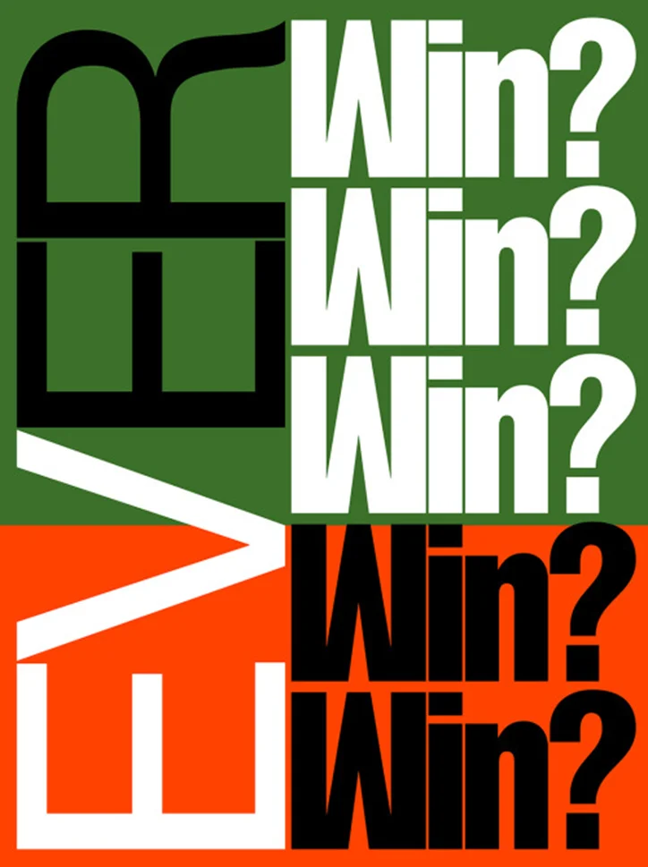
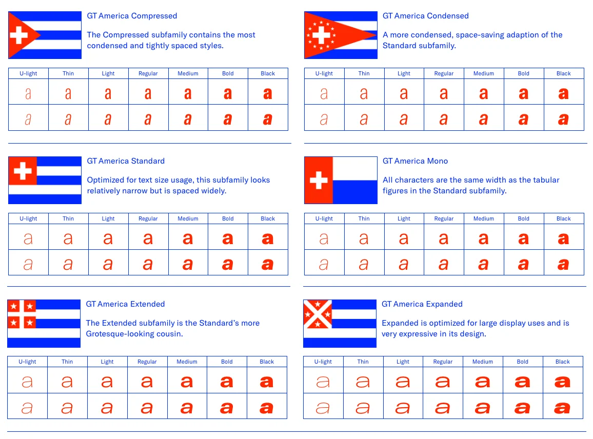
It's the type family we didn't know we needed. Grilli has launched their long awaited GT America family, a stylish net of 84 styles. The types are sharp, and incredibly versatile, but the most incredible thing about the project right now might just be the mini-site they created for it. 

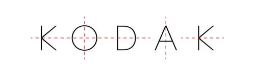
Well, not exactly, but they are seeing new branding. The rebrand, done by Work-Order, is classic Kodak meets the ways of the now. It's appropriate, and rife for future adaptation. See the new look here. 

This article from Story Brand is a good quick read, and one to hand out to clients, on constructive ways to get and maintain healthy client-designer relationships. 


If you're a fan of Futura, this is the show for you. There will be a special exhibition at the Gutenberg Museum outside of Frankfurt, Germany from Nov. 3, 2016 until April 2017. I really hope I find myself out there before its up. Visit the exhibition site for more


Fontstand published this write up about František Štorm of Štorm Type and his devotion to modern revivals. A good read to see more about a talented designer's process. 


Dan Cassaro and Dan Christofferson have joined up under the Young Jerks moniker, creating a source of awesome power to be reckoned with now emanating from their position in the the Graphic Design Universe. New site, same Dans, what a dream team. 
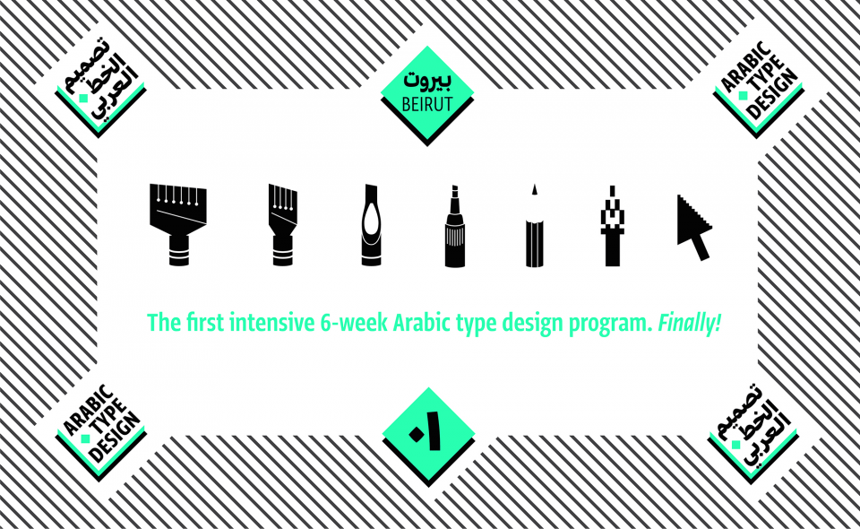

It was a pleasure to read this article from TPTQ Arabic on the Education of Future type designers, something the non-latin world of type design desperately needs. They set up the first 6 week intensive Arabic type design program and have some interesting results from the projects completed on view. Read all about it here


TWFTDKyle ReadComment
THIS WEEK FROM THE DESK

The announcement of Variable Fonts have probably raised more questions than answers about their application and possibilities, but TypeShift is really helping to bring things into view. Looks like a promising tool to visualize Variable Fonts. 


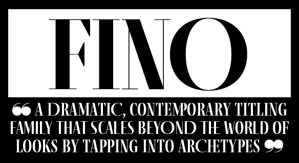
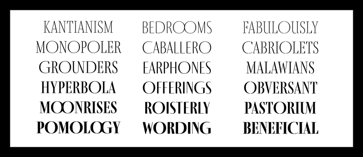
This week, TypeTogether released Fino—an extensive family packed with personality and perfect for editorial projects. I'm sure this will be a big hit with the likes of W Magazine and more adventurous runway periodicals, among many others. Check it out here


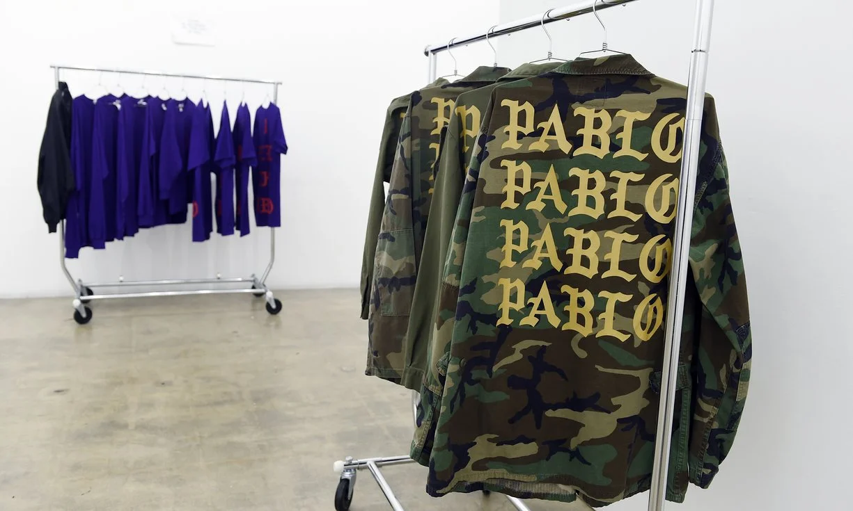
Interesting read on how fonts are "so hot right now" in the fashion world. The examples they give here are expected and lack real insight, but perhaps this is a topic the Badson Blog will conquer in more depth soon. Read it here


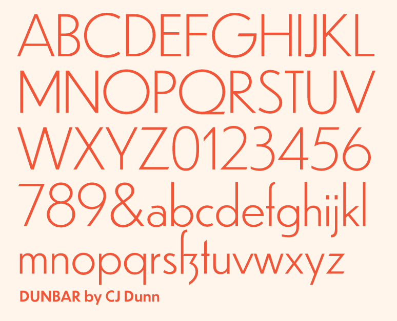
Designer CJ Dunn has been working on fonts in his practice for years, but finally put them together for sale through his new online foundry CJ Type, first of which is Dunbar. 


If Koln's site were food, it would be delicious. The new studio site is a treat for the eyes, and the brain. 


TWFTDKyle ReadComment
THIS WEEK FROM THE DESK

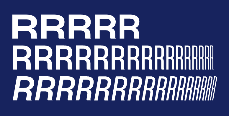
Sharp Type released what might be one of the most expansive type families we've seen in a while. Clocking in at a hefty 249 fonts, Sharp Grotesk is still packed with style. Check out the whole family on the new Sharp Type Site


"Swipe to change typefaces" is the instruction, but this interactive type specimen from Typotheque is all print, and amazing, and only 5 Euros. Such a big fan of this. Bought! 


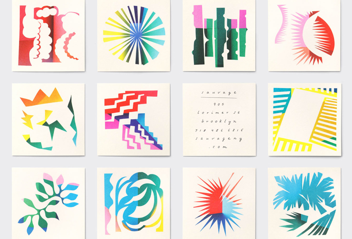
New work alert: The always impressive Triboro Design form Brooklyn's latest branding work for contemporary French restaurant Sauvage is adventurous design with an artistic twist. View the full project on their site here


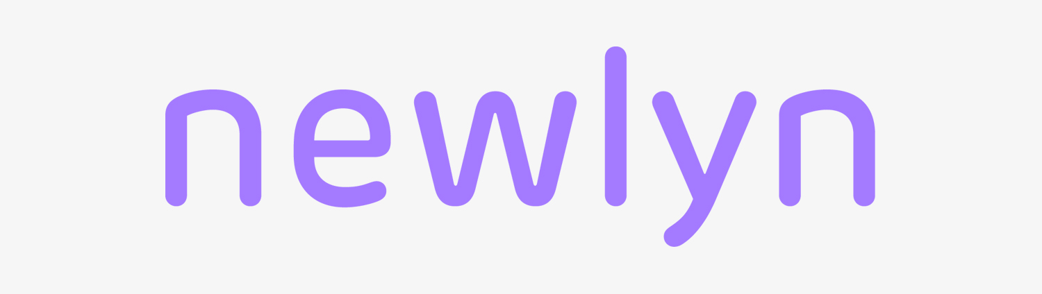
The latest independent type foundry to join with TypeNetwork is Newlyn, the brand-focused foundry created and manned by Englishman Miles Newlyn. Read the announcement here


Read this interview with John D. Jameson and his passionate niche in the type world. Type Specimens on the web are the future, and we all know they could be much more than they are now. Keep up the quest, John. 


If you want to talk about environmental type, few people have more fun with it than Paula Scher. Her team at Pentagram have created type that stretches the length of the the new 'boardwalk' at Rockaway Beach. See more of the full project here


Montreal based designers Olivier Charland & Cécile Garièpy have joined up to form Par Hasard, a new graphic design firm with a promising future in art direction.


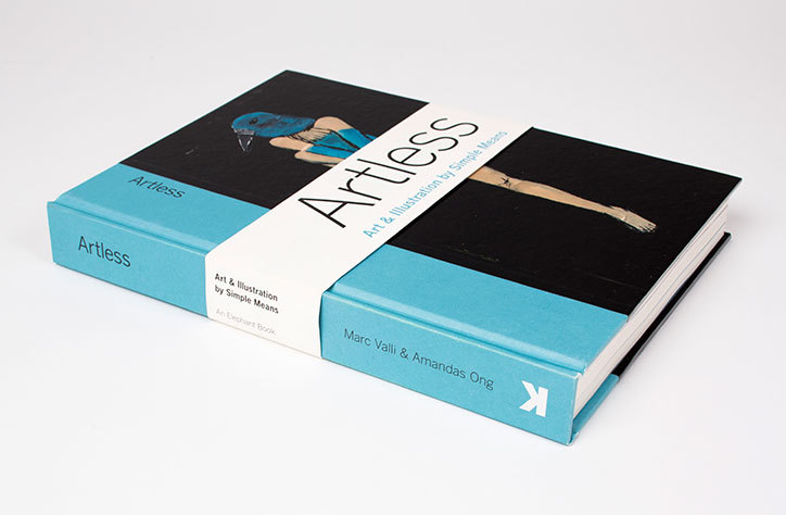
Marc Valli & Amandas Ong have published a new book through Lawrence King on the return to simple means in illustration and art direction. The book is sadly already sold out, but it remains on the studio Christmas list anyway. 


The famed design studio Huge launched a new content department this week called Magenta, based primarily on Medium. It's set to champion the way people use and contribute to Medium for the design industry-centric mind. One of their first major articles published was an interview with Tobias Frere-Jones, and it is a good one. It's a typical "Day in the Life", but with lots of genuine insights from the man himself. Definitely worth the read, perhaps more than once. 


TWFTDKyle Read Comment
THIS WEEK FROM THE DESK

The sophomore release from FJT, Retina, is an expansion and total re-engineering of the Retina family initally drawn for the Journal in the early 2000s. It's thorough, expansive, and a really great workhorse for broad text and tiny-number typesetting. Fast Co. also has a great interview with Tobias on the process here

One of the most intriguing part of this post actually, is the little sneak preview of Exchange—a seriffed face continuing the 'defensive typesetting strategy' of Retina due out in 2017. Can't wait!


An interesting read about the introduction of Movement and motion into the art of poster design via the AIGA.


OHno Type Co's Type Video for Vulf = On Point Font Marketing


An AIGA article on Women in typography popped up early this week, and although I wish they would have used more recent stats about type conferences (2016 TypeCon was almost exactly 50/50 in speaker representation.), and pointed to a few more recent female type designers currently in the industry (there are lots!), the article is very in depth and spurs on further reading into this important and timely issue. 

It’s not just women in the industry that need to feed their experience into work and use their position to readdress the status quo, but everyone across the gender spectrum.

I love the name, springing form "No Tofu", the affectionate term for that box that appears in place of missing glyphs (See video!).

Monotype and Google debuted their Noto collaboration this week which aims to have complete digital representation for every language and writing system out there. I don't know how many font families there are out there that have over a million glyphs, but I'm pretty sure this project will surpass that if it hasn't already. 


TWFTDKyle Read Comment
THIS WEEK FROM THE DESK

James Edmondson at the helm of OHno Type Co released Vulf Mono this week, a monospaced family of four weights and italics designed for and with the band Vulfpeck. It's a real gem with undulating curves, vibrating crossbars, stark deep cuts, and even a set of musical glyphs. Plus, it's well priced and available to the public. If you were wondering how to get some character into your font menu, this is it. See and buy Vulf on the OHno site, or read more about the process in James' post about it on Medium


Vox indeed goes deep on the world of comic book fonts with some drool worthy printed pages. 


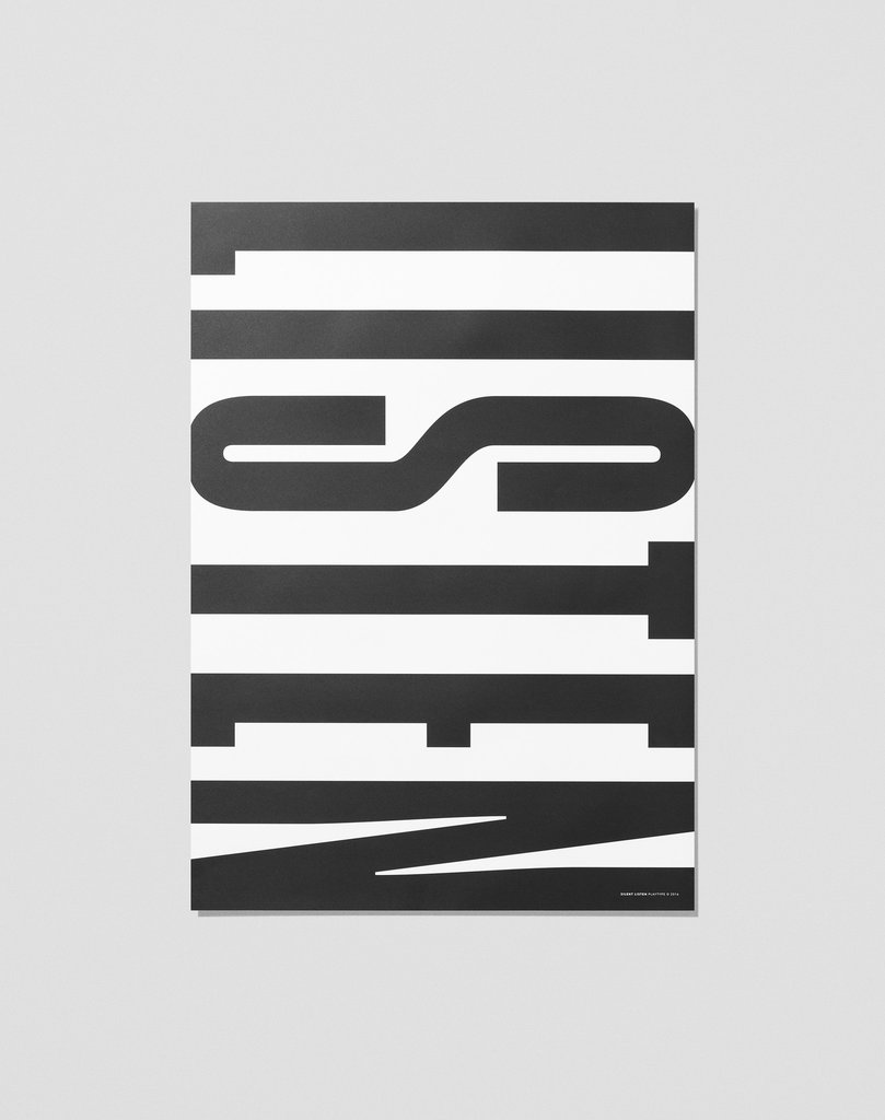
Playtype is fantastic, and this poster is proof that when type and design team up, good things happen.  Buy this on their site here


I'm still not sure how I feel about this 'swiss style' of graphic design. It lies somewhere between the Yale School of insanity and classic Robert Bringhurst. Nonetheless, this feature of Futur Neue's latest expression of graphic design is intriguing and worth a look see on It's Nice That


This subtle spread from French Designers BB Bureau floated past the desk this week via Ello, and it's a great conversation starter on the ideas of typography and magazine layout. It also lead me to learn of the existence of Kiblind Magazine, which is available to online some very nice spreads online. Wish I had known about this zine sooner. 


TWFTDKyle ReadComment
FALL IS HERE

One question I get a lot is "Why are you in Denver?" Many folks assume that a type design studio would prefer to be operating out of the design industry's magnetic poles: New York or San Francisco. And although those people would be right to think that, they rarely know about the best reasons for setting up shop in Colorado... the number one of which is happening now. 

Fall is here and in Colorado, that means change. Change in the winds, the temperature, wardrobes, but most exciting of all: the mountains. Every year around this time, the aspens turn gold, the pines become more fragrant, and the mountains are draped in a tapestry of wild painted colors. 

This is my favorite time of year. The best way to experience this—if you don't find Colorado on your travel calendar any time soon—is on Instagram. I've tagged a few of my favorite Coloradans' images and accounts here to take you away from the cement cities for a second and into the fresh air of the Rockies. 

A photo posted by DRAM (@dramapothecary) on

A photo posted by Travis Ladue (@travisladue) on

A photo posted by Mike (@coloradoalpenglow) on

Fall time in Colorado always reminds me to experience change with an open mind, and that there's so much more out there that you're not experiencing in your daily routine. May your transitions into new things go well this season. We have a lot of new things coming up in the Studio and Shop. Be sure to check in on the website now and again.  

K


Kyle ReadComment