
THIS WEEK FROM THE DESK

James Edmondson at the helm of OHno Type Co released Vulf Mono this week, a monospaced family of four weights and italics designed for and with the band Vulfpeck. It's a real gem with undulating curves, vibrating crossbars, stark deep cuts, and even a set of musical glyphs. Plus, it's well priced and available to the public. If you were wondering how to get some character into your font menu, this is it. See and buy Vulf on the OHno site, or read more about the process in James' post about it on Medium.

Vox indeed goes deep on the world of comic book fonts with some drool worthy printed pages.
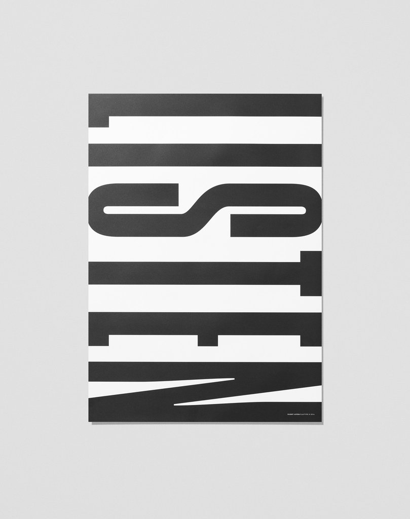
Playtype is fantastic, and this poster is proof that when type and design team up, good things happen. Buy this on their site here.

I'm still not sure how I feel about this 'swiss style' of graphic design. It lies somewhere between the Yale School of insanity and classic Robert Bringhurst. Nonetheless, this feature of Futur Neue's latest expression of graphic design is intriguing and worth a look see on It's Nice That.


This subtle spread from French Designers BB Bureau floated past the desk this week via Ello, and it's a great conversation starter on the ideas of typography and magazine layout. It also lead me to learn of the existence of Kiblind Magazine, which is available to online some very nice spreads online. Wish I had known about this zine sooner.