Posts in TWFTD
This Week From the Desk

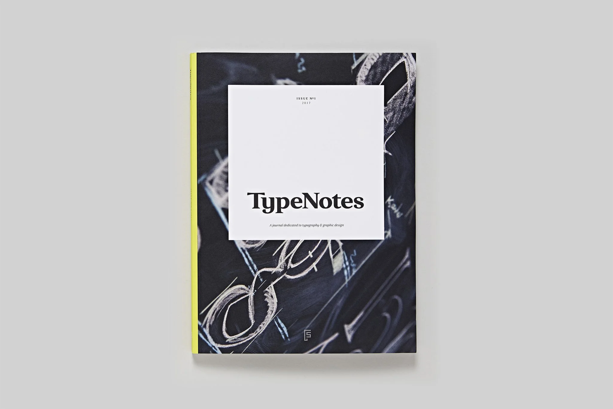
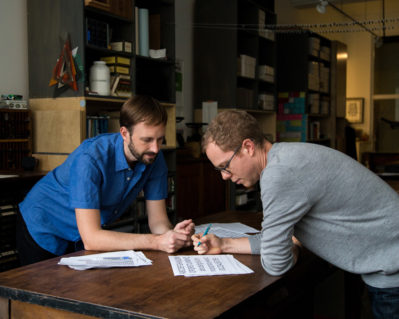
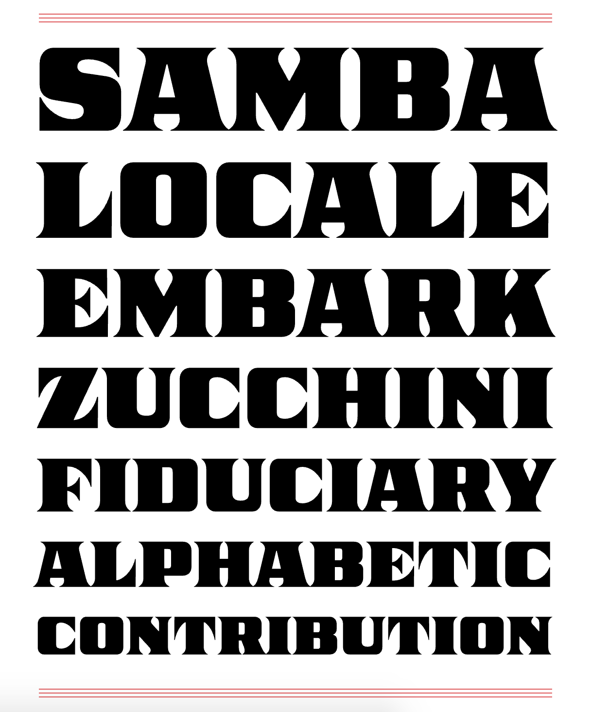
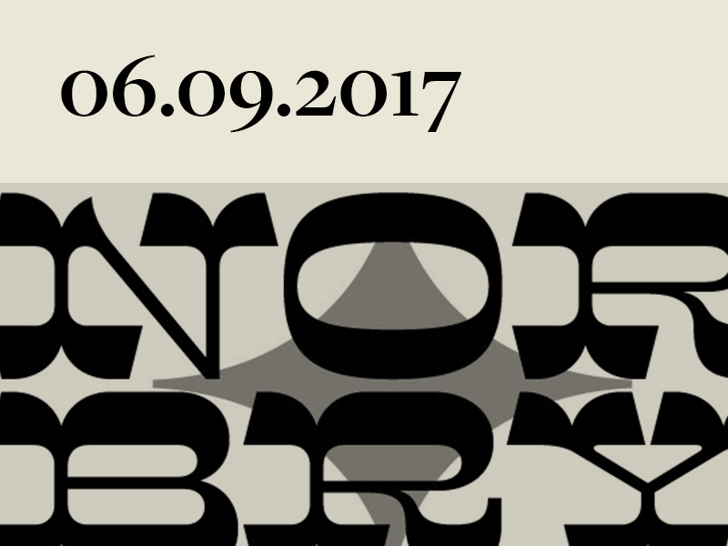
The Hamilton Wood Type Museum's Legacy Project presented the latest installment of quality wood type fonts inspired by the heritage at Hamilton this week: Guest designer Nick Sherman designed Brylski, in honor of Norb Brylski—a long-time pantograph operator at the Museum. Brylski the typeface is as classic as classic wood type gets, invoking the spirit of Rob Roy Kelly and the legend of Norb Brylski himself. For more, see and buy Brylski from P22 Type, and read more about the legacy project at Hamilton


This longer interview from 99u has a few more gems from Erik Spiekermann on what it means to be productive, to now be a part of the 'old guard' in the industry, and how good work gets done.


Say hello to the Revolver Type Foundry, the new type enterprise headed by Lukas Schneider based in Frankfurt am Main, Germany. Lukas is an alum of both The Royal Academy of Art in The Hague, The Netherlands and the storied Plantin Institute. Revolver Type debuted this week with 5 type families, all equally well designed and as they are ambitious. Check out the Revolver Type site, chances are you'll see something there you like. 


Although this video is not new, it's certainly entrancing. Loving the style and type treatment for this whole campaign. See the entire branded campaign and record collateral by Mario Hugo on Hugo & Marie.


Interesting read on Matisse's nonppainting work which includes dustcovers, posters, and graphic designs. 


It's been an interesting week in the way of Corporate Typeface designs. From the debut of YouTube Sans, and Nina Stössinger's expertly presented counterpoint to it on Typographica, I'm not sure you'd want to have your new corporate typeface on the chopping block now while the knives are circling. But despite all that, Swiss Typefaces has debuted their new type system for Ebay, the online auction giant. I believe this typeface to be much better executed than the aforementioned YouTube project, however it seems to irk me with just how neutral it is! I'm looking forward to seeing how this all plays out in the real world. Until then, see all the details of the Type Family at Swiss Typefaces.

This Week From the Desk

....has been bonkers

This week was an incredibly eventful week filled with all sorts of type news, events, and a swelling of typeface releases. This has resulted in one of the longest lists of noteworthy happenings to cross the Badson Desk since we started making these weekly reviews last year. We’ve peppered in a few news items amongst the relentless onslaught of typeface releases so you don’t get type blindness, but it is recommended that you take your time and sit with the list over a good cup of coffee this weekend to take it all in. This industry is incredibly vibrant and alive. ’Till next week!


Commercial Type is back to doing what it does best: Type design with a specific client in mind. (Well, they're not really 'back', they've been consistently killing it since they opened up shop in 2004.) Irregardless! Their latest contribution tot he newspaper type genre is Sanomat, released this week. It's a strong showing of restraint and conscious choice in a corner of the type market that is more saturated than a glass of water sitting out in the rain. Discover Sonomat at the Commercial site. 


Ohno Type Company released an expanded character set to their iconic Viktor Script this week with a small wide caps. Edmondson describes these caps best on the Ohno Blog: “Though wide typefaces designed for all caps settings are common, they are very rarely done so with brush features: swelling strokes, kinked whitespaces, and soft terminals. These qualities allow Viktor Script Caps to match Viktor Script, while supporting the opposite end of the hierarchy.” These caps are a great match to Viktor's brushy stylings, and actually come with the complete Viktor Script. This is another interesting move from Ohno, mixing up how fonts are bought and sold, and subtly subverting the expectation of what comes standard in a font package. Viktor Caps are available for sale on the Ohno Type Co website


Hello, Halyard. Darden Studio released the Halyard set of families this week with Halyard Display, Text, and Micro. Halyard is a robust sans reminiscent of Benton and sturdy workhorse Sans fromt he 20th Century yet remains delightfully weird in the all the right moments. In describing Halyard, Darden states that “Distinctiveness is achieved by bringing an almost impetuous vigor to Halyard’s shapes and through a willingness to adapt surprising historical forms into genuinely useful ones, which is so characteristic of Darden Studio designs.” I couldn’t agree more. Play around with this exciting new release from Darden on this incredibly fun and informative mini-site


The work of Two Points was on the mood and inspiration boards at Badson this week. The firm has been run by Lupi Asensio and Martin Lorenz out of Hamburg, Germany since 2007, but continue to make some of the most fresh typographically-minded work out there today. Their portfolio of work is deep, but their work done for the ADI Awards is an especially poignant project to pour over. Although this project is not new, it's a refreshing example of type-design-meets-visual-identity-done-well to revisit. See the full ADI Project an their other outstanding work on their site here. 


Pilot is described as “an informal jobbing typeface for short texts and striking display use.” It was designed by Aleksandra Samuļenkova, who has taken this design from a working project at the Type & Media Program at KABK in the Hague to a robust and enticing family release with Bold Monday. I'm a fan of the way the angularity of the letterforms don't feel gimmicky or stale after a while—something very difficult to pull off. See the full family of 10 styles, available through Bold Monday here.  


TPTQ Arabic releases Teshrin

TPTQ Arabic has been publishing Arabic types to accompany their deep and prolific catalog of Latin typefaces since 2011, and this week, they released Teshrin—a beautiful Arabic counterpart to their October type family. Designed by Kristyan Sarkis with love, skill, and care and it shows! From the rounded terminals to the mastery of weight distribution from character to character, Teshrin carries the flag with pride for TPTQ Arabic's mission of supplying the globe with more innovative and versatile Arabic types. Discover more about Teshrin here.


Google doubled down on their emoji investments this week, releasing an all new redesigned emoji font... that's over 2000 characters, people! They took to Medium to give a few more in depth details on the emoji, how animation plays into the emoji landscape, and how the new emoji are not only better for Android devices but easier to make on the back end. A good read. 👍🏻👍🏻


Last week, Victoria Rushton released her latest typeface Gautreaux through Type Network. Sometimes typefaces can be incredibly personal, and Gautreaux is a rather poised example of this. Inspired by a lettering style from Tommy Thompson’s The Script Letter called “free style lettering”, Gautreaux is packed with Open Type wizardry and marks a return to a love of script typefaces for Rushton. Read the Type Network article on Gautreaux here.


Rui Abreu adds to the growing repatoire of homerun typefaces at R-Typography this week with Sul Mono. Sul Mono is a monospaced font with some interesting geometries. Although there have been lots of monospace typefaces produced in the last few years, Sul is Rui's first offering to the category. See all of Sul Mono here.  


The famed punchcutter François Guyot is back! Well, at least his style is. The week saw the release of Guyot, a stunning new display face derived from the printed work of Guyot by ReType. Guyot seems to not fall too far from the original tree in how it handles the reviving of such a distinct style as Guyot's. Guyot has the potential to be a truly essential go-to in the font menu for years to come. See more specimens of Guyot here

Fun fact, ReType joined the roster at TypeNetwork this week too. Big week. Congrats to ReType!


Congratulations to Ramakrishna Saiteja of Bangalore, India for being awarded the Society of Typographic Aficionados Catalyst Award! Saiteja's work is already so well rounded and so necessary in the world of Indic Scripts. SoTA has chosen the right winner. See the full announcement here, and congrats again. Welcome to the club, Ramakrishna!


TWFTDKyle ReadComment
This Week From the Desk

The shiny new Black Type Foundry—straight outta Paris, France—debuted their first major type release this week in the form of Vesterbro, a beautifully human serif with a wide range of talents. It looks great in text AND display (something a LOT of font families claim but few truly achieve) and shows off its features in a very thorough website specimen. Explore and purchase Vesterbro here. 


Can you believe that this this is a BOOK? Bibliophiles, you might want to sit down for this one.  This is the TDC 1000, a 1024 page book encompassing artwork that was received at the Tokyo TDC's 25th Annual Awards. Although this book was published in 2013, this is the first that i've seen it, and it made me do a double take. It's restocked at Counter Print Books this week


Type, scribes, cryptography, what's not to like? This article about coded texts in the era of illuminated manuscripts was circulating at the beginning at the week... a satisfying and thought-provoking read. 


An interesting write up on Mathias Clottu's redrawing of a Mies van der Rohe sans serif type named Allzweck, originally created by the famed architect in 1966. I'm really intrigued by these horizontal letterforms, and would love to see an even deep case study of this project. (via It's Nice That)


Klim's Hypothetical

“A dilemma! You now have to balance your personal ethics against potential income. So what are the possible scenarios?”

Take a moment to read this quick ‘hypothetical’ scenario posed on Klim's blog. The plight of selling digital files online is real. 


New letters from Louise Fili dropped this week. Say hello to Montecatini, a typeface that will transport you to a world of classic bygone fashion, espressos on the plaza, and fine Italian suits. Louise's studio packs as much character and life as you’ll ever find into this typeface. See the beautifully designed (of course) specimens on the Louise Fili site, or buy the font directly from MyFonts. 


Anthony Burrill and Michael Marriott are set to launch a collaborative collection of furniture for Design Undefined – the third edition of Clerkenwell London’s interdisciplinary design show at the annual event. The pair have created a ‘room within a room’ containing a unique collection of furniture that marries Burrill’s colourful design vision with Marriott’s utilitarian design style and material ingenuity. The event is a step outside of the 2D for Burrill, with the show described as “a celebratory showcase of his work to date.”. Read more about Design Undefined here.


There have been a few ...ill-received... typefaces this week, but Monokrom's expansion of Telefon was not one of them. Monokrom added three new weights with italics to the family, bringing the total to 12. Not sure if or when the love affair with Metro inspired styles will ever let up, but for now, it's fine with me. See more and buy the typeface here


TWFTDKyle ReadComment
This Week From the Desk

This rather interesting blog post by Daniel Benneworth-Gray floated past the desk this week about his typographic book cover designs for the Alien series. He mentions that books based on films rarely get enough attention. Well, sir, you have our attention now with these covers! (P.S. I wish these were real!) See the full post on Daniel's Blog.


Loved this short little window into the weird words that type designers use to test their fonts published on Wired this week. Personal favorite: "Högertrafikomlaggningen" from Jackson Cavanaugh at Okay Type. I have a few good ones myself that I think would make a great little book. 


Type Network continues to grow this week with their recent deal to present Monokrom in their roster. It's not THAT big of a deal I guess because Monokrom fonts are already available on FontShop, as well as on their own independent site. Read more about the aquisition (is this even the right term?) in the official TN announcement here


123 calling cards from an international roster of artists ranging from the 18th century to the present day have been facsimilied and inserted into new book Oracles by Pierre Leguillon and Barbara Fedier. Very excited to try to grab this one from Edition Patrick Frey. (via It's Nice That)


Check out this great little demo for Variable Fonts on the web, developed by Devon Govett using Typekit. It's a good way for everyone to start to get our hands dirty and demystify Variable Fonts a little. Try it out here.  


A post shared by COLLINS (@thisiscollins) on

Collins, an agency staffed with only incredible creatives, won a TDC Award for Type Design this week for Kernit—a type system based on the work of Jim Henson. The face is so unexpected and honest, very stoked to see it win. Looking forward to seeing ALL the TDC Type Design Competition winners. 


This poster from Seoul's Everyday Practice is one of my favorite pieces of design to float across the desk this week. Their entire approach and body of work is something to admire. Take a visit to their site here


The latest contribution to the world of typographic publications is Type Notes, a new periodical from Fontsmith focused on promoting typefaces, both theirs and others, and talking about typography. They've stacked up a few fantastic contributors, and it appears there's enough type exploded across the pages to put you in a coma for a while, but hey, there are worse ways to land in a coma, right? See all the details and order a copy on their website


I learned a new word this week: Scrollytelling. The art of telling stories in digital spaces through mastering the scroll. Its rather fascinating, really. Learn more about it from this blog post on The Pudding.

“The most important reason to preserve the scroll is if the transitions are truly meaningful, and not just something to make it pop.”


The Society of Publication Designers (this is non-solicited, but they're a great organization) is hosting an event in New York next week talking about the power and state of independent publications. The discussion will feature a collection of some of the most amazing people:  Matt Willey from Avaunt Magazine and the NYT Mag, Leo Jung from The California Sunday Magazine, Caitlin Thompson of Racquet, Tina Essmaker of The Great Discontent, and Christopher Isenberg from Victory Journal. If your'e in NYC, don't miss this. 


TWFTDKyle ReadComment
This Week From the Desk

It's Baaaaack! Mary Catherine Pflug has been hard at work on the second annual Font Purchasing Habits Survey. Last year, Mary presented the results of the survey to applause at TypeCon. This year's survey marks it as an annual event and gives a fascinating look into the type industry. This year, there is a reward of 9 free fonts to all who take the survey. Submit your answers here, and speak up for the industry. 


Say Hello to XYZ Type, the formal foundry for the type world's most underestimated dynamic duo Jesse Ragan and Ben Kiel. The two gents are not only two of the most talented type makers working today, but two of the most humble; working as passionate educators—on top of all the type work. Cortado, Aglet Slab, Export, these faces are just the beginning for XYZ Type. Watch this space for what is sure to be some list-topping type for years to come. Congrats Jesse & Ben!


Missed posting this last week, so it's in the mix for this one, Lucas Sharp is having fun again with his latest release Respira Black. This new-age blackletter is the font your font menu has been craving. The face releases with a fascinating set of posters for purchase, the proceeds of which all are donated to the NRDC.


Here's a 'must-have' book for you: "Strange Bird—The Albatross Press and the Third Reich". Published this week by Yale University Press, Strange Bird is the first book about the Albatross Press, a Penguin precursor that entered into an uneasy relationship with the Nazi regime to keep Anglo-American literature alive under fascism. It's got all the right things: a book about books and WWII era historical intrigue. Purchase on the Yale site here


Although it is easy to throw hateful critique at the success of big name designers like those at Pentagram, this branding program for QUAD Cinema in New York by Paula Scher and her team makes it very easy to love. I think its easy for people to insult good design because "it looks like the designer didn't try very hard"... well to that I say "That's the point." Good design should appear effortless if not transparent altogether. This project is a beautiful example of this. Lighting, signage, color, environment, architecture, typography, this project has all the hallmarks of a Paula Scher application and I'm rather in love. Read and see more at B P and O here.


David Johnathan Ross, in all his wizardry debuted his own Fonts of the Month Club this week, set to release one display font every month. You can subscribe to 3, 6, or 12 months wroth of fonts! For $6-$8 per font, you BEST be getting in on this new model. Discover more here! The first month's offering is Nickel, an all caps font inspired by banknotes. 100% fun. 


Estorick Collection of Modern Italian Art is holding an exhibition of the work of Franco Grignani (1908-1999), a designer and artist who anticipated the rise of Op Art. The show looks positively mind-bending. The opportunity to see how art and design intersect in this way is a rare opportunity. Anyone in London going to see this? I'll be looking out for photos.


This recently published project by Michael Bierut and his team at Pentagram for the Frank Lloyd Wright School of Architecture is a rather fascinating application of type. It seems as though several of the partners at Pentagram have an affinity for stretching type all over buildings, which will surely be fodder for lots of good branding and type debate for months to come. Looking forward to seeing a more formal case study, but for now, read the write up in Architect Magazine. 


I'll leave you with this absolutely delightful video from Japan of Rube Goldberg as storytelling. 


This Week From the Desk

The next life for Standards Manuals has manifested, this time presenting the Brand Standards Manual for the EPA, designed by Chermayeff & Geismar back in 1977. The logo design in itself is a thing of beauty, but the system developed to support the department at its formation is inspiring. The Kickstarter is officially open now. This book is a design nerd MUST. 


Ogilvy & Mather partnered with Fontself to create "Gilbert", a font inspired by Gilbert Baker—the creator of the rainbow Pride Flag who sadly passed away this month. See more of this colorfully layered font project on Creative Boom.


One of Colophon Foundry's latest types Montefiore now has a beautiful specimen book to accompany it. I've always been into Colophon's specimen booklets. You can snag a copy on their site here


Oh how I wish I could go to this. Gail Bichler will be speaking about the development of the New York Times Magazine from 2015 to present day at the TDC in June. If you're in town, GO. See the details and buy tickets on the TDC site here


Raise your hand if you still use tumblr... 🙋🏼‍♂️! I was reminded that Production Type's tumblr exists; and its beautiful, obviously. Enjoy the scroll here


TWFTDKyle ReadComment