This Week From the Desk
Week 43
New Release: Peristyle by Hoefler & Co.
H&Co. released Peristyle this week—a family of 9 fonts including a stencil style and color font capability—with a look as if out of another era. H&Co have a certain eye for delivering fonts that designers want to use, and Peristyle seems to carry that torch well. Perfect for all kinds of display uses, Peristyle brings even more versatility to the H&Co. library. Discover more about the design process and potential of H&Co.’s latest release on their website here.
MyFonts Fontacular
Today, Friday the 27th of October, is the last day of MyFonts' annual Fontacular event, where a large collection of fonts available on the site are offered at large discounts and new prices. Regardless of how you feel about discounted font sales, the Fontacular is a great way for you to refresh your font lists and get inspired for new projects. One of the more interesting ways this event presents its deals is in the form of bundles by foundry (there are 50 represented in the sale). So, if there’s a certain foundry you’ve been waiting to grab fonts from, now is your chance.
Butterick Checks in on Variable Fonts
Matthew Butterick revisits his predictions from 2016 on Variable Fonts. The original article is still a fantastic ‘how did we get here’ primer to Variable Fonts, and his follow up published this week at the end of the article gives a great touch base on how things have gone since. It’s worth your time to catch up and read the entire piece on Matthew Butterick’s solid and often entertaining blog Practical Typography.
Release: Two New Additions to the Duplicate Family from Commercial Type
The gents at Commercial Type have expanded their Duplicate Family this week with the addition of two new styles, bringing the total number in this collection to 5: Ionic, Sans, Slab, and now Soft and Round. The Soft and Round Styles of Duplicate are particularly notable because of the inclusion of a few unconventional details not usually found in rounded sans styles in their design. Ball terminals and casual stroke endings bring these new typefaces into a realm of possibility that branding agencies will love. Purchase the entire Duplicate Type Collection, or just your favorite style, at Commercial Type.
Release: Newson from Revolver Type
Lukas Schneider who heads up the Revolver Type Foundry has been on a tear of great type releases this year, the latest of which is Newson: a solid humanist sans with a stoic professionalism. You can envision using each of Newson’s 7 weights in roman and italics for everything form corporate identities to web blogging in style. Read on about Newson and buy the family at Revolver Type.
Stumptown Evokes the Power (and Wrath) of Hobo
Perhaps you saw the rebranding efforts put forth by LAND for Stumptown Coffee Roasters’ new packaging this week. Perhaps you noticed the toned colors and tattoo-worthy graphic illustrations peppering the design. Perhaps you even noticed the not-so-subtle use of Hobo illuminating the name of the beans inside. If you did, surely you have formed an opinion about it. The design world has seemingly lost its mind over this one type choice and split those in it into two camps... Hobo, or no Hobo.
We wanted to take a minute to stand up for this design and praise its rejection of the easy solution: one of expected slickness and digital cleanliness. These are coffee bags, and deserve to have a little fun. The use of Hobo is always a deliberate choice—no one ever uses Hobo by accident. This is a perfect example of how type choice can communicate deeper than the words ever could.
Read more opinions and details in the Brand New Review of the rebranding.
Linotype releases Rosella by Sabina Chipară
Rosella is a family of layered fonts inspired by the classic Engravers Style serif but engineered for display uses in the modern age, designed by Sabina Chipara. Rosella consists of 6 styles that you can mix and match to achieve all new levels of typographic expression. Published by Linotype this week, Rosella is a great way to help your font library break out of the habit of neutral sans serif types and text faces. You can buy Rosella at Linotype.
Swiss Typefaces Releases SangBleu
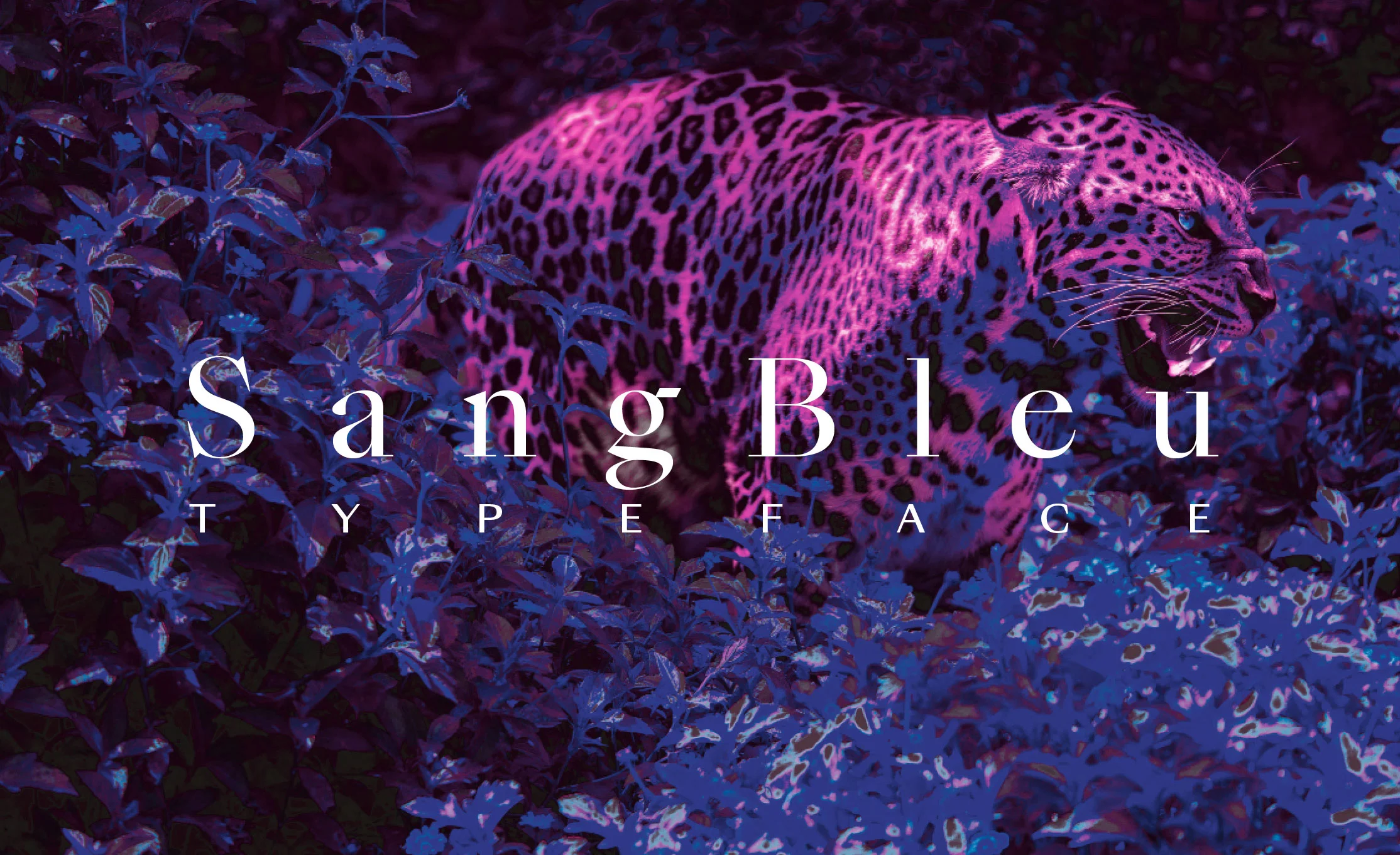
Swiss Typefaces, perhaps best known for creating future-forward, modern type designs such as Simplon and Euclid, dropped a major collection of typefaces this week in the form of SangBleu. SangBleu is a font collection that encompasses 5 different styles built on the same chassis making a total of 45 new fonts. Empire, Kingdom, Republic, Versailles, and Sunrise each have a different typographic genre in their sights and each seem to exude the same brash spirit and ambition. It’s really a masterful work.
If the name seems a little familiar, you’re not wrong. Swiss Typefaces had released a family under the same name a few years back, but the release this week is intended to completely replace it.
“The new SangBleu supersedes our previous typeface of the same name, which, together with Romain, has been discontinued. It is not an update, but a completely new design, consisting of five full-featured collections: Empire, Kingdom, Republic, Versailles, and Sunrise. Each one comes in four or five weights, all of which are accompanied by matching italics. At 45 styles in total, it is our most ambitious release so far.”
It’s sharp, it’s packed with attitude, and aims to be the “Everything Font” collection you reach for no matter what you’re designing. Will SangBleu’s performance live up to the foundry’s track record of popular fonts? Only time will tell. Learn more about the entire SangBleu Collection at Swiss Typefaces.
TDC63 Judges Choice
The Type Directors Club has published their Judges’ choices for best in show from the TDC 63 and 2017 Typeface Design Competitions. The choices do not disappoint. This year there were a total of eleven judges that came on to pick their favorite pieces from both competitions. Judge Berton Hasebe’s selection (and pictured above) of Salvaje, originally designed by Cristian Vargas as a Type Media project, is a particularly nice pick. Read more from the Type Directors Club, or wait for these results to be published in the next Type Directors Club Annual.
Release: The Minotaur Lombardics
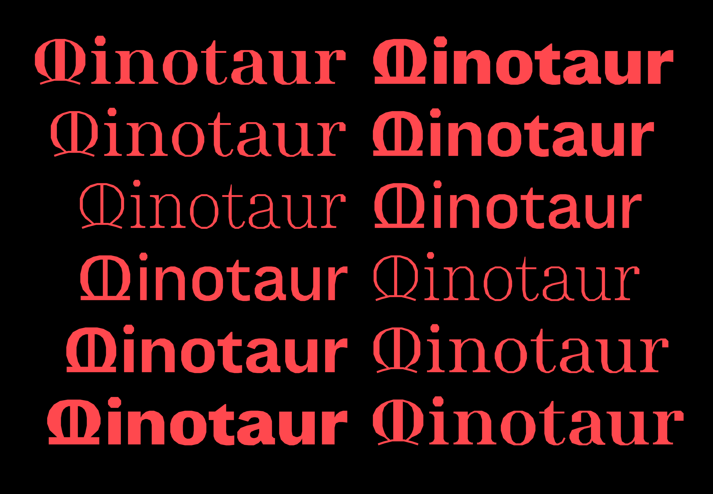
In case you haven’t seen any type this week that fills that void of ‘weirdness’, Production Type is prepared to help you out. This week saw the release of 6 new fonts from Production Type: Minotaur Lombardic and Minotaur Sans Lombardic. The two sets are the latest additions to Production Type’s decisively weird (and decisively awesome) Minotaur Collection—fonts designed exclusively with straight lines.
So, what does Lombardic Mean? Well, the Lombardic Style is one of expressive Capitols and letterforms not afraid to expose their origins in the pen. The fact that Production Type saw a need to throw these styles into the Minotaur Collection says a lot about the disruptive nature of the foundry and designers.
Explore what the heck is going on with these captivating fonts from Production Type.


