This Week From the Desk

The All Eyes on Type Festival in Rotterdam this year looks like an incredibly immersive experience. This video they created in promotion is one of the most bonkers and impressive things I've seen in animation in a long while. See the full conference site here.


The Norman Door

This is not a recent video, but recently crossed the desk. Vox produced this video on The Norman Door, a concept of confusing design.  


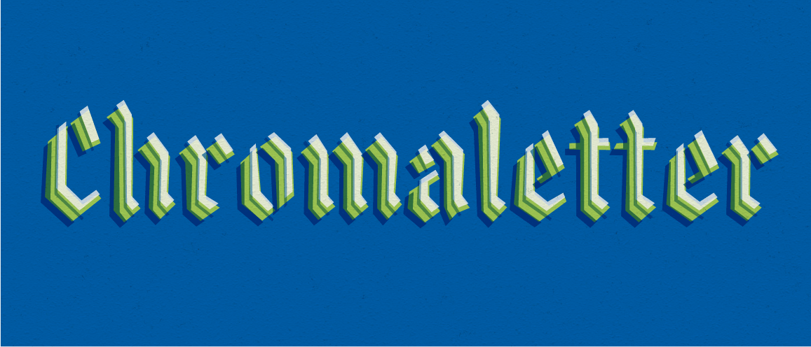
R Typography expanded their hot selling Grifo family with two more condensed weights Grifito and Grifinito. Have a look and play around on the specimen site. Its good to see a good expansion of a good typeface family. The flared sans trend continues. 


The UK is holding a Design competition, accepting submitted designs for the new UK Passort to be issued after Brexit. This article announcing the competition has some interesting historical typographic goodies from the past to oogle at.


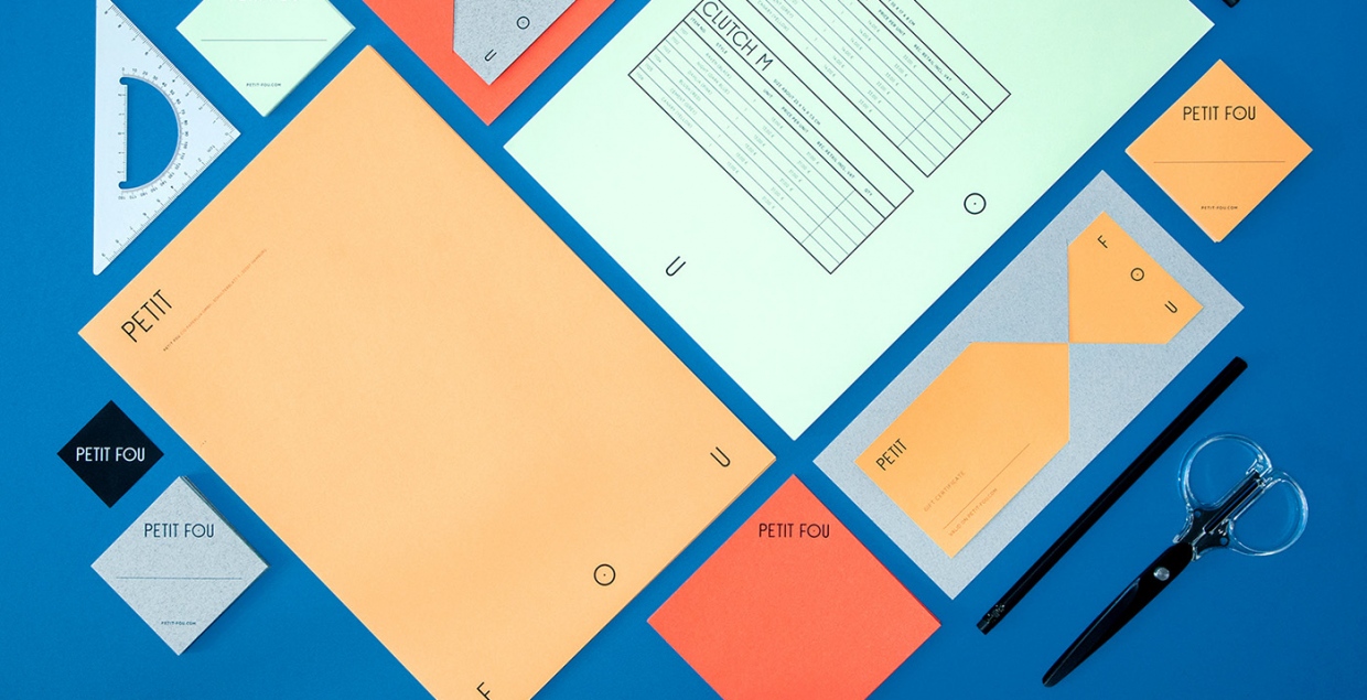
Loving this Branding application for Petit Fou, a quirky paper handbag company, designed by Daniela Gilsdorf. (via Mindsparkle Mag


Illustrator Andy Rementer's latest project is a zine published through Commune Press in Tokyo. File under Want, Please. 


Local Brand Penrose Coffee had a very nice feature on VSCO this week. I've beena  fan of Penrose's typographically driven branding and sharp photographic strategy from the very start of the brand last year. Worth a quick read


TWFTDKyle ReadComment
This Week From the Desk

Design Conversations: Isabel Urbina Peña

Fellow Type@Cooper graduate Bernardo Margulis hosted the first of a new podcast wherein he interviews interesting people in the design sphere for AIGA Philadelphia. This first cast is with another Type@Cooper alum Isabel Urbina Peña, one helluva book designer with the most infectious smile you'll ever encounter. Looking forward to more! 


Think the Brush Script genre has hit the saturation point? (maybe...) Well Lost Type Co-Op's latest release Calafia will have you searching for reasons to use a brush script all over again. Designed by both Neil Secretario and Riley Cran, Calafia finds personality in the brush strokes where others have fallen short. Snag the font on Lost Type


If you're a lover of print, this weekly podcast radio program should already be on your list of things to listen to. The Stack reviews the best in print from across the globe every week in quippy and colorful detail. Listen to the latest episode here.


Release: Process Type's Moniker

Moniker is Process Type's contribution to the realm of the rounded sans, and it hits it right on the head. You can see the mastery and craft in these letterforms, and the conquering of subtlety. See the entire family on the Process Type site, it truly is a unique offering in a genre that's very tough to innovate in. 


Love this portfolio site for architecture design firm Dallas Pierce Quintero in the UK as an example of good type mixing on the web.


This is a very good short read from Print Magazine by a master of brand & identity, Sigi Haviv. 


Suitcase Type Foundry released Pepi & Rudi, a sans a slab duo superfamily. Lots of geometrical quirk here. See the full specimen on their site here


Lucky Peach, innovative print magazine much beloved to foodies world wide, is shuddering by the end of the year. It's looking to go out with a bang of a double issue this fall. Sad day for print. 


TWFTDKyle ReadComment
This Week From the Desk

Commercial Type released their extensive Chiswick family this week. After features in Eye Magazine and rumors floating around the type blogs, Chiswick is finally here in 3 Family Styles: A Serif, a Sans, and a Grotesque. Although its hard to find one moment in this family that lacks perfection, the real heroes of this family are the italics and numerals filled with personality. View, try, and buy on the Commercial Type website


Friends of the studio Scribbletone posted a passion project that's just too much fun: a digital sans version of the Written language from the land of Hyrule in the world of Zelda. It's always amazing when type designers create types from dead or invented languages, but even better when it expresses the personality of those who created it so perfectly. 


A stunning branding package from Perky Bros. for a brewing company with a penchant for the mystic. This project is the perfect orchestration of paper, color, graphics, and type. (via BP&O


This article from Publishing Executive on what Print is really missing and things print can do to remain valuable is quick and interesting. 


Monotype released Masqualero this week. It's a sharp serif deign with a strange vertical stress and flared vibe. It also comes with a decorative cut that seems to throw Monotype's hat in the ring amongst the likes of Dala Floda and Obsidian. The specimen page for this family is actually really amazing and a fun experience. 


The history of Canadian Graphic design runs deep—filled with prolific work that you've probably seen many many times—but is seldom featured or celebrated. This film, currently embarking on a kickstarter campaign to get the film produced, aims to bring a long overdue spotlight to the people behind the designs in Canada. We're definitely contributing to this one. 


The latest foundry to join the growing squad at Type Network is CSTM Fonts, known for their unique perspective on Latin and Cyrillic types. Read more about the move on Type Network's blog here


TWFTDKyle ReadComment
This Week From the Desk

If you haven't heard already, TYPE magazine—an all new publication from the minds of Roger Black and Editor Doug Wilson—launched their web blog this week. TYPE is a place for people curious about fonts to learn and explore more about what's happening in the typography Industry. It's a great addition to your morning blog roll, with insightful and specialized content produced daily. Explore TYPE here


This week, Svizra launched a new project called Logobook. You know all those previous collections of logos in print that you couldnt quite get tour hands on? This online and free collection seems to be everything you were missing. What an awesome resource. Learn more about the Project in this interview with It's Nice That


I'm not sure how everyone else feels, but personally, I think the 'design in use' H&Co. emails are great. This one that went out this week about Matchbooks is cheeky and fun and such an amazing way to utilize their deep catalog. 


If you're looking for a way to get a little more book jacket design into your Instagram feed, @knopfjackets is perfect. Old, new, and everything in between. Follow along for a tour of great book covers. 


TWFTDKyle ReadComment
This Week From the Desk

The Scintillating Work of Ryu Mieno

It's Nice That featured the work of Ryu Mieno, and it could not have come soon enough. His typographically heavy and inspired work is rich and engaging.  See everything from posters to hats on his site


Neil Summerhour of Positype has been making fonts for a long long time, and has thusly stocked up a deep catalog of retail fonts. Finally, Positype has released a new website on which to experience and buy them. The site is clean, modern, and filled with the incredible variety of type the foundry has produced over the years. Bravo, Neil! 


Monocle Magazine (empire, really) has been doing it's thing for 10 years. To mark the occasion, the Media company has redesigned the print issue, recommitted itself to its radio and conference programming, and positioned itself to be a world leader in media content. Gotta love Monocle. Check out their 10th Anniversary speed review video


Lost Type Co-op dropped 3 new font families this week that all seem to feature corners over curves. Chromaletter by Dan Gneiding, and Muskeg and BLKLTR by recent Type@Cooper West grad Dave Bailey continue to add to the repetoire filled with personality Lost Type is becoming known for. See all the new fonts here


TWFTDKyle ReadComment
This Week From The Desk

If you're looking for something to really pick up your hope in the future of type design, have a visit to the TypeMedia 2016 site. Its a great site PACKED with juicy new type projects completed by the 12 students there. My favorite part is the fact that each one feels truly original, and not just a derivation of a historical style or something that's been done before. So much character in these characters. 


Matt Willey has released his latest type creation Blakey Slab, of which all profits will be donated to the ACLU. I'm not positive if this face is exactly the same as the one he developed for the NYTMag on hollywood stars, but it looks to be. Another great editorial type tool from a man who rarely misses.  Buy a license here.


Spotted this new branding project from Two Times Elliot for new prescription glasses retailer Cubitts. It's smart. It's sharp, its everything you'd want your glasses to be. This project is a good example of simplicity with character. See more on their site. 


You can download all 8 Issues of the famous Dada Publication (1917-1921). Its true historical eye candy for your digital collection. (Thanks for linking, Swissmiss)


The Typographics Conference is back! The website offering the schedule, registration, and a retro type vibe (OHM) is up, and looks great. I hope the tote bags light up. Get Early-bird Registration now. 


TWFTDKyle ReadComment