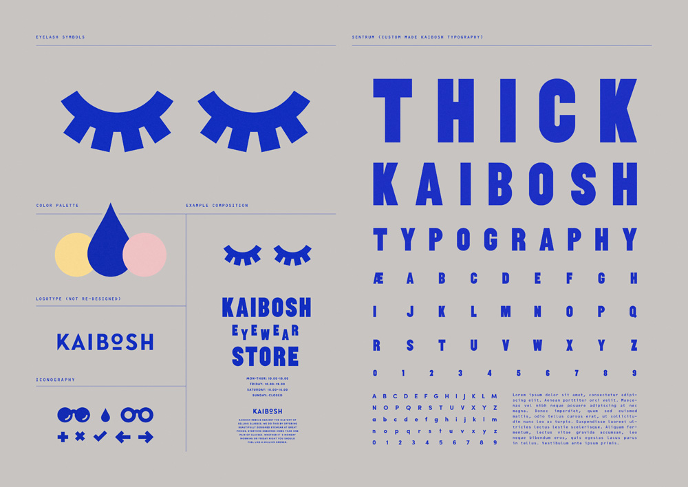
Meet Sherman
This is a great project released this week. Pentagram's work for Syracuse University needed a bookish and smart looking type family, and Goudy seemed to work well, so they turned to Chester Jenkins to develop a forgotten Goudy design for the modern era. Its sharp, its friendly, its intelligent, and looks damn fine on orange.

Positype has thrown a hat into the neutral sans ring with their latest family release Aago. Its a family of 54 fonts that aren't COMPLETELY devoid of personality despite the marketing comparisons to Helvetica and Arial. I think it has more to do with DIN an humanist sans faces than anything else. Either way, you can explore Aago on your own via MyFonts.


Everyone who knows me, and even if you don't (if you don't, let this be your informing), knows that I have a soft spot for print, especially if its unconventionally made or bound. Structure is a publication that looks gorgeous and is singing my song. Full of sexy photography of furniture and graphic texture, this is a printed object that has jumped to the top of my want list. See the full feature on BP&O.

Ideo's deep think tank has produced a vision of a whole new future to think about. Circular Design. It's not necessarily an original idea, but it IS the most thorough and useful presentation of it I've ever seen in their Circular Design Guide. I'm convinced this is worth its weight in gold, I can't wait to employ these ideas, and the site is kind of amazing.
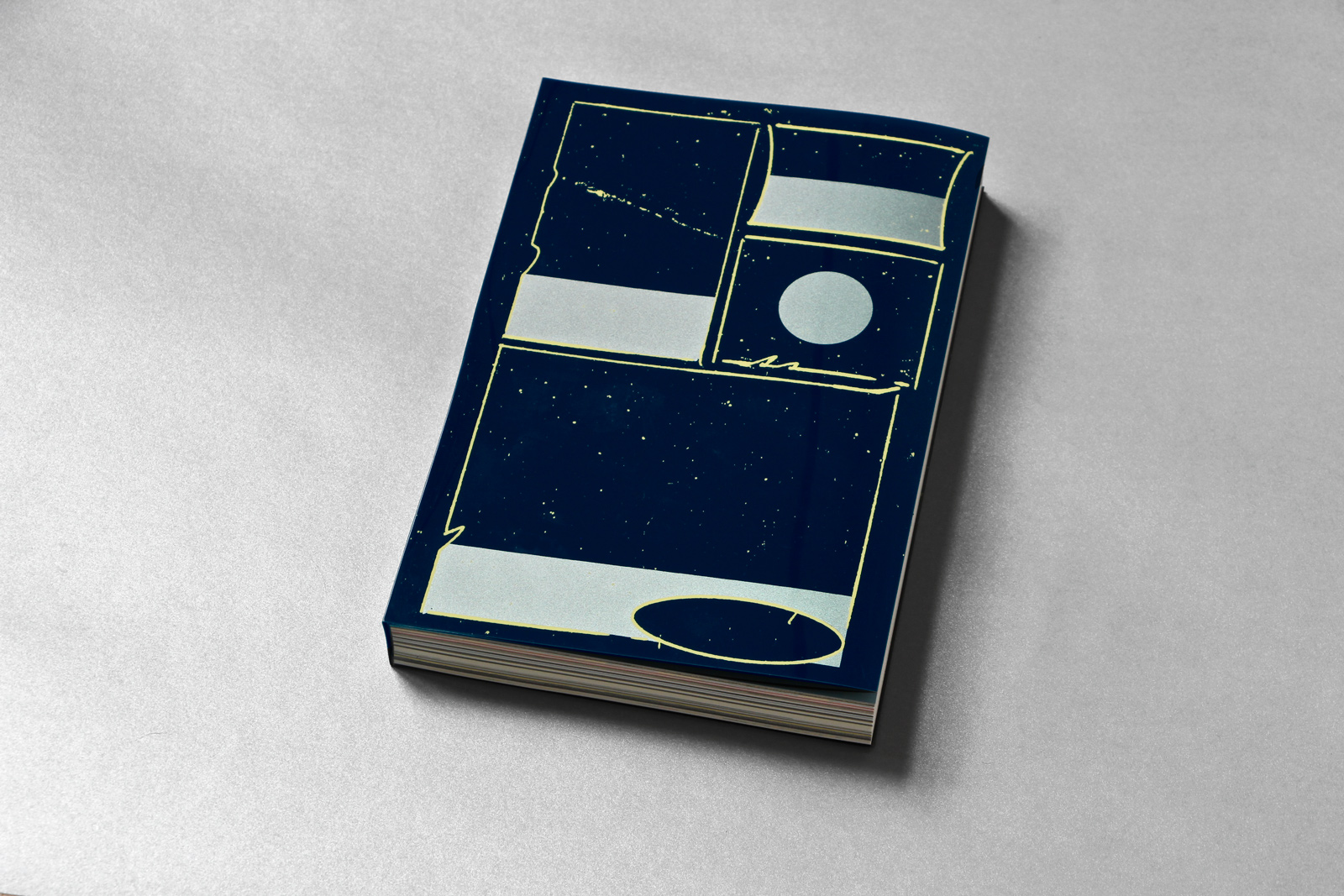
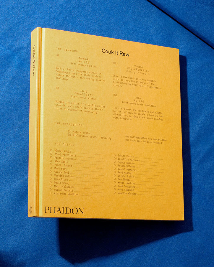
Need. This. Book.

“Fonts just fall out of the sky. People don’t think about the thousands of hours of craftsmanship that go into building them. We’d like to make that more accessible to the clients and students who come here. The type industry shouldn’t be a closed door.”
– James Fooks-Bale
This is something I know a lot of folks in the type industry have been thinking about. How do we start expanding the industry to new markets and opportunities without losing the heart and craft of it all? This article from the AIGA does a good job of highlight Monotype's view of the issue and what can start to be done about it. Also, I wish my name was Fooks-Bale.
An absolutely captivating short from the New York Times that has stuck with me all week. I dare you to look away.