THIS WEEK FROM THE DESK

END OF THE YEAR LISTS EDITION

'Tis the season for end of the year lists. It's always great to look back on the year in type and design, but sometimes it's difficult to remember all the amazing things that have happened. This year, there were amazing new releases, conversations, designs, and debuts. This TWFTD is devoted to all the end of the year lists coming out that sum it up so perfectly. 


It's Nice That has a different style to its summation lists by interviewing one person or studio in over a half dozen categories that they cover from film to illustration to music. They interview amazing friends and personalities such as Tuesday Bassen for Illustration, Toro y Moi for Music, and Design Studio for graphic design. Highlights, lowlights, it's all a good industry insider look at things you may have missed. See all the lists here


Richard Baird at BP&O has kept an immaculate blog devoted to the design output of bespoke studios around the world this year. Her's pubilished two lists so far of end of the year reviews. 
1. Best of BP&O in Graphic Design
2. Best of BP&O in Packaging
3. Best of BP&O in Brand Identities
4. Best of BP&O in Studios

Both lists are beautiful reviews of some very contemporary ideas in graphic design, branding, and packaging. I love the emphasis on color and paper present in his choices. 


Quipsologies' Brand New has served up their lists for best and worst reviewed logos this year. It's always fun to read these for their snark and humor sprinkled in. 

1. Most Notable Projects of 2016
2. Best Reviewed Projects of 2016
3. Worst Reviewed Projects of 2016


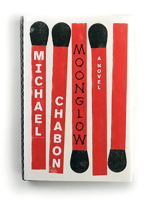
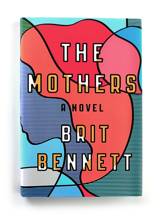
There were obviously hundreds of amazing book covers designed and released this year. The New York Times has made their picks for the best of the year. Although I think there are quite a few more that belong on this list, its a great place to start. See the full list here


Love it or hate it, Medium has become an enormous platform for writing of all kinds. It's a great place for everyone to collect and publisht heir thoguhts on entrepreneurship, design, business, and really anything else. Daniel Eckler has collected 75 of the 'best' design reads on Medium from the year. There is enough on this list to keep you reading for at least until New Years. 


TWFTDKyle ReadComment
THIS WEEK FROM THE DESK

After a full 10 years in formal business, TypeTogether got it's type... together.... for a new site, launched this week. It's a fascinating refresh, opening the foundry up to a clearer impression of their brand. From the Homepage to the presentation of individual types, and the strong presence of a blog and features, this new site is built to last; not to mention be a stage for an already legendary collection of types. They even made a little video to walk you through the newness. Bravo! 


Commercial Type has (finally) put up a shoppable section of their site... Commercial Goods. At last, we can obtain the Commercial specimens, some of my favorite specimens out there. Perhaps the best part is that everything is free! Just pay for shipping.  


Yes. A Cookbook from a Bank. This project from Bedow in Sweden (via BP&O) is a great example of how a brand can extend itself beyond its typical service without breaking. This book is well designed, and with a custom typeface that looks really sharp. Gotta find out more about it. See the full project here.


Finally, the crossed Fingers Emoji is here! It's one of over 100 new emoji and symbols shipped in the latest iOS 10.2 update. Ive been wanting this emoji for a while, often just typing out "Crossed fingers Emoji" in conversations. See what else made the new cut here, or watch the announcement video.


This week, Google decided to spin off its Self-Driving Car project it had been incubating in GoogleX. The new company is called Waymo and it's self-driving car technology for hire. The new company came with a new logo, and it fits squarely in the Google suite of products while still somehow departing from it? Whatever you think of the logo, the site is actually quite nice. I'm looking forward to seeing where this goes. 


Shiva Nallaperumal, an incredibly talented type designer from Chennai, India, launched a new site for himself and his work. There's graphic design gold in there. 


TWFTDKyle ReadComment
THIS WEEK FROM THE DESK

pstype quietly released Hatch this week, a typeface family of 8 weights with slightly polarized contrast and packed with personality and character.  It's soft and humanist in the curves and corners where it needs to be, and sturdy like a slab-face in others. It's a great addition to the pantheon of slab faces out there. Check out all the samples for yourself here


It's Nice That put up a very nice profile on Taiwanese designer Wang Zhi-Hong, a book jacket designer. It's always good to see how design and type play out in non-latin languages. See the full article here.  


Typofonderie, the French type house helmed by Jean Francois Porchez, has expanded their modern French classic type family Parisine with new Narrow and Condensed weights. Jean describes Parisine like this: 

Parisine was born as the parisian métro signage typeface. This family of typefaces has become over years one of the symbols of Paris the Johnston for the London Underground or the Helvetica for the New York Subway.

See the extensive full family on the Typofonderie site here. 


They Whitney Museum has an in-house design department responsible for all the interior and branding design for the museum. Their website is full of contemporary design eye-candy, and it worth a look through.


Every time this project kicks off I get very excited. I'm a sucker for a good collaborative serial project. The site is amazing and there's so much new music that I haven't heard of. Check out these reimagined album covers designed by a list of 16 talented people here as it all counts down this and next week. 


'Tis the season for lists. This one of the best Book Covers of 2016 according to the New York Times—although short—does not disappoint. I'm really looking forward to the 50/50 list from Design Observer too, but for now this list is kicking it all off in style. "If good design might lure us into an experience that makes us smarter, then we’ve hit the jackpot when the book allows us to spend time within the head space of a stranger." 


This was just a fantastic read dotted with examples of such diversity in art. 


TWFTDKyle ReadComment
THIS WEEK FROM THE DESK

Commercial Type dropped their latest family release this week with the rather chemical name Styrene, and perhaps that was appropriate because each character seems to have been cooked up and combined with long lines of theory to arrive at the "charmingly awkward" result. Styrene, delivered in two family widths (with the equally sterile names A and B) for text-setting variation, is a great example of many things, but most notably designing type for the benefit of the customer using it and bucking any trend or temptation to crank out 100 instances between masters. It seems to be making a subtle jab at the harsh German types of the past like DIN or Mark; injecting the personality they wished they had. I also cannot be more impressed with the way the weight holds in each face from thin to black. I will always be a fan of Berton Hasebe's work, and although initially I was taken aback by the weirdness here, I absolutely love the much needed originality and personality Styrene brings to contemporary type design. 


I love everything this woman touches. Creative Review has this good look into Gail Bichler and her work with her team at the New York Times Magazine. I cannot wait for a monograph of her work to come out. Read the article here. (Disclaimer, NOT A FAN of the "registration to read" policy over at CR.) 


Loved this identity project feature by RE in Australia on BP&O this week. The design for this identity is concise yet expressive, simple yet dynamic, and most enjoyably, typographic. The work brings Grilli Type's Sectra to life, and has a rather cheeky conversation with 'Hidden Characters' you find in typesetting. Read and see more here


If you haven't yet seen the movie Arrival, you should.  It's a good movie with a heavy dose of the study of language at its core. I was happy to come across this view into the formation and expression of the film's new alien language from WIRED. Check out the details here, and then go see the movie! Who knows, maybe one day typography will evolve into circular settings and non linear formats...  


It's been a good week for reconnecting with Art Directors. It's Nice That featured Shaz Madani—an art director we'd like to take for a coffee and a chat—on their Regular column on artists and their favorite books. See Shaz's list here.  


For those who are interested, Typophile jolted back into life this week. Hurray for community! 


TWFTDKyle ReadComment
THIS WEEK FROM THE DESK

Thanksgiving

This week held the classic American Thanksgiving Day, and although there are a lot of things that make us fearful or worried or stressed about our lives these days, there are many more things to be thankful for. We think Type Network's post on their growing family has got us feeling a little sentimental as well. 

This year, Badson has grown in the number of products in the shop, projects completed in the Studio, and typeface projects underway in the Foundry. It's certainly been a grind, and means big and amazing things for 2017, but for now, I'd just like to give thanks to all those we work with, for, and in the spirit of. I'm thankful for the opportunity to come in to work and passionately engage with letterforms. 

I hope everyone had a happy thanksgiving and a chance to take stock of the good things around you. Now, back to work! 


Very British Types indeed! Mark Ovenden has put together a complete profile of both Edward Johnston and Eric Gill and how their work has defined 'Britishness' for over a century. The book is published by Lund Humphries, available on the 29th of November. For more, Monocle interviewed Mark to get the story behind the men. Listen here: 


Indra Kupferschmid posted this quick post on Alphabettes last month, and I honestly don't know how I missed it. She highlights this spectacular gem of a book and how she got her hands on it. It's moments like these that prove what print has over digital. 


TWFTDKyle ReadComment
CALLIGRAPHY @ LORE

This weekend, we held a Copperplate Calligraphy Class at the beautiful Lore here in Denver CO. With a full table and eager minds, students approached the rather intimidating letterforms of the Copperplate style, and rather successfully too!  It can be daunting to try to get into learning such a disciplined and elegant writing style, but over the course of a few hours, we all got a little closer. 

The workshop included a handsome deck of instruction materials and a custom drawn alphabet based off of the work of Earl A Lupfer

Practice makes perfect when it comes to calligraphy, and every one had the chance to find their stroke and begin their relationship with the pen! 

We're looking forward to more workshops at Lore in the New Year. Calligraphy and beyond! If you missed your chance to get in on this workshop, follow us on Twitter and Instagram to be in the loop on all news and upcoming workshops. Keep practicing everyone!