THIS WEEK FROM THE DESK

This is refreshing and original branding and design work for the physical world. I like that it is not just a web-ready sans serif put in a grid... it uses type and imagery well to bring a new sense of character to the brand. Well done. via BP&O


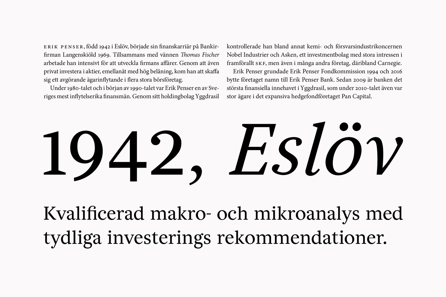
Frank Griesshammer released Source Serif 2.0 this week. It's a modern classic, and I'm really happy to see that Frank keeps building into it. It's an open source font from Adobe, and Frank writes about that and so so so much more in this post on the TypeKit Blog. Much love for this work. 


Lars Muller Publishers latest gem is a monograph of German printer and Graphic Designer Dafi Kuhne's work to date. It looks stunning, Dafi's work is enviable. This is the kind of book that you could sit with for a long long time and still discover new things in. Buy it on the Lars Muller site. 


FontShop published their Best of 2016 list. The first of several lists I'm sure to come out summating the year that was in font releases, this list is specifically filled with FontShop's best and brightest sellers. The well-designed feature page is worth checking out. 


Friends of the studio Charles & Thorn have upped their online work-showing game with a new home for their exquisite lettering and design work. 


Came across the Blueprint this week: a little weblog collection of interviews focused around the idea of working together and managing communication in business and client relationships. It's all put on by Teamweek, a group scheduling platform, so it makes sense. Its got a few profiles and interviews worth reading.  


David Johnathan Ross is back at his type wizardry in classic fun fashion with his latest variable font release Fit. It's a cheekily named font that literally fits into any line width by making textbook use of the power of variable fonts. The specimen pages are great because you can literally change the line width of the specimens and watch the variable fonts work right before your eyes. 


TWFTDKyle ReadComment
THIS WEEK FROM THE DESK

HAPPY NEW YEAR 


This list of books to get in 2017 is excellent. Needless to say I'll be putting a few of these on the shelf this year, starting first and foremost with the Harry Pierce book. Here's to a year filled with books! 


Modern graphic design housed in a dynamic web experience, yes please. The work out of french studio Spassky Fischer is worth a quick study. 


In Memoriam: Karl Gerstner

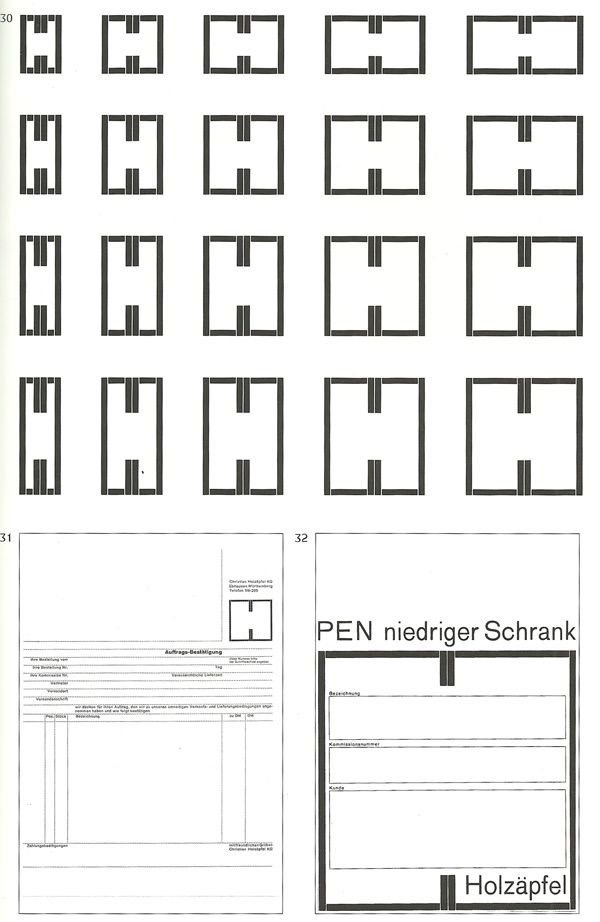
Karl Gerstner passed away on New Years day at the age of 86. Gerstner was a Swiss typographer and graphic designer who embodied the title of Commercial Graphic Designer. His prolific amount of work and cultural impact will be affecting the world of design for decades and decades to come. 

“Just as [Friedrich] Dürrenmatt disguised literature as detective stories, so I created everyday art without forcing people into museums,” —Karl Gerstner

The topic of emojis will seemingly never leave us. In some ways their importance is incredibly misunderstood with much more to be discussed and talked about, but at the same time talking about emojis seems so played out and unexciting. Will Hudson and Alex Bec take an hour or so to dive into the much maligned topic on the It's Nice That podcast. Worth a listen. 


In Memoriam: John Berger

John Berger is THE pioneering critic and author in how we see and understand art and design and everything visual. His seminal text "Ways of Seeing" changed how we would make art and talk about the world of visuals forever. He died on New Years Day at the age of 90. I believe his New York Times obituary was one of the best depictions of his life. If you feel like really getting lost for a little bit, check out his four part series based on his book on youTube:


This next weeks issue of Billboard magazine is ultra-fun, always a fan of a good typographic cover.  These two can never do enough typographic work. (I wish there was a larger image available on the internet!)


TWFTDKyle ReadComment
Hello, 2017

A video posted by Badson Studio (@badsonstudio) on

Hello 2017. It's really nice to finally meet you. 

There's a lot to look forward to in the next 365 days. We're very excited about all that this year has in store. We won't say TOO much about all of the goings on, but we can say that we are PUMPED to be growing and expanding and creating more than ever before this year.

We're looking forward to new typeface releases from the Badson Type Foundry, more fun products in the Shop, and of course, more great collaborative work with our killer clients. Of course, it certainly won't be a year without its challenges, but we say "Bring 'em on!". We're looking to be more productive and devoted to what makes Badson great: quality and empowering products delivered with style and an informative world of content. 

Stay up to date with all things Badson by following us on Instagram, Twitter, or Ello!

We hope everyone had a wonderful New Years; lets all go do some good. 

Kyle ReadComment
THIS WEEK FROM THE DESK

END OF THE YEAR LISTS EDITION

'Tis the season for end of the year lists. It's always great to look back on the year in type and design, but sometimes it's difficult to remember all the amazing things that have happened. This year, there were amazing new releases, conversations, designs, and debuts. This TWFTD is devoted to all the end of the year lists coming out that sum it up so perfectly. 


It's Nice That has a different style to its summation lists by interviewing one person or studio in over a half dozen categories that they cover from film to illustration to music. They interview amazing friends and personalities such as Tuesday Bassen for Illustration, Toro y Moi for Music, and Design Studio for graphic design. Highlights, lowlights, it's all a good industry insider look at things you may have missed. See all the lists here


Richard Baird at BP&O has kept an immaculate blog devoted to the design output of bespoke studios around the world this year. Her's pubilished two lists so far of end of the year reviews. 
1. Best of BP&O in Graphic Design
2. Best of BP&O in Packaging
3. Best of BP&O in Brand Identities
4. Best of BP&O in Studios

Both lists are beautiful reviews of some very contemporary ideas in graphic design, branding, and packaging. I love the emphasis on color and paper present in his choices. 


Quipsologies' Brand New has served up their lists for best and worst reviewed logos this year. It's always fun to read these for their snark and humor sprinkled in. 

1. Most Notable Projects of 2016
2. Best Reviewed Projects of 2016
3. Worst Reviewed Projects of 2016


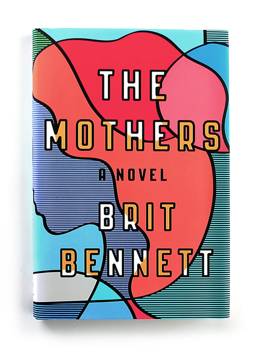
There were obviously hundreds of amazing book covers designed and released this year. The New York Times has made their picks for the best of the year. Although I think there are quite a few more that belong on this list, its a great place to start. See the full list here


Love it or hate it, Medium has become an enormous platform for writing of all kinds. It's a great place for everyone to collect and publisht heir thoguhts on entrepreneurship, design, business, and really anything else. Daniel Eckler has collected 75 of the 'best' design reads on Medium from the year. There is enough on this list to keep you reading for at least until New Years. 


TWFTDKyle ReadComment
THIS WEEK FROM THE DESK

After a full 10 years in formal business, TypeTogether got it's type... together.... for a new site, launched this week. It's a fascinating refresh, opening the foundry up to a clearer impression of their brand. From the Homepage to the presentation of individual types, and the strong presence of a blog and features, this new site is built to last; not to mention be a stage for an already legendary collection of types. They even made a little video to walk you through the newness. Bravo! 


Commercial Type has (finally) put up a shoppable section of their site... Commercial Goods. At last, we can obtain the Commercial specimens, some of my favorite specimens out there. Perhaps the best part is that everything is free! Just pay for shipping.  


Yes. A Cookbook from a Bank. This project from Bedow in Sweden (via BP&O) is a great example of how a brand can extend itself beyond its typical service without breaking. This book is well designed, and with a custom typeface that looks really sharp. Gotta find out more about it. See the full project here.


Finally, the crossed Fingers Emoji is here! It's one of over 100 new emoji and symbols shipped in the latest iOS 10.2 update. Ive been wanting this emoji for a while, often just typing out "Crossed fingers Emoji" in conversations. See what else made the new cut here, or watch the announcement video.


This week, Google decided to spin off its Self-Driving Car project it had been incubating in GoogleX. The new company is called Waymo and it's self-driving car technology for hire. The new company came with a new logo, and it fits squarely in the Google suite of products while still somehow departing from it? Whatever you think of the logo, the site is actually quite nice. I'm looking forward to seeing where this goes. 


Shiva Nallaperumal, an incredibly talented type designer from Chennai, India, launched a new site for himself and his work. There's graphic design gold in there. 


TWFTDKyle ReadComment
THIS WEEK FROM THE DESK

pstype quietly released Hatch this week, a typeface family of 8 weights with slightly polarized contrast and packed with personality and character.  It's soft and humanist in the curves and corners where it needs to be, and sturdy like a slab-face in others. It's a great addition to the pantheon of slab faces out there. Check out all the samples for yourself here


It's Nice That put up a very nice profile on Taiwanese designer Wang Zhi-Hong, a book jacket designer. It's always good to see how design and type play out in non-latin languages. See the full article here.  


Typofonderie, the French type house helmed by Jean Francois Porchez, has expanded their modern French classic type family Parisine with new Narrow and Condensed weights. Jean describes Parisine like this: 

Parisine was born as the parisian métro signage typeface. This family of typefaces has become over years one of the symbols of Paris the Johnston for the London Underground or the Helvetica for the New York Subway.

See the extensive full family on the Typofonderie site here. 


They Whitney Museum has an in-house design department responsible for all the interior and branding design for the museum. Their website is full of contemporary design eye-candy, and it worth a look through.


Every time this project kicks off I get very excited. I'm a sucker for a good collaborative serial project. The site is amazing and there's so much new music that I haven't heard of. Check out these reimagined album covers designed by a list of 16 talented people here as it all counts down this and next week. 


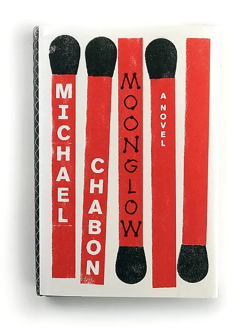
'Tis the season for lists. This one of the best Book Covers of 2016 according to the New York Times—although short—does not disappoint. I'm really looking forward to the 50/50 list from Design Observer too, but for now this list is kicking it all off in style. "If good design might lure us into an experience that makes us smarter, then we’ve hit the jackpot when the book allows us to spend time within the head space of a stranger." 


This was just a fantastic read dotted with examples of such diversity in art. 


TWFTDKyle ReadComment