THIS WEEK FROM THE DESK

Commercial Type dropped their latest family release this week with the rather chemical name Styrene, and perhaps that was appropriate because each character seems to have been cooked up and combined with long lines of theory to arrive at the "charmingly awkward" result. Styrene, delivered in two family widths (with the equally sterile names A and B) for text-setting variation, is a great example of many things, but most notably designing type for the benefit of the customer using it and bucking any trend or temptation to crank out 100 instances between masters. It seems to be making a subtle jab at the harsh German types of the past like DIN or Mark; injecting the personality they wished they had. I also cannot be more impressed with the way the weight holds in each face from thin to black. I will always be a fan of Berton Hasebe's work, and although initially I was taken aback by the weirdness here, I absolutely love the much needed originality and personality Styrene brings to contemporary type design. 


I love everything this woman touches. Creative Review has this good look into Gail Bichler and her work with her team at the New York Times Magazine. I cannot wait for a monograph of her work to come out. Read the article here. (Disclaimer, NOT A FAN of the "registration to read" policy over at CR.) 


Loved this identity project feature by RE in Australia on BP&O this week. The design for this identity is concise yet expressive, simple yet dynamic, and most enjoyably, typographic. The work brings Grilli Type's Sectra to life, and has a rather cheeky conversation with 'Hidden Characters' you find in typesetting. Read and see more here


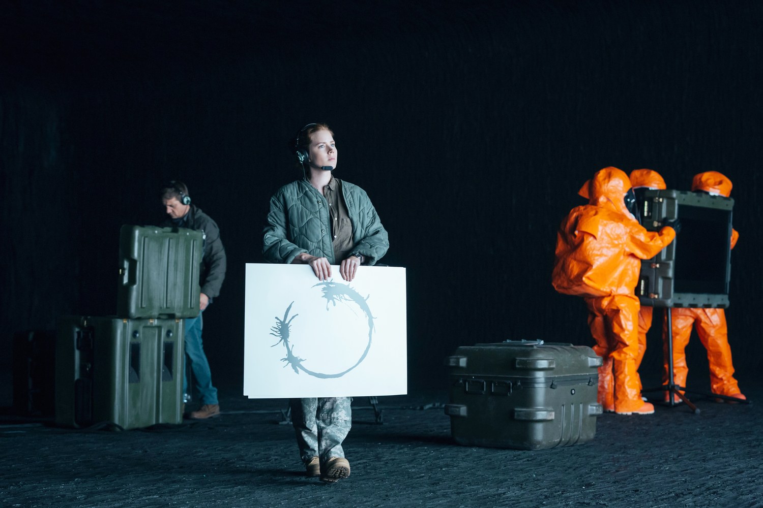
If you haven't yet seen the movie Arrival, you should.  It's a good movie with a heavy dose of the study of language at its core. I was happy to come across this view into the formation and expression of the film's new alien language from WIRED. Check out the details here, and then go see the movie! Who knows, maybe one day typography will evolve into circular settings and non linear formats...  

It's been a good week for reconnecting with Art Directors. It's Nice That featured Shaz Madani—an art director we'd like to take for a coffee and a chat—on their Regular column on artists and their favorite books. See Shaz's list here.  


For those who are interested, Typophile jolted back into life this week. Hurray for community! 

TWFTDKyle ReadComment
THIS WEEK FROM THE DESK

Thanksgiving

This week held the classic American Thanksgiving Day, and although there are a lot of things that make us fearful or worried or stressed about our lives these days, there are many more things to be thankful for. We think Type Network's post on their growing family has got us feeling a little sentimental as well. 

This year, Badson has grown in the number of products in the shop, projects completed in the Studio, and typeface projects underway in the Foundry. It's certainly been a grind, and means big and amazing things for 2017, but for now, I'd just like to give thanks to all those we work with, for, and in the spirit of. I'm thankful for the opportunity to come in to work and passionately engage with letterforms. 

I hope everyone had a happy thanksgiving and a chance to take stock of the good things around you. Now, back to work! 


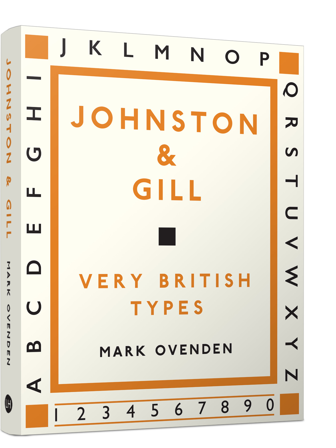
Very British Types indeed! Mark Ovenden has put together a complete profile of both Edward Johnston and Eric Gill and how their work has defined 'Britishness' for over a century. The book is published by Lund Humphries, available on the 29th of November. For more, Monocle interviewed Mark to get the story behind the men. Listen here: 


Indra Kupferschmid posted this quick post on Alphabettes last month, and I honestly don't know how I missed it. She highlights this spectacular gem of a book and how she got her hands on it. It's moments like these that prove what print has over digital. 


TWFTDKyle ReadComment
CALLIGRAPHY @ LORE

This weekend, we held a Copperplate Calligraphy Class at the beautiful Lore here in Denver CO. With a full table and eager minds, students approached the rather intimidating letterforms of the Copperplate style, and rather successfully too!  It can be daunting to try to get into learning such a disciplined and elegant writing style, but over the course of a few hours, we all got a little closer. 

The workshop included a handsome deck of instruction materials and a custom drawn alphabet based off of the work of Earl A Lupfer

Practice makes perfect when it comes to calligraphy, and every one had the chance to find their stroke and begin their relationship with the pen! 

We're looking forward to more workshops at Lore in the New Year. Calligraphy and beyond! If you missed your chance to get in on this workshop, follow us on Twitter and Instagram to be in the loop on all news and upcoming workshops. Keep practicing everyone!


THIS WEEK FROM THE DESK

This week was Monotype's annual Font Marathon where two of their type designers try to design a new and complete font in a week.... a daunting task. The event is highly transparent as they're sharing the progress all the time on Facebook Live and Instagram. I've been enjoying it through Terrance Weinzierl's Instagram account and the #fontmarathon hashtag. There are some fun and challenging entries this year. 

A photo posted by Z E T T E L E R (@_zetteler_) on


If you don't follow it already, @mintneverhinged's account filled with vintage and beautiful stamps is just amazing. 


James Edmondson had an interview with Goodhertz this week in an attempt to relate typefaces to musical plugins. It's a bright few minutes. 


I finally got around to listening to this, and I'm a little bummed I waited. Take a listen to this seminar turned podcast held in October with Erik Spiekermann, V&A Curator Johanna Agerman Ross and architecture critic Peter Murray on the topic of what makes good design. 


In trying to keep up with the latest advance in the type world—Variable Fonts—I check in on the #variablefonts hashtag on twitter every so often and its really amazing to see the convention evolve before you. There have been some fascinating things being posted by some very smart people. 


TWFTDKyle Read Comment
THIS WEEK FROM THE DESK

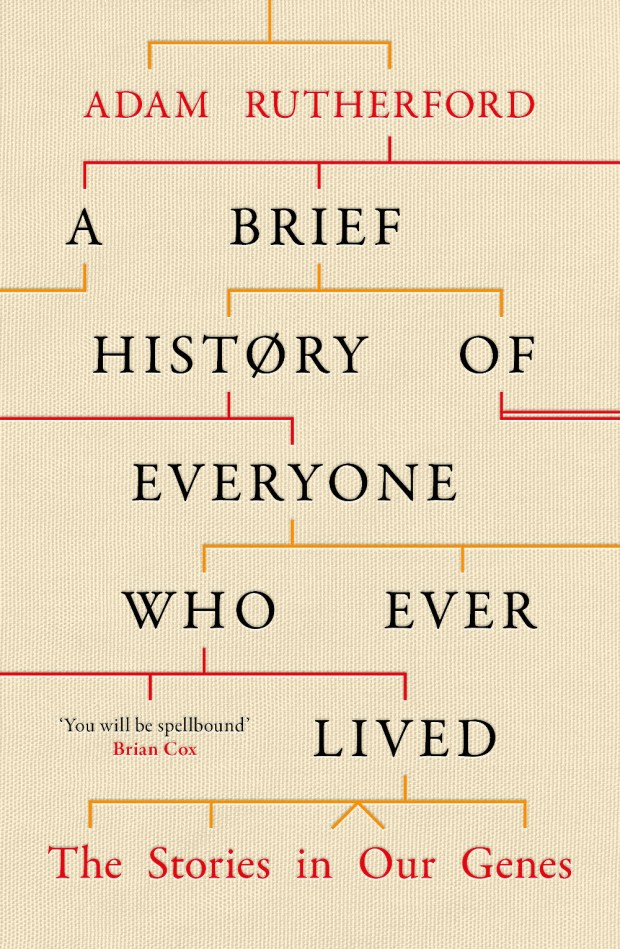
The Casual Optimist has great monthly lists of interesting Book Covers. I can;t say they're all amazing, but some of them are. See the November list here


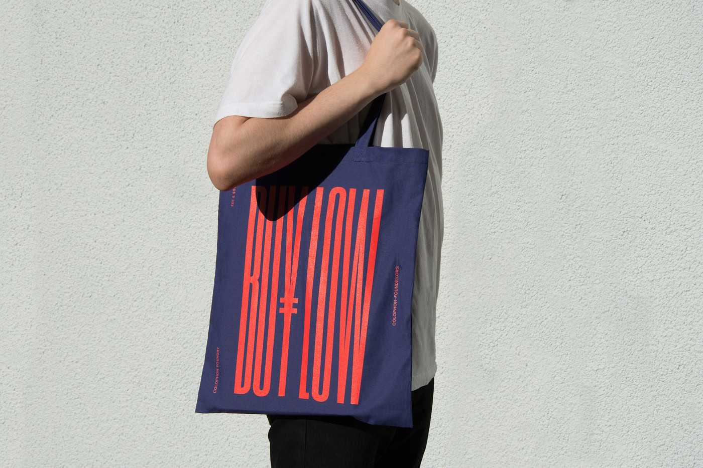
Currently desiring this new tote from Colophon Foundry. 


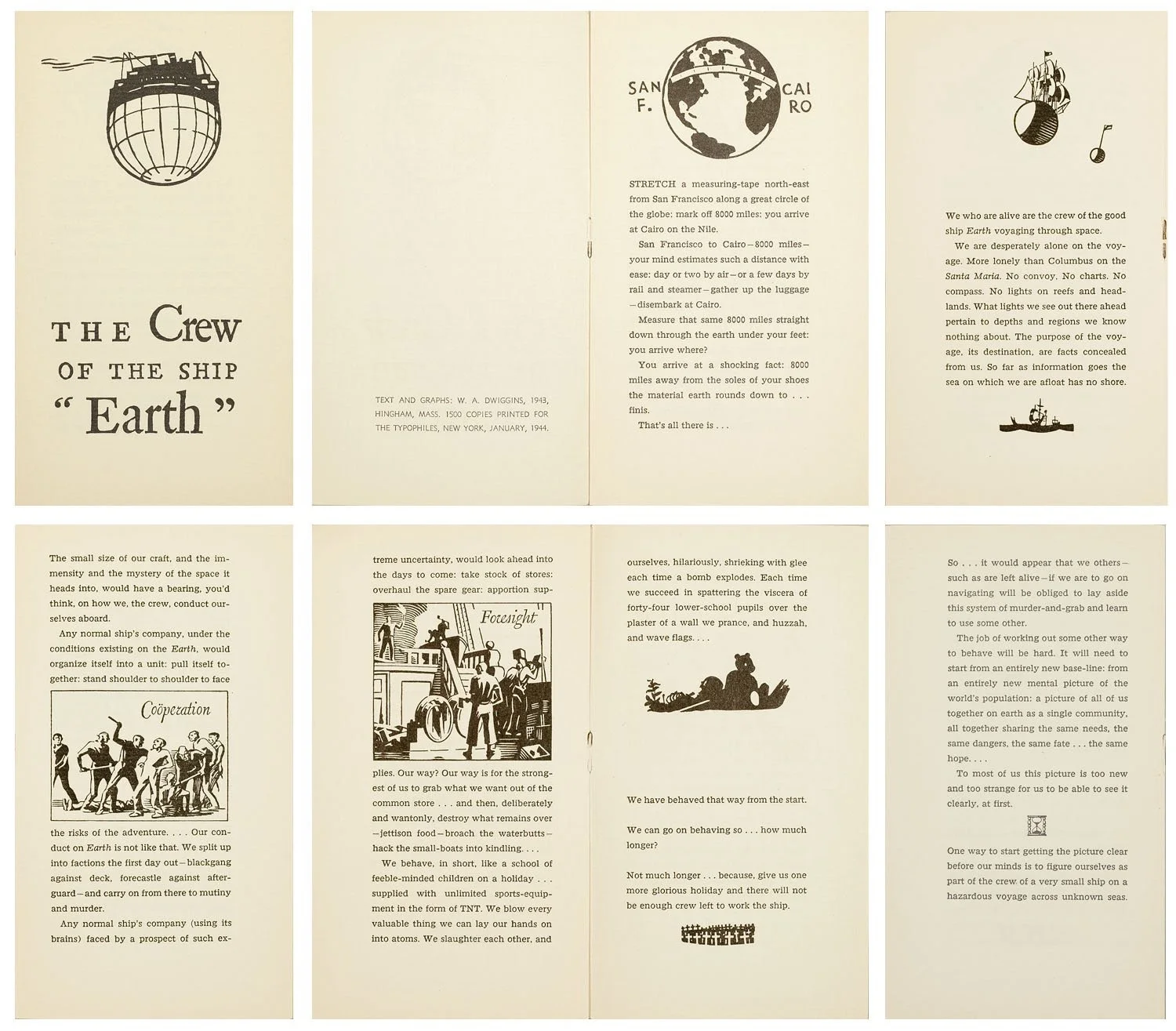
The biggest news this week was of Donald Trump winning the US Election. A lot of folks (turns out a majority of voters, actually) are pretty bummed. This chapbook excerpt set and printed by Dwiggins in 1944 published on twitter this week dulled the stinging edge a little. Its a great piece about optimism and togetherness, and proof that good design can rise from all climates. All things I think we Americans need reassurance of this week. 


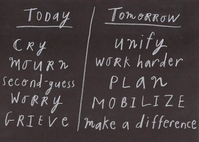
A fantastic read for all designers from FastCompany addressing post-election emotions and picking up the pieces and moving on in a positive way. (This image from Debbie Millman sums things up well.)


In lieu of it being a rather long week, it has helped to just look at some beautiful things, and one of our studio's favorite things to stop and look at for a while is the work of Les Graphiquants.


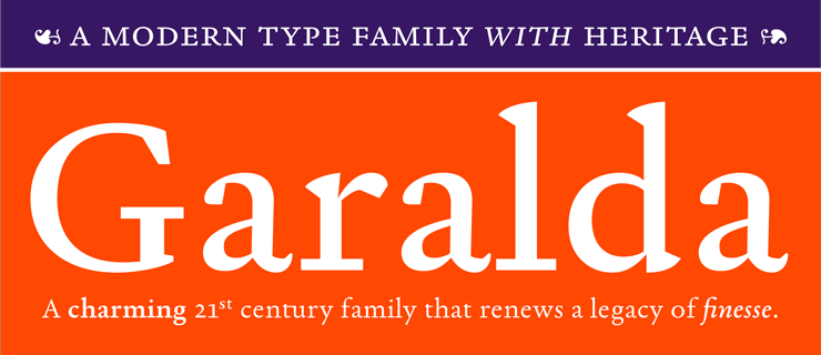
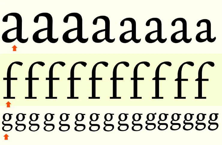
Released through Type Together this week, Garalda is a Garamond inspired text and display face with special attention paid to its italic, which makes for some rather interesting characters. Published with its release is a mini site with in depth details on its development and good answers to questions like "Why tackle the Garamond theme now?". 


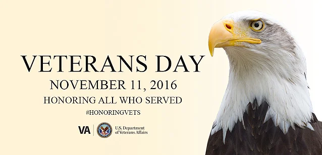
Also, It's Veterans Day here in the US

Just a little reminder, thank, hug, talk to, call, engage with, mention, or promote a Veteran today. 


TWFTDKyle ReadComment
THIS WEEK FROM THE DESK

Adobe Typekit launched it's type licensing engine under the name Marketplace this week. It has brought together all kinds of independent foundries to make fonts available for sale to all. The most promising aspects of Typekit's Marketplace are it's unified EULA and access to Adobe Original fonts. Read more on their launch page here


Victoria Rushton released a rather emphatic text face in 6 weights with Italics called Embury this week. It's available through her foundry page on Type Network


Jaguar's recent content devotional to type design and American-British design conversations is really well done and full of video, images, and soundbites worth sharing. The headlining video featuring Colophon Foundry is a great highlight. 


The Royal Mint released a redesigned £1 Coin this week with more features than you'd believe could fit in 23 cm. It's "micro-lettering", and cool security traits make it rather fascinating. Check out the Apple-style video for all the details on this metallic wonder. 


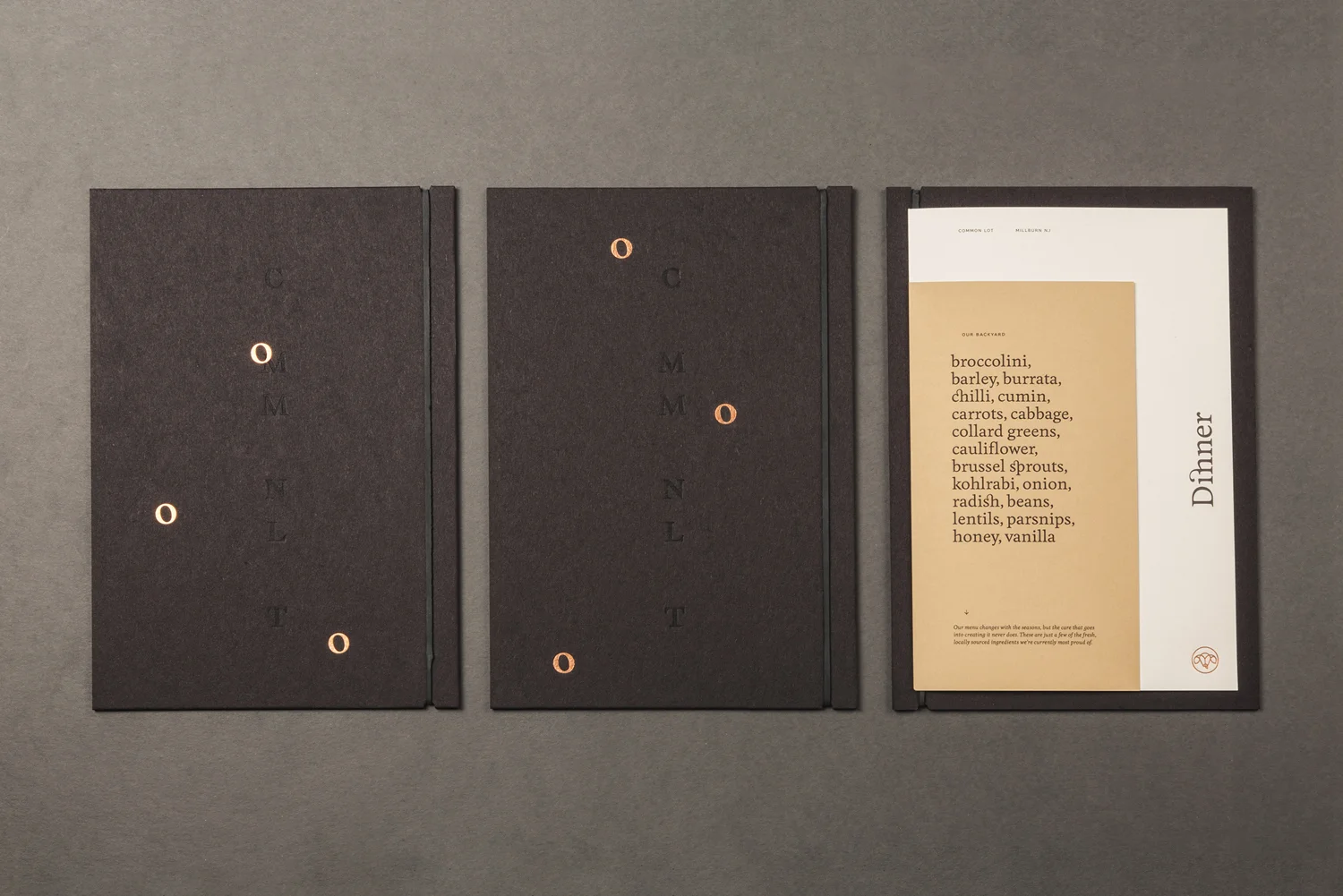
I have fond memories of growing up in new Jersey, attending shows at the Papermill Playhouse in Millburn, and now that Perky Bros has beautifully branded new restaurant Common Lot just around the corner, I desperately want to go back. BP&O profiles the design on their blog


It broke last week that MoMA acquired the original set of emoji designed by Shigetaka Kurita. It s great to see where the modern day ones originally came from. 


TWFTDKyle ReadComment