THIS WEEK FROM THE DESK

This week, we published our full report on what went down at TypeCon this year in Seattle. Themes, ideas, and big takeaways. In case you missed it, check out our full post on Medium.


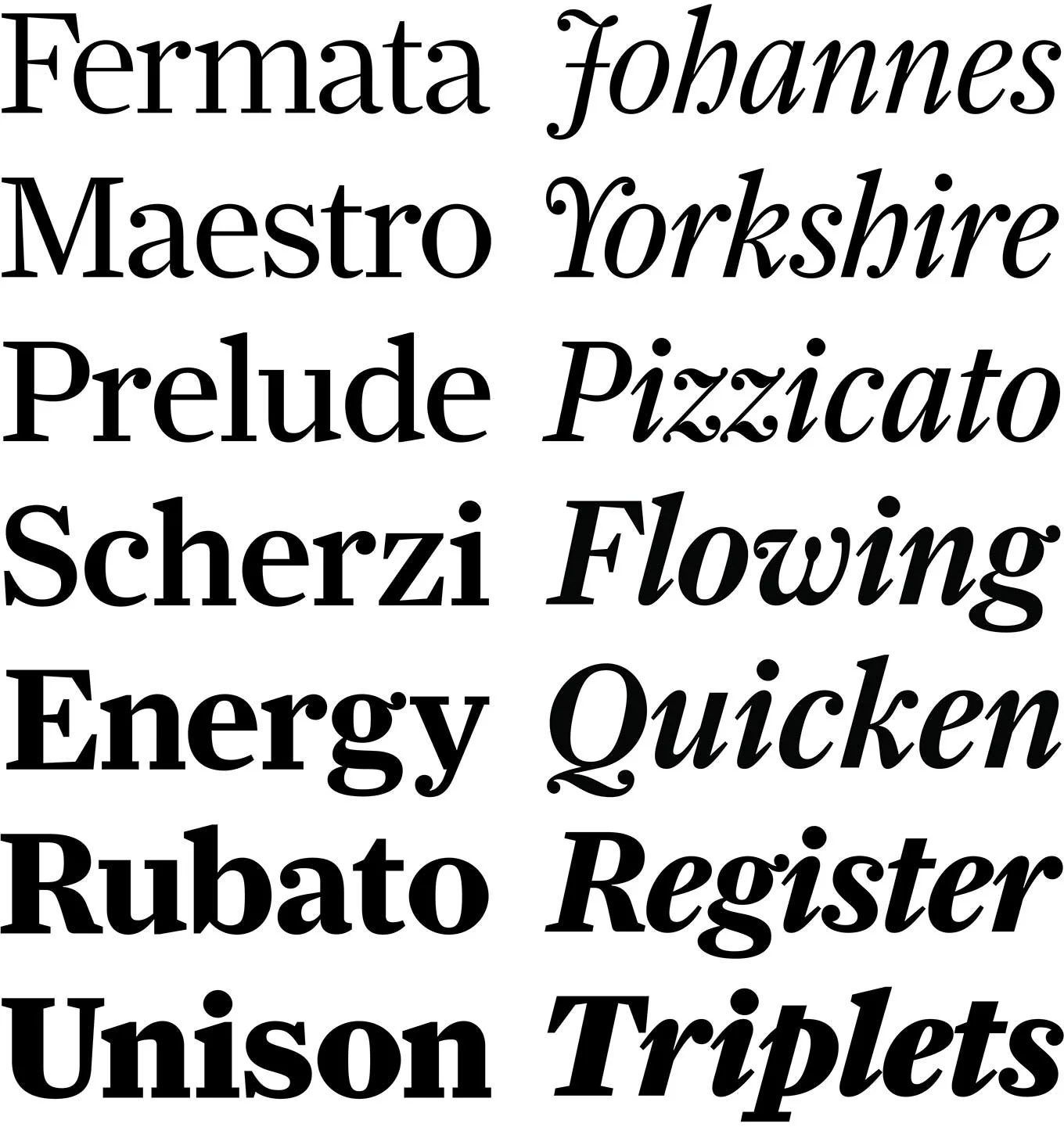
Nina's long awaited ‘subtly stressed' type family has been released this week. It aims to contest the ideas that reverse stressed types can't be used in modern design capacities. (need proof? check out the type in use on the web with this fun travelogue site) I hope this one runs far and wide because its a beaut, and available through Monokrom. Congrats Nina! 


This video, created by designer Diana Ovezea, highlights an hour's worth of her type design process on the computer. It's a good peek into a workflow that takes months if not years for some designers. 


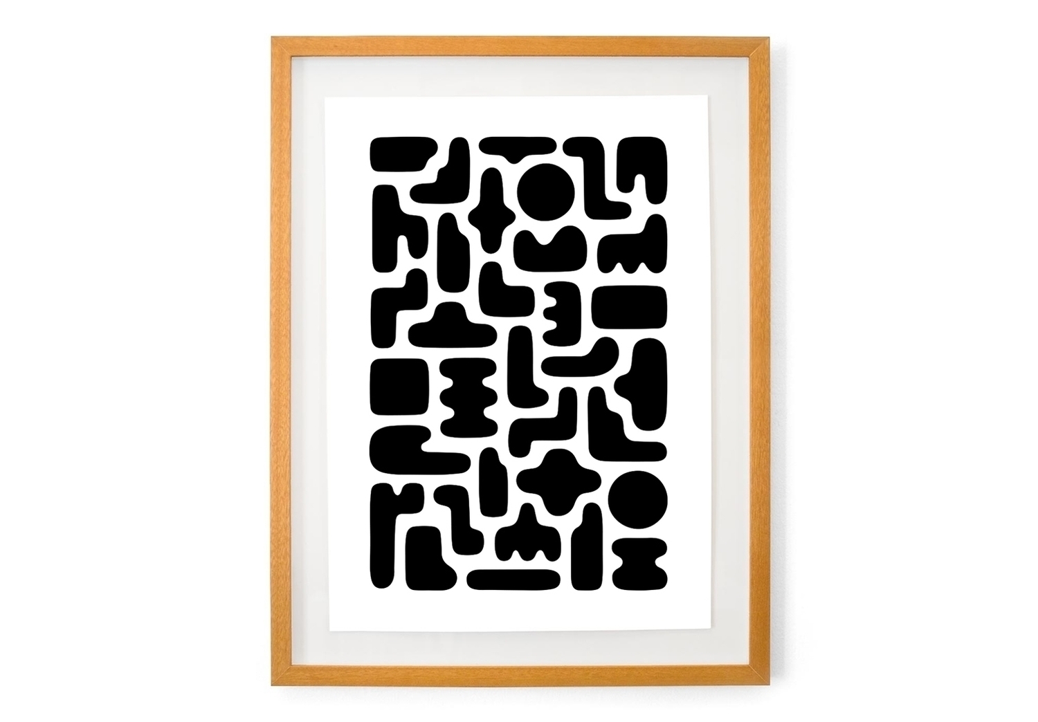
Love this print by Dan Covert. There are a LOT more on his site too. 


A thought provoking write-up on 3D Printing's role in design went up recently on the How Design Blog. It shows some good examples of 3D printed typography in use, among other products like cars and cameras. (My personal favorite being the "On Such a Full Sea" Cover by Helen Yentus, pictured above.) I want there to be more examples moving into the future, there's some real potential for design here. 


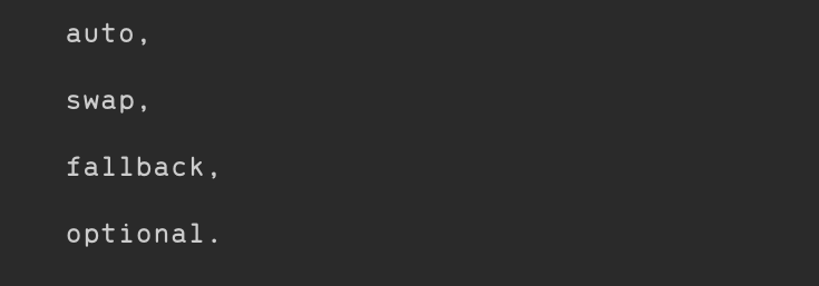
This Medium article from the Web Designer Depot has some good things about new progress in making basic font-display properties in CSS more dynamic. Although only available for a few browsers, perhaps this can improve web typography just a little more. 


Thomas Jockin is expanding his fantastic community building workshop series from New York to the West Coast... San Francisco. Do sign up if you're in the SF area with a need to be a part of something. 


TWFTDKyle ReadComment
THIS WEEK FROM THE DESK

The big news this week is that TypeCon 2016 is happening in Seattle, WA. We're here in the PNW City by the Bay to meet and greet, and share in the ideas, thoughts, and good times. We'll have a formal write up of our experience at the conference after it all wraps up on Sunday, but if you're not in town and curious about what's going on, follow #typecon2016 on all channels to see what's happening. 

P.S. How excellent is the identity system for the conference by MuirMcNeil this year? Bloody brilliant. 


Danielle Evans is profiling designers, illustrators, and digital artists working in the field of dimensional typography on her blog. It's insightful, interesting, and presents some beautiful work. Check out the most recent posts here


Spend a few long moments with this extensive web experience of the Bauhaus and Harvard's relationship. There is a lot to look at from typography, painting, and object design, to architecture, essays, and archived photographs all coming together to tell a fascinating story. 


Everyone seems to have jumped on board the celebration train this week as the National Park Service turned 100 years old. We're pretty excited about it because the posters used to promote the park system in the 30's and 40's inspired our own tribute to the perks in Ermine. Posters, parks, anything NPS is featured this week, did you capitalize? 


TWFTDKyle ReadComment
THIS WEEK FROM THE DESK

Matt Willey continues to be a strong source of inspiration for the Studio, so it was a treat to read this AIGA Eye on Design interview with him on his history of creating beautiful custom types for a slew of beautiful publications, complete with lots of type samples and sample spreads. 


Ed Benguiat's Stranger Things

This has been making the rounds for a few weeks now, but it is really great to see a type legend get some newfound recognition form a main stream audience. Read the Fast Company article on the use of ITC Benguiat in the title sequence. Also, Kudos to the designers for Stranger Things for going to the real source of their inspiration, and not just making a knock off version of it. 


Type on the web is changing, this quick read gives a fun taste of the current climate, how fonts are being handled online, and the real reasons why "Type is Fragile". 


These location inspired typographic covers for a selection of global cities is fun and well executed. Love these. Read more via It's Nice That.


The full history of Dance Ink Magazine, recently revived by designer Abbott Miller, is on full display here in a xylophone filled barrage of 90's design dripping with type and image. It's an older video, but it manages to float across the desk again this week to much delight. There's something magnetic about the designs in these pages, something that's not yet played out.


Kyle ReadComment
THIS WEEK FROM THE DESK

Frere-Jones Type has created a custom typeface made specifically for Data Visualizations and clear readong of dense numbers. No details on their site yet, but there are some nice in-use examples on the Tableau site write-up. 


Monocle Magazine published this great quick look at some interesting urban signage from Neon Signs in Warsaw to Street signs in Vienna. 


This Print Magazine article published in March of this year floated past the desk again this week, and prods the asking of another question that's good to ponder every now and again: "how can type embody relatable human traits in new and original ways?". Tanja, by Commercial Type, certainly is pretty. 


Franklyn has been killing it lately with new projects on their beautiful site. This one for Capsule, and online Pharmacy, is proof to me that good design can be applied to even the most unglamorous of services. 


Normally, I steer clear of brush script typefaces, but this one from Mika Melvas caught my eye this week. Pick it up at MyFonts.


Kyle ReadComment
THIS WEEK FROM THE DESK AUG. 5

Like type? Like type specimens? Ok, how much do you like type specimens? Neubau has released a very limited edition box set chock full of samples and physical objects for their Neubau Akademie Typeface Family starting at 600 Euros. 


Hoefler & Co. debuted a field to play with all of their typefaces on the web at once. I'll admit, Its fun. I know this is not revolutionary, but its a great way to get your hands dirty with their deep catalog for free. 


In case you've forgotten, today is the start of the 2016 Rio Olympic Games. I'm looking forward to seeing how Dalton Maag's typeface created for the games plays out across all the buildings, promotional materials, and graphics over the next few weeks. 


Yoann Minet released a rather exotic backslanted typeface this week alongside new regular and italic faces. There are some really innovative solutions to backslanted letterforms here. This is something I'd love to see more of in type. 


Congratulations Nina! 


TWFTDKyle ReadComment
THIS WEEK FROM THE DESK

With all of the amazing things going on in the world, never mind just the internet, we thought we'd make a place to share some of our favorites. This Week From The Desk is a new segment on the Badson Blog, wrapping up each week with the things that really impressed, fascinated, moved, and inspired us. Check back every Friday to see what we've been seeing. 

FS Siena

Fontsmith produced one of their biggest releases of the year in their elegant and sleek contrasted sans FS Siena. The amazing part, besides the very beautiful photographs of the specimen, is perhaps the ad campaign launched to promote it. It's great to see how foundries are using traditional web avenues to promote fonts to the public. 


Doves Type on BBC Radio 4

The Doves Type project has always been captivating, but this radio story on BBC Radio 4 takes the story to another place altogether. Have a listen,  and support the type


New cuts of Farnham

Christian Schwartz has added new Headline cuts of the eponymous 2004 release Farnham now available to the public through Type Network.  It's efficient, beautiful, and looks eager to do some work. 


Samsung One from Brody & Associates

Neville Brody and Associates (Brody Associates) developed a new corporate typeface family for Samsung. Entitled 'Samsung One', the type family is strong, sturdy, and cut out or the digital arena. They made a pretty video to introduce the release, as well as a rather detailed write up on the Samsung Newsroom Blog.


Margaret Calvert is a badass, and hasn't received nearly the amount of due she deserves. All that changes this month as she is honored along side Tony Cragg at The Queen's Honors. This write up on her typographic work for UK's Roads and Airports is eye opening. Does anyone else think she should have her own NYC Transit Authority Brand Manual Published? 


Gravers & Files Punchcutters Film

You know how I've always said that I wish Matthew Carter would record audio books? Well, this is the next best thing. Monotype has sponsored the revival and restoration of a film made in 1957 about the process of punch cutting with Carl Dair and P.H. Radisch at the Enschede en Zonen Type Foundry in Holland, now with Matthew Carter's overdubbed narration. Its fascinating, nerdy, and beautiful to see how tactile the history of type really is.