...On Our TedX Adventure

#TYPEHUNTRINO

Last night, we hosted an event with Ted X Mile High, an adventure to be exact. This adventure started out with a short talk and culminated in a scavenger hunt for found type in our favorite part of town, RiNo. The evening started out with a small TED style talk about typography in the community and the current typographic landscape here in Denver. We had a blast. If you missed it, we hope to catch you at the next one, but for now, we thought this would be a good chance to share an excerpt from the talk itself:

Public typography is an incredibly relevant and active thing in a growing community, and we pose three ways that anyone can be a better steward of it. We call them the three "-tions":

Preservation
Documentation
Celebration


Preservation is a big deal in a rapidly growing city. Denver is growing incredibly fast. Entire city blocks are being re-zoned and redeveloped for the population explosion going on right now. Denver, being uniquely placed in the country has a special cultural history that's worth preserving. 

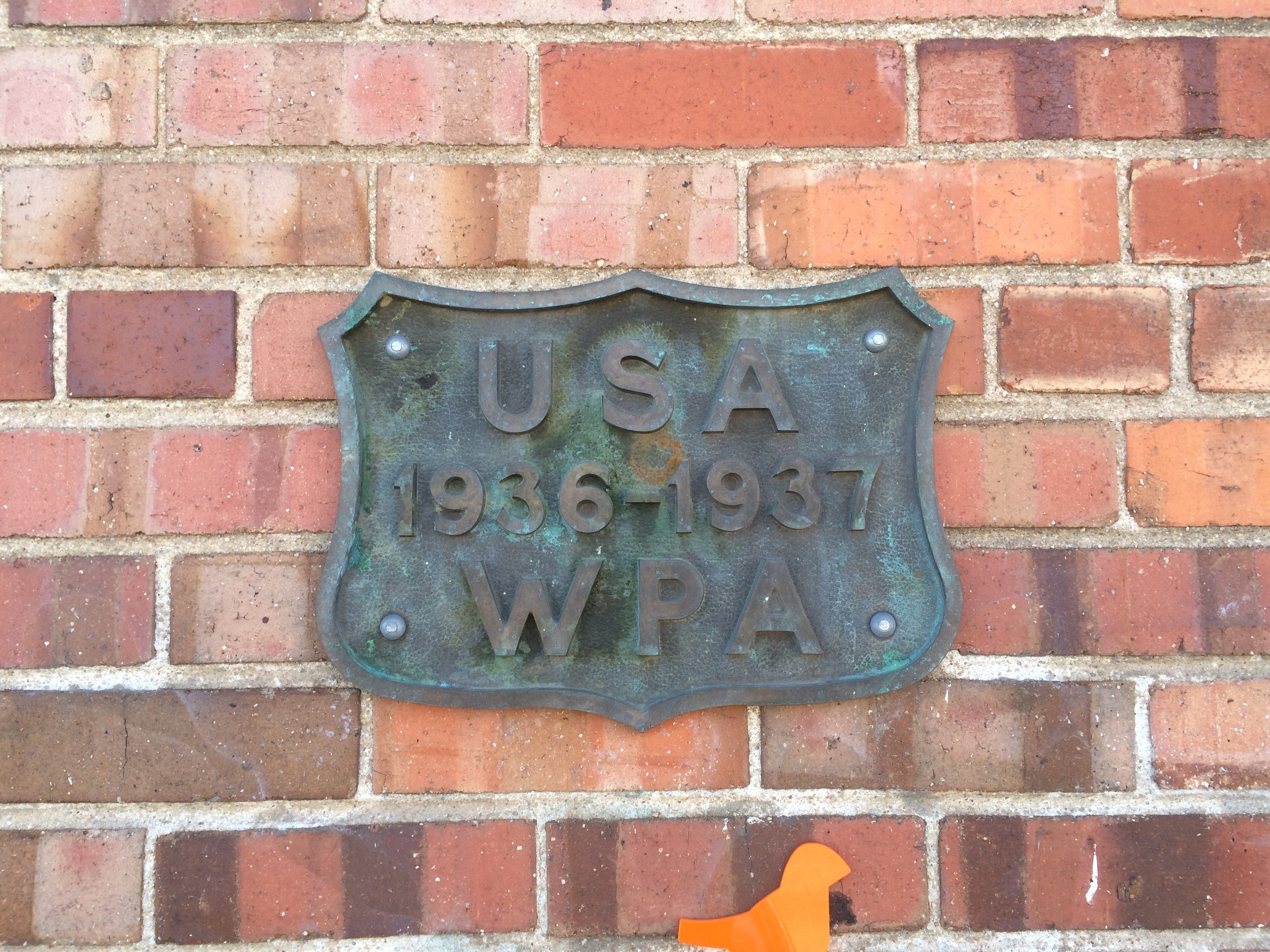
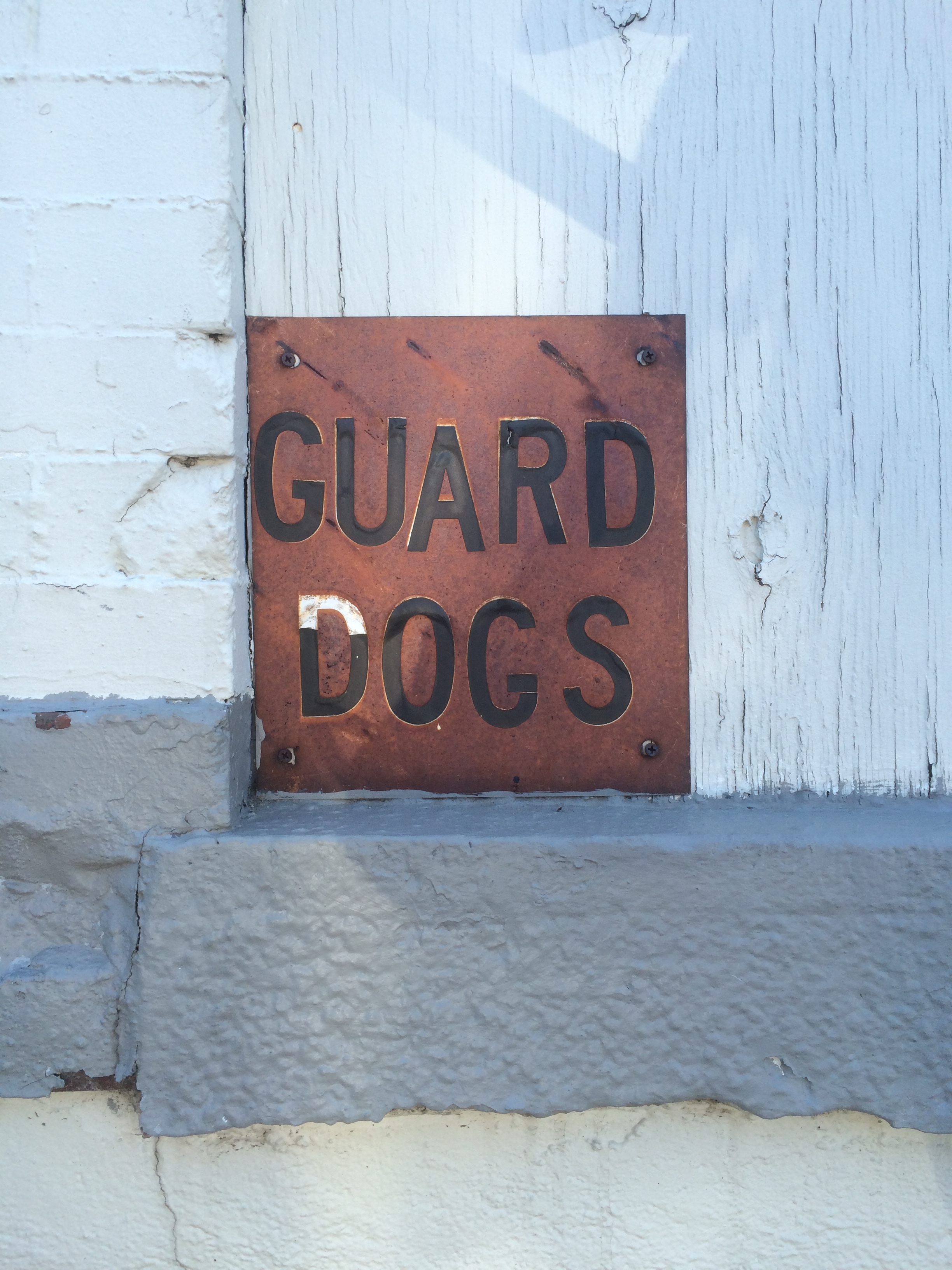
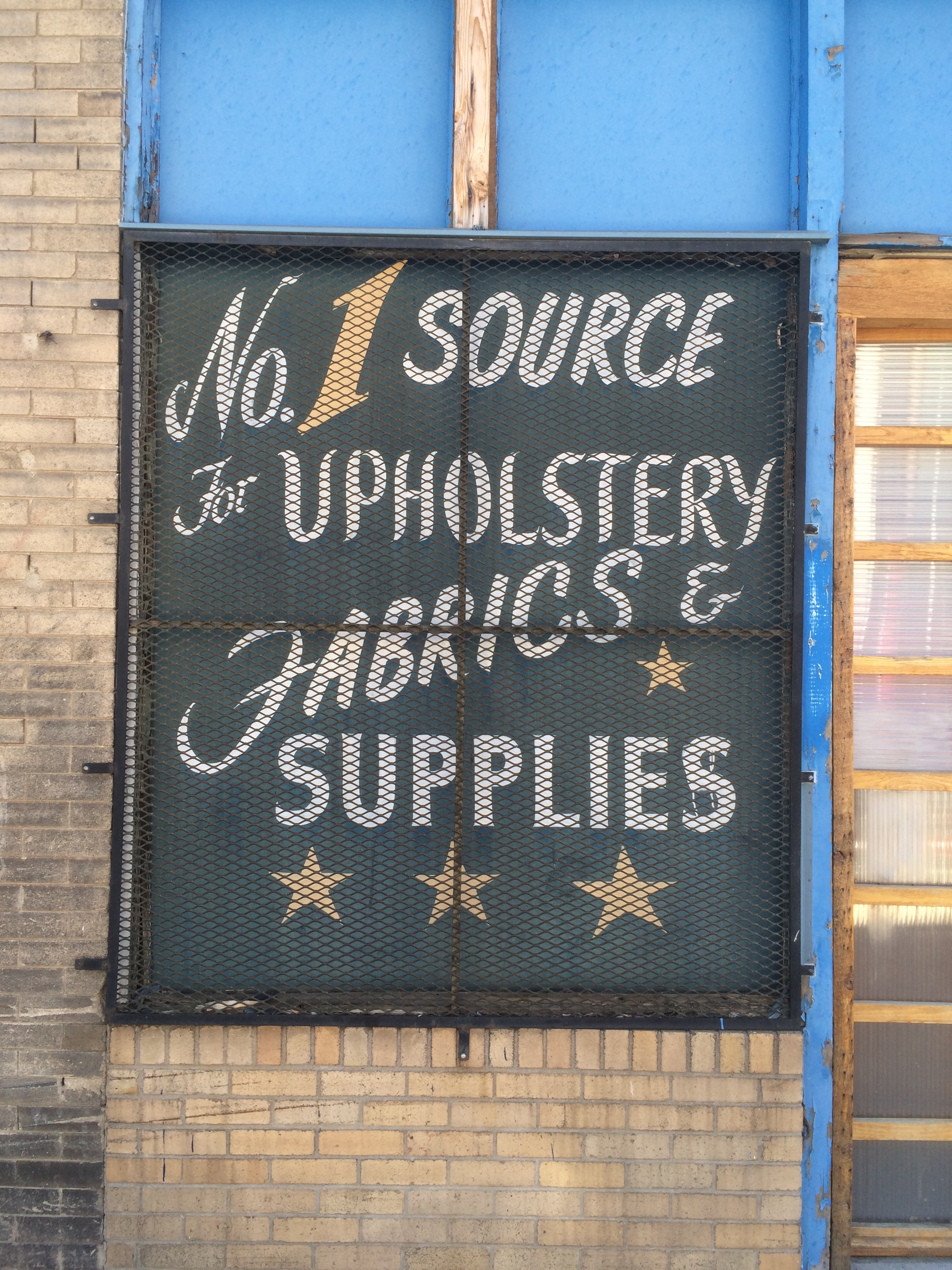
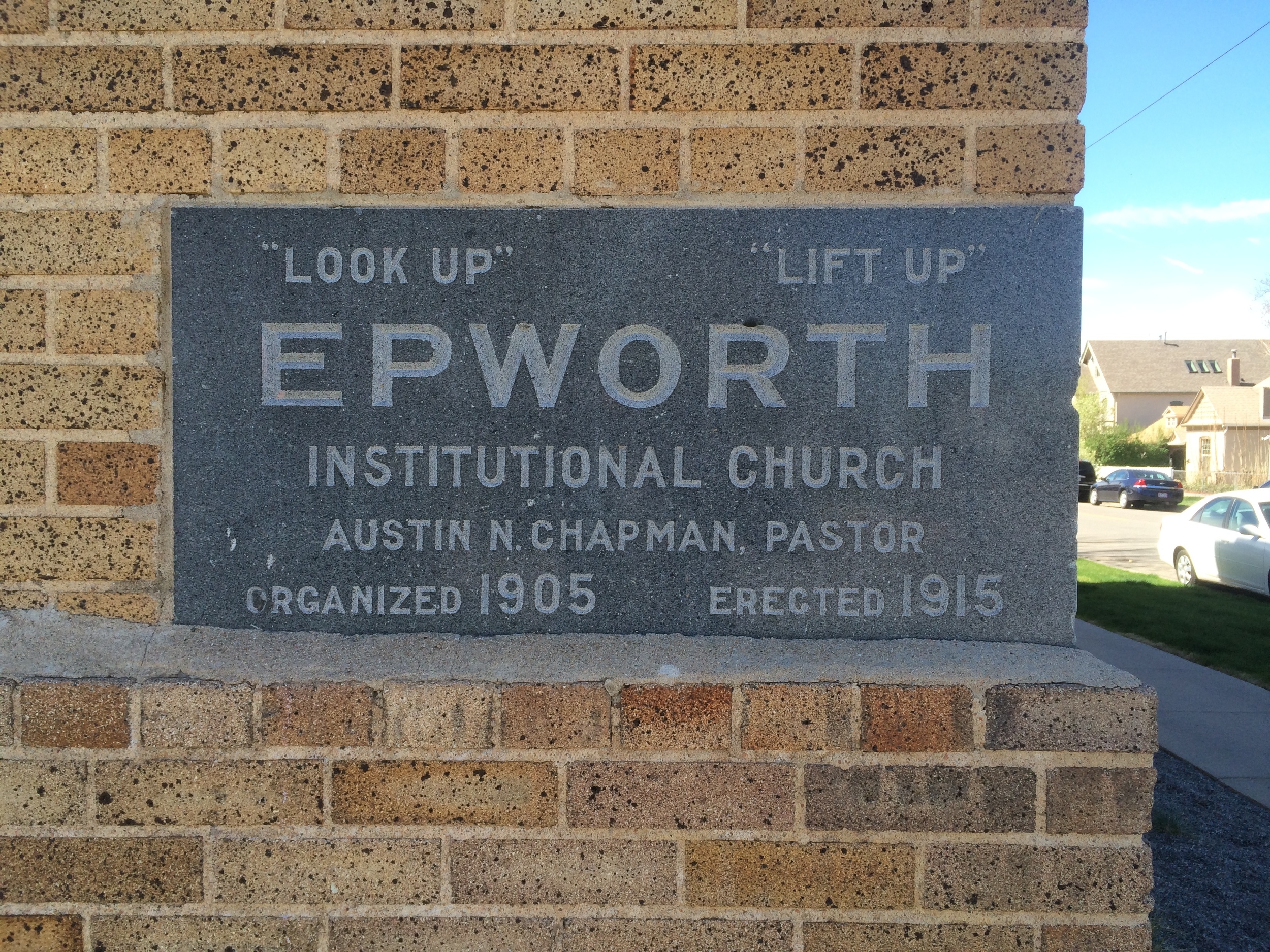
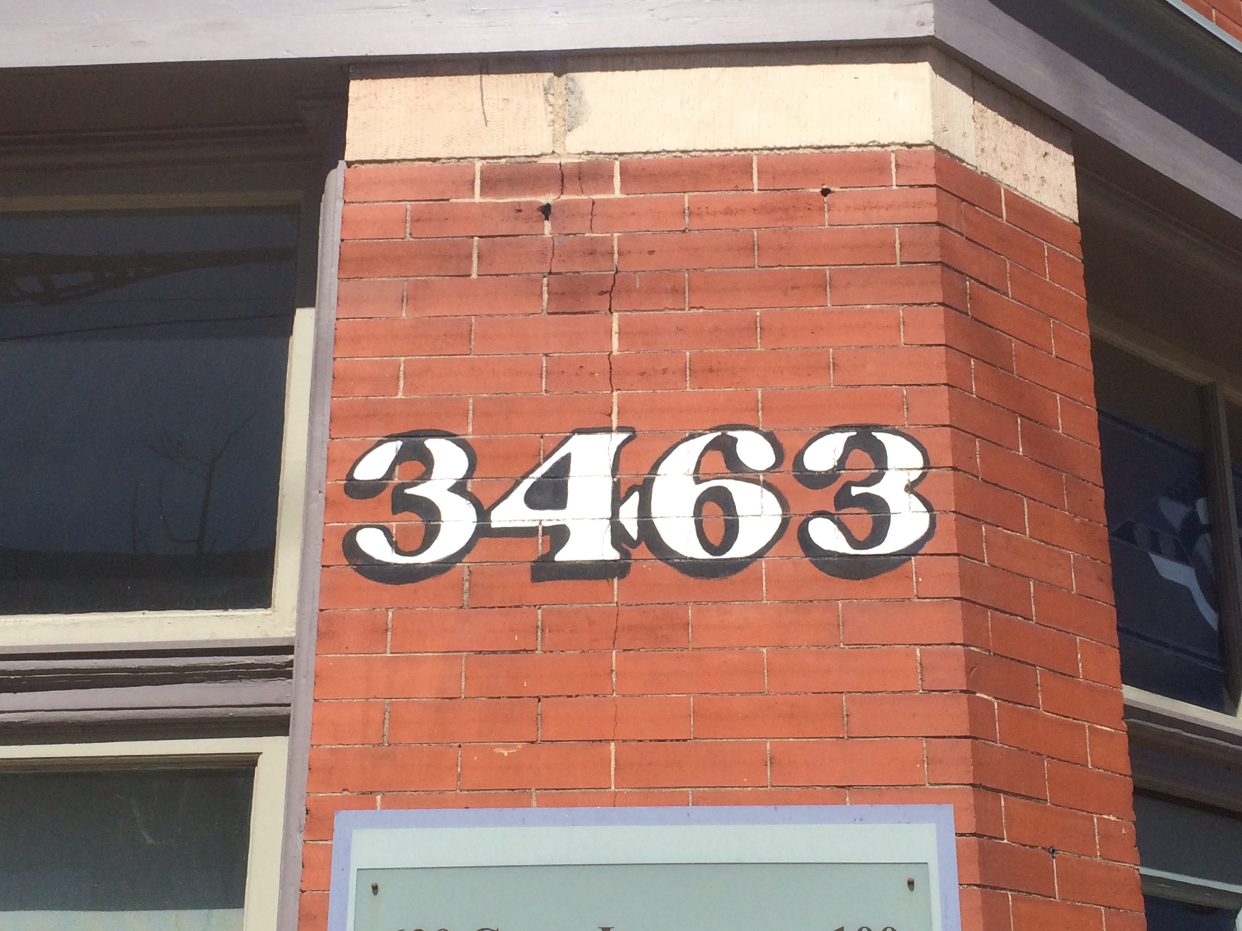
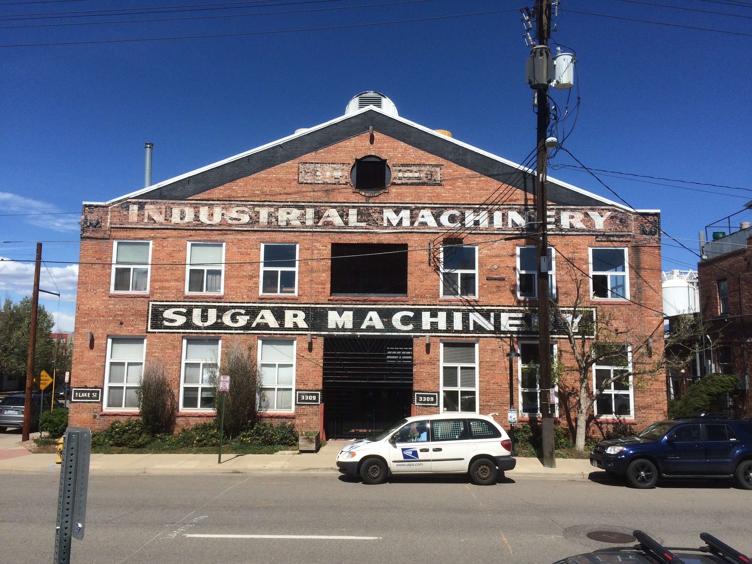
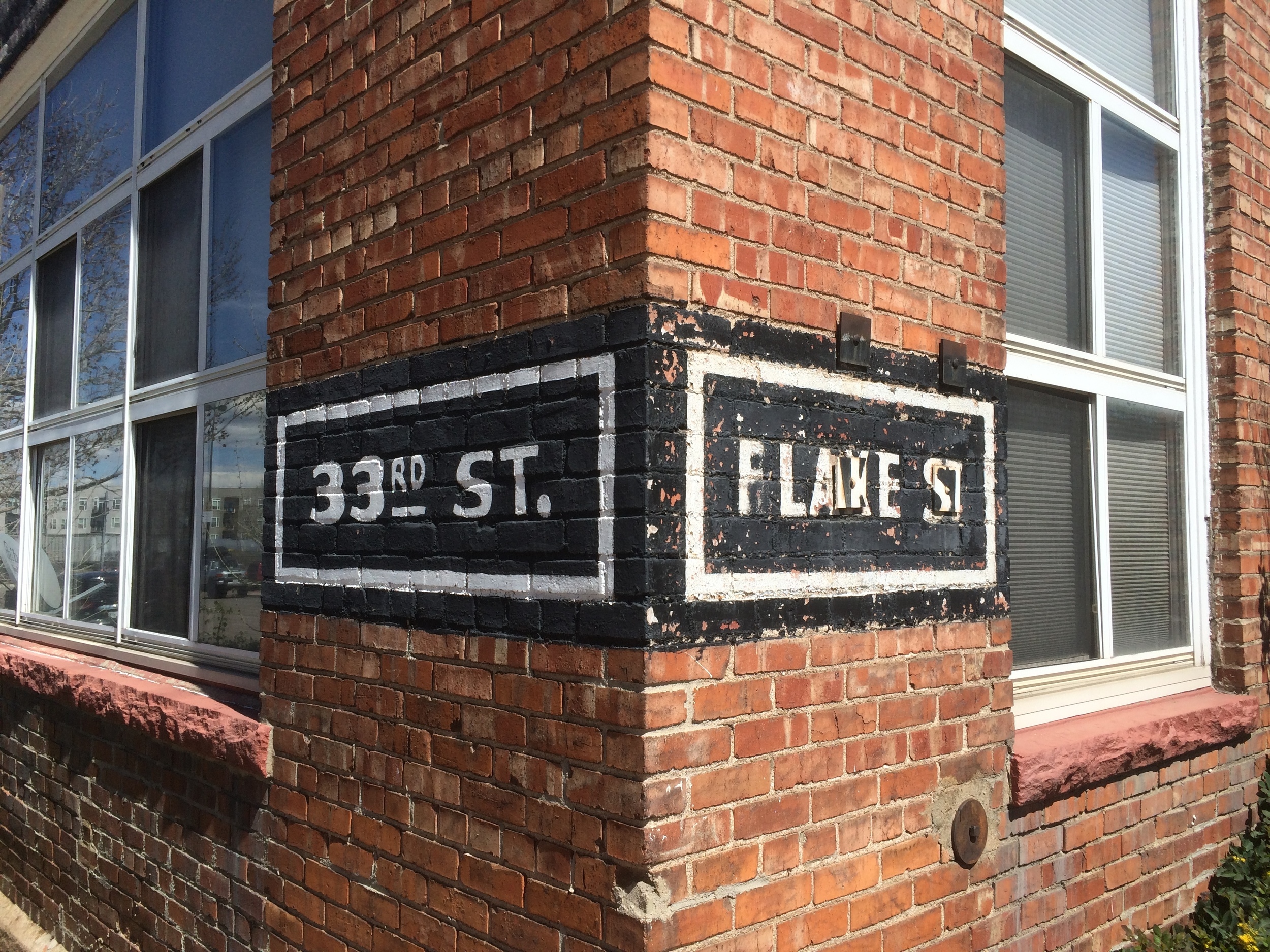
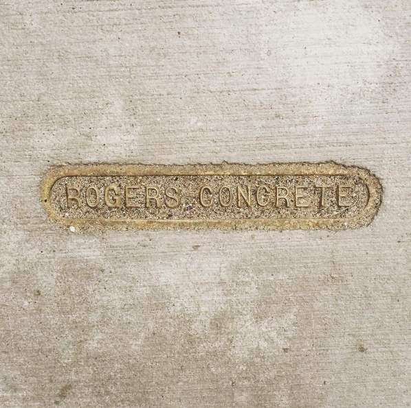
Documentation of the typographic gems you find throughout a city can go a long way towards defining a city's unique voice. We've been documenting a lot of beautiful things on Instagram under the #typehuntdenver tag, but there are lots of ways to contribute to archives of found type. The scavenger hunt we crafted aims to get everyone sharing Denver's type in this way. 

Celebration! Celebration is always key because you can do as much documentation as you want, but if you're not sharing them or having the conversations around what they mean to the city then you're missing the point. Denver has a chance to embrace it's fascinating typographic history by celebrating what that history is and means, and then instilling it into future growth.  

We believe that typography is a major part of what comprises our global, national, and local cultures. Therefore, the preservation of our typography is the preservation of our culture. 


After the talk, we sent everyone out in teams for a type Scavenger Hunt in the RiNo area. Folks snapped up some great photos, but there were a LOT of clues left unfound! There are lots of vibrant photos from the hunt you can see in the #typehuntrino tag on Instagram, or if you find yourself in the area, contribute to it yourself. It was so great to see people come out to share in an experience with other people, and to explore a part of town that has such a rich and vibrant type history. If you're reading this and you're not in Denver, We challenge you to not let the history of your community fade. 

Big thank you's go to Cate and Lauren at TedXMileHigh Adventures, Pon Pon for the killer space for the event, and to everyone who came out. We're looking forward to more type events like this one! 

...ON GETTING INTO THE #PATCHGAME

Get To It 

It's finally summertime, or at least for most of the Northern Hemisphere. With summer comes a lot of amazing things like green trees in the city, hours spent reading by the pool, and cool summer drives at night with friends. Summer has always been the season for memories. 

When we're really honest with ourselves, summer is also the time when memory making can also be a major distraction. Unfortunately, work takes work, and reminding yourself to get the work done before the fun can start can be the hardest part. That's why we're getting into the #patchgame. 

"Get to it."  It's as simple as that. This has been something we've found ourselves saying around the studio lately. This simple mantra has given us a little extra focus as the days have been getting warmer and the mountains have been calling a little louder. Realizing we liked these three words together made the decision to bring it to the shop an easy one. 

We created these simple patches that can be worn on your sleeve, jacket, pack, or really wherever. Designed in two colors—white and navy—, and using our Guilder Regular type, they make a simple and effective statement. 

We worked with a local Denver embroidery to create these patches. They're not your mass-produced patches. Their hand craft is evident and designed to be sewn onto any surface. (No ironing!) It's the real deal. Made with love, by hand, for you.

So if you're like us and you've got a lot on your plate but waning motivations, these patches are a perfect get. There's no time like the present, seize the day, carpe that diem... get to it! 

...ON MOTHER'S DAY CARDS

Heads up! Mother's Day is Sunday, May 8th! 

Now, if you're a good son or daughter, you've had this date marked on your calendar for weeks, and you've already arranged for flowers, cards, and all the online deals you could find to be sent to your mom's doorstep. However, if you're not as astute and have managed to let the date blow past you yet again, we've got you covered. 

Now, it's not much, but it's at least something. We drew up a super easy Mom's Day card with a simple message for you to send your mom's way to prove that you didn't actually forget this year! Simply print, fold into a card, write your message, and drop that puppy in the mail. (Sure, the letters are red, but it prints out just fine in Black & White, too.) 

Download a foldable card file here. 

HAPPY MOTHER'S DAY

Kyle ReadComment
SPOTLIGHT NO. 4

CNN SANS

The topic of Font Licensing has popped its little head into the global conversation once again this week with CNN presenting its very own new font: CNN Sans. The resounding immediate commentary on the font family is that it's pretty much Helvetica, which is hard to refute. But CNN is pumping the e-airwaves with videos and chatter about how its the new original face of CNN. 

What's interesting about the conversation this time is that it's not just about the fact that you should license fonts, but it extends the focus to the pros and cons of buying a large corporate licenses versus having your own custom typeface designed. 

It's a bummer that a lot of these conversations tend to end with clients deciding that getting a slightly modified version of something well known like Helvetica instead of getting something truly original commissioned is the right way to go, but I can see where they're coming from in several respects.

Monocle 24 recently took a swing at the conversation in their radio Monocle Daily program, highlighting reasons for and against CNN's new font family (i.e. is 36 weights really necessary?) and a little perspective from the font industry itself in the form of a Bruno Maag shout-out. Personally, I'm just excited to see people talking about this matter of buying or commissioning fonts at all.  


SPOTLIGHT NO.3

BIG — Illuminated Typography

The Danish Bjarke Ingels Group, or BIG, has put their cards on the typographic table with their recent modular lighting system. These designer lights are engineered to seamlessly fit together (so cool) to create any letter of the alphabet with no more than 4 joints. BIG states the goal of the project was "to design a new font that translates into light, an alphabet used to write and express thoughts, a tool to give shape to spaces." Take that bauhaus. Although we're not usually fans of oversimplified mathematical types, this project is a brilliant typographic design solution for an adventurous medium. 

See more of the BIG project on the Artemideblog

SPOTLIGHT NO.2

Glasgow Roadliners for O Street

It's Nice That had an excellent feature on O Street and their unlikely recent collaboration with street painters or 'Roadliners' to re-brand the UK based design studio. This is a brilliant campaign all the way from the research and respect for masters of an unseen craft to the application of the branding in an absolutely modern way. 

The real shining star of this project is the typography, drawn from the real world. We're often asked as studio, "How can typography really bring anything worthwhile to the brand that a good graphic designer can't?". Our response is always "A designer is only as good as his tools, and typography can be your Excaliber. This collaboration is a perfect example of that. 

View more of this project on It's Nice That. Or, see more of the branding application on O Street's studio site