Posts in TWFTD
This Week From the Desk

The annual ATypI Conference happened this week in Montreal. The truly international association for Typography presented talks by designers, type designers, and typographers of all kinds. If you weren’t able to make it, ATypI has graciously posted all of the talks from this year’s conference to this YouTube playlist so you can binge watch the 3 day event, Netflix-style. Thank you, ATypI. 


Here’s one to put on your calendar. TypeThursday is doing something they’ve come to be very good at: fostering a community around the design and discussion of typography; this time in the for of a Gallery show. The show features selected works from 5 type designers who are making a name for themselves with original and forward thinking designs. “What You See Is Not What You Get” is currently on display at Farmingdale State College in Long Island, NY until November 15th, with a lecture and show reception event on October 3rd. Curious what the future of type design is shaping out to be? Well, here’s a good idea. Learn More about the show and Lecture Event at TypeThursday


The Adobe company from the west, Typekit, has launched early access to its latest product: a Font ID Tool they’re calling Visual Search. It does precisely what the name implies, searching the deep Typekit catalog of web typefaces by your own uploaded image. This ability to search by found image is not exactly anything new—it’s a move to match MyFonts’ ‘What the Font’ visual search tool—but it does seem to be a helpful way to discover quality typefaces you may not have otherwise landed on. Check out the complete tool on Typekit. 


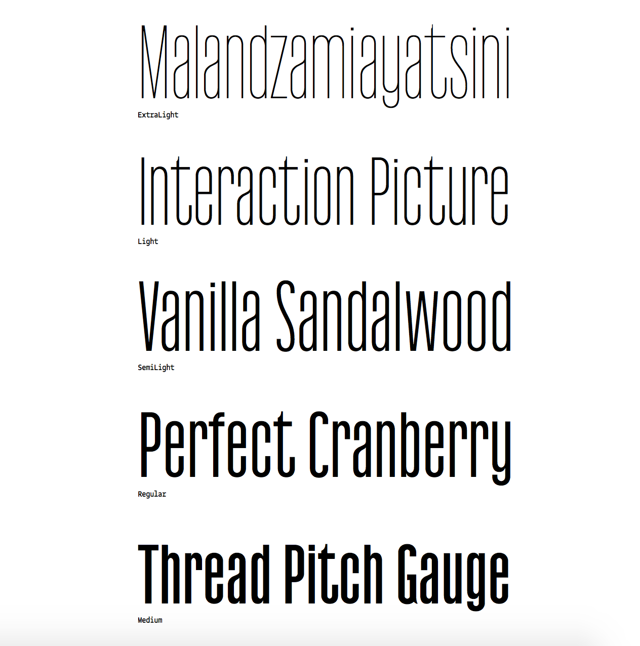
Typewriter fonts have certainly found an audience in the last few years. Typefaces for coding, for display, historical accuracy, or just nostalgia. This week, Feliciano Type Foundry released the newest addition to the Typewriter genre with Marcin Typewriter: a 6 weight family with italics designed to sit with the rest of Feliciano’s Marcin Families. They’re edgy, and a little crude at times, but provide a certain air of authenticity when set in long text. It feels like a typewriter typeface. See more about the family here


In a follow-up to her successful Font Purchasing Habits Survey, Mary Catherine Pflug is dipping back into the world for more data with the Type Designer Survey. Pflug states in her description of the project, “If you’re a type designer, I invite you to share your thoughts on the hard-hitting topics facing type designers and the type industry today like discounting, plagiarism, challenges of selling, and threats to our industry.” This kind of data is essential, and so needed in our industry. If you are a type designer, please make your way over to the Type Designer Survey to lend your answers. 


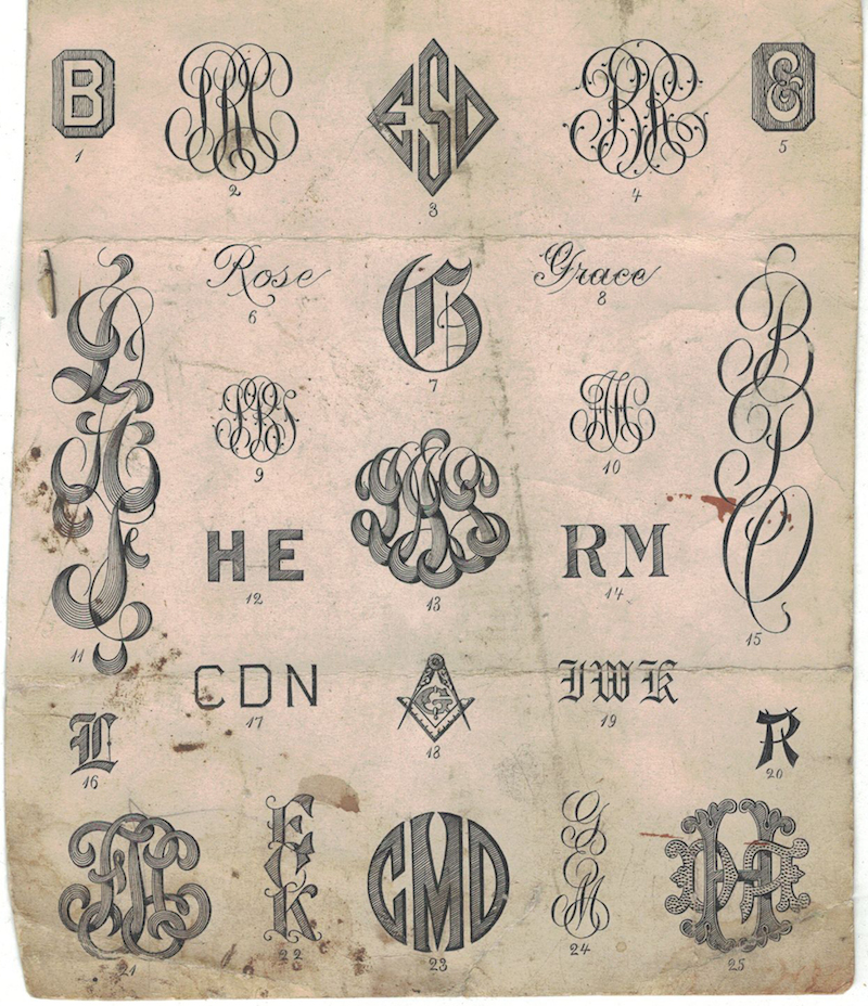
The typographic gymnastics performed by Herburg Weiland are something to take notice of. His work—comprised of zines, editorial designs, posters, and experimental pieces—is profiled by It’s Nice That. It’s certainly worth a minute or two. 


P22 has been creating historically inspired typefaces for well over 20 years. Their latest release is Aetna, a [type description here in 4 widths]. If the name sounds familiar, you’re not alone, go into how its a revival. Designed by Aaron Bell, this type is wily, thorough, and perfect for your wood type project needs as it packs in so much of the useability of the original wood type into this digital package. Did you see the family includes a ‘Streamer’ collection for full chromatic type capabilities on this thing?

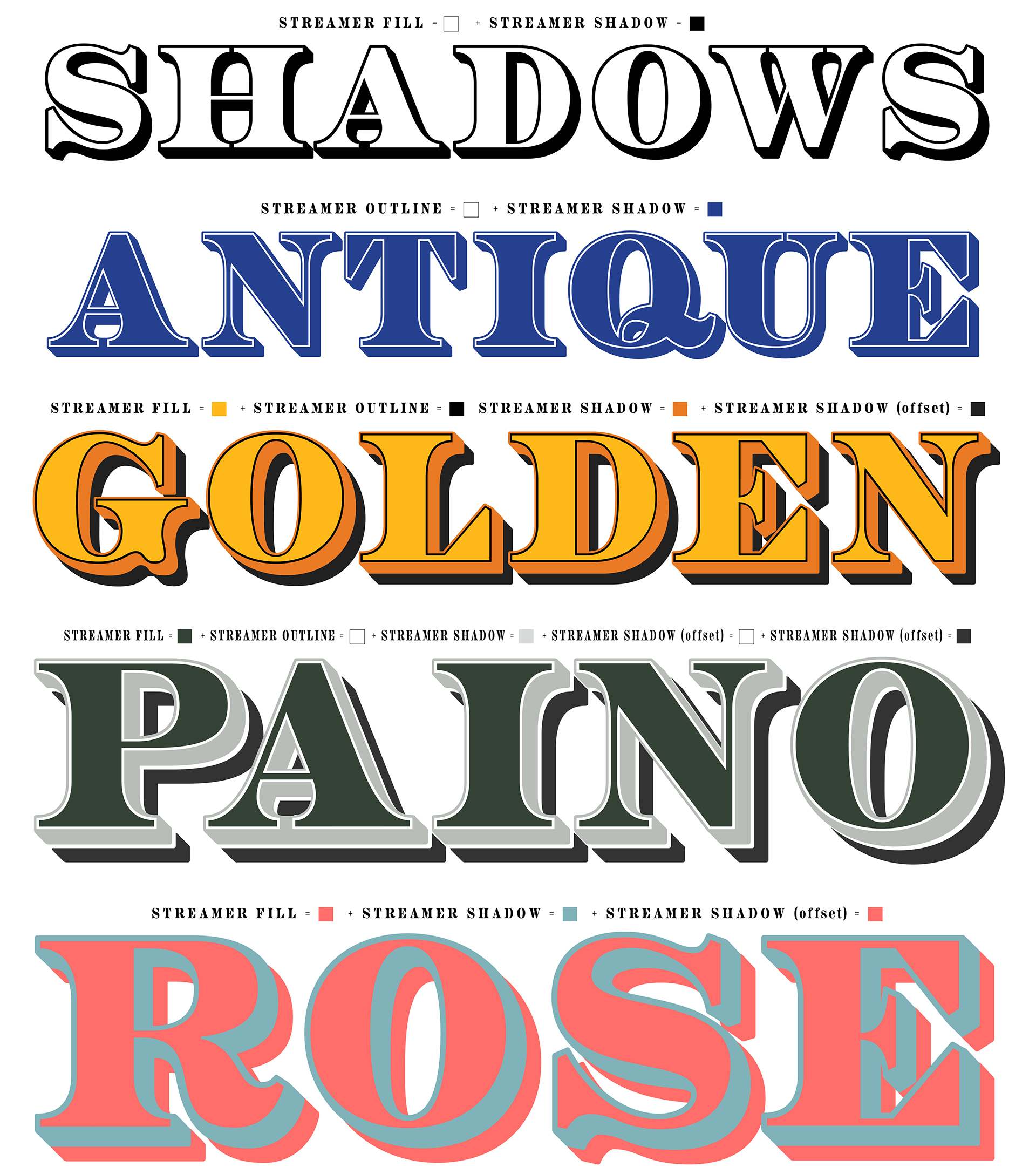
The real value here, aside from buying a quality typeface, is that 100% of each purchase benefits the Hamilton Wood Type Museum in Two Rivers, WI. Read more about Aetna and buy it here. Also, don’t forget to check out the physical font cut into wood type for the museum by Virgin Wood Type. Incredible.


The Hamilton Wood Type Museum, favorite mecca for the Wood Type aficionados among us, has announced dates for their 2017 Wayzgoose. “Now in its ninth year, the Hamilton Wood Type & Printing Museum annual Wayzgoose Type Conference hosts designers, printers, typographers and letter geeks of all stripes from across the globe.” The conference will take place November 3, 4 and 5 and has lined up some can’t miss speakers, including Gail AndersonJonathan HoeflerBrian & Kim FrenchBrad VetterCarolyn PorterJulie SolaJenny WilksonPatterson Clark and more. Check here for the Wayzgoose schedule and see more about the speakers here


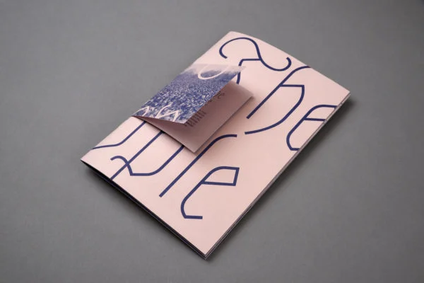
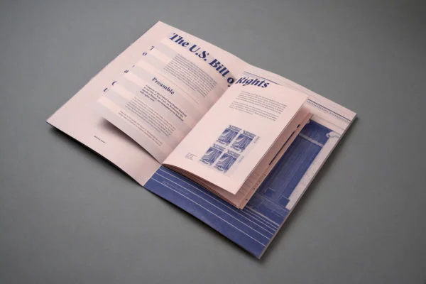
Inspirational printed matter this week comes from Blok Design and their catalog for the Toronto International Film Festival. If anyone knows how to get your hands on this catalog, let us know, we certainly wouldn’t mind a copy floating around the office. 


TWFTDKyle Read
This Week From the Desk

This week, we find our desk in a different location. We have moved our office from the trees and rocks of Denver, Colorado to the palms and sands to San Diego, California. We’re happy to have moved to the West Coast, and can’t wait to continue to bring the world of type to you from a new perspective. 

This week, however, has been distracting for several reasons besides our move west. With hills and mountains from LA to Colorado engulfed in several wild fires, an earthquake off the coast of Mexico, devastating floods in India, Hurricane Harvey having drowned out lower Texas and another hurricane, Irma, leveling the Caribbean Islands and gunning for Florida and the southern US... it seems like the world is quite literally out to get us. It’s been hard to focus on the importance of fonts and the business of making letters. But there has been a lot to celebrate this week in the world of typography, and that’s part of what this briefing is here for: to bring a bit of calm and interest amidst weeks of distracting news and heartbreaking events. 

Be sure to sign up for the email dispatch of This Week From the Desk, where you’ll find even more insight and news form the world of type. Have a great weekend everyone, and good luck. 


Klim Releases National 2

Building on top of what was already a momentous design, Kris Sowersby of Klim Type Foundry has updated his National Type Family in almost every way, and expanded it's ability and scope. Now containing 64 fonts over 4 widths, National 2 is a “comprehensive expansion of National’s original aesthetic concept.” As is the case with most Klim releases, you can get a more insightful read into the origins and details of the complete project on the Klim Blog


Typotheque released a set of Devanagari companion fonts to their seminal Greta Type system this week, in explosive fashion. “Greta Sans Devanagari is the largest typeface system of interrelated styles produced for any Indic language, suitable for small text and headlines.” says Typotheque. The family consists of 80 styles for Devanagari, which aids in Greta's far reaching language representation. Read more about what Greta Sans Devanagari has to offer and explore the colorful specimens (designed by Shiva Nalluperumal) at Typotheque


Production Type released a type family this week that has been in the works for a long time, and springs from fashionable roots. Antique Gothic is Production Type's commercial offering of a private type system created for Louis Vuitton back in 2014. This new expression of Antique Gothic is delivered with three light weights, a regular, and medium weight. The lack of bolder weights is a tasteful choice here, honoring the origin of the types themselves. Buy and discover more about Antique Gothic at Production Type


It looks like our friends from Across the Atlantic are headed this way for a whirlwind trip through Canada and the USA, bringing goodies and toys for us all. Their Roller Coaster Tour is bringing 5 lectures and 2 workshops to 4 cities in 6 days in the month of September. A roller coaster indeed. Learn how you can get connected to all the tour's events on their own event page


Optimo Type Foundry released a sturdy condensed Sans this week called Next. On first look, it seems rather devoid of anything worth writing home about, however the character does start to emerge with a little time spent. The turned out flares, of the lowercase a, the strange cuts on c's and g's, and then the alternates which seem to have no restraint when it comes to the rules set by the other glyphs.... Interesting things happening here. See the full family on the Optimo site


The home to display fonts both famous and infamous, Virus Fonts, has a new site, and a fresh take on their deep catalog of display and text typefaces. Perfect for the rebel, protest sign maker, or counter-culturalist in you, the work of Barnbrook Studio has got you covered. See all the Virus Fonts in a new light on their redesigned site


Type Network announced this week that it has partnered with Garage Fonts to bring the famed type family Freight to it’s ever-growing collection. Freight is a design produced by Darden Studio that has found success in wide distribution through Garage Fonts. Garage Fonts’ partnership with TN means that the 4 style family can reach an even larger audience. Freight is a masterstroke of type design (we use it on this site). Check it out for yourself at Type Network.

TWFTDKyle ReadComment
This Week From the Desk

Having been in the works for few years now, Positype has finally released Scotch, a slender and wily Scotch Roman in 3 varieties. Neil Summerour has injected a bit of a new wind to this genre—populated with other well known families like Miller or Harriet—by adding a “Deck” expression to the family... something between Text and Display. Its handsome, expressive, and reminiscent of a bygone era of mid-mod furniture and weekend drives in the Cadillac. Scotch is available through MyFonts


It’s rare on this platform that we would talk about something before it is officially released, but this is just too exciting to leave unmentioned. Bethany Heck has been working away at creating a platform for intelligent discourse on quality fonts since she saw a need after attending the Typographics Conference this year:

“We need more discourse and analysis around the usages of typefaces by designers, for designers. So, I’m going to start the Font Review Journal, where I will be talking about the general aesthetics and historic influences of typefaces while spotlighting unique letterforms or characters and breaking down what a font excels at and what it has a harder time with.” —Bethany Heck

The Font Review Journal will launch next week, and you can be sure we’ll be sharing it here. For now, see a few previews of what the FRJ could be on Bethany’s Dribbble.


Creative Mornings has always been a source of inspiration. This list of 12 Talks from Founders on Big Ideas and Humble Beginnings is a great resource to help you recharge this weekend. 


Online publishing platform Medium has done another about-face on their logo, to lukewarm reception. It's easy to see why when you examine the reasons or needs for this change. Medium has always had a fantastic eye for typography on the web, making it a central part of their product. Perhaps this new wordmark shift is in homage to that, but it's unlikely. Read more about Medium’s change on Brand New, or see how the new identity plays out on the redesigned site itself.


The annual typography conference put on by SoTA is happening right now (Aug 23-27) in Boston. Of course, nothing beats actually attending this conference, but if you’re not able to be there this year you can follow along on twitter and instagram under the hashtags #typecon and #typecon2017


Monotype’s trade publication The Monotype Recorder has been a cornerstone of the company’s outreach and education initiatives for a few years now. The publication has been filled with everything from typographic eye candy to thought provoking long form articles on type history. This week, Monotype opened up the Monotype Recorder Issue #5 for sale—to be shipped August 25th. Grab a copy here. 


TWFTDKyle Read
This Week From the Desk

It’s certainly been a week. This is the first This Week From the Desk post that coincides with the new email dispatch published at the same time. For this week, and all the weeks in September, we'll be publishing full edition TWFTD posts here on the Blog in concurrence with the inbox dispatch. However, once October hits, the blog edition of TWFTD will become the abridged version! We would love for you to sign up now to get our beloved weekly review in your inbox every Friday to make sure you get ALL the news and stay connected to the latest in the world of typography.


Louise Fili announced her latest type release at the beginning of this week: Marseille. Louise Fili's lauded studio has been able to bring true international design style to her work, and lately to type design. Fresh off the heels of the Italian delicacy Montecatini, Marseille takes us to France with its traditionally French Art-Deco character and alternates that practically put the croissants and chocolates in front of you. You can buy Marseille on MyFonts


Since releasing the “Untitleds”, Klim Type Foundry has been on a tear of making type real for so many. This week we saw this taken to the extreme in a stroke of brilliance for a gallery show of the types and related works at Object Space in New Zealand. It’s hard to argue that the most enticing parts of the exhibition are the sculptural periods, or full stops, from Untitled Sans and Untitled Serif. Original, and beautiful. If you find yourself on that side of the globe, stop and see the show soon; it runs until September 17th. 


Pelago. It’s Crystal Clear. 

The Adobe Originals Team has released their latest lab creation—Pelago—to Typekit. Adobe describes the new family as this: “Pelago is a semi-formal sans-serif type family by Adobe Principal Designer Robert Slimbach. The family has a crisp contemporary appearance and an understated elegance.” No kidding. We’d like to translate this into easier language... It’s clear as hell. Pelago is absolutely at the top of the digital readability game, and I hope to see this design become well used and well loved out over the coming decades. See for yourself at the full Typekit specimen page


The work of Studio Panorama blitzed across the desk this week in a streak inspirational flash, fresh with posters and experimental graphic design to keep the conversation going for a while. The work is a glimpse of the future, while bringing a note or two in from the past, culminating in a statement of where the studio thinks the world of graphic design is headed. We're inclined to start listening. Read more about their studio feature on It's Nice That


Landa is the latest release from prolific type foundry Sudtipos billed as “A rendez-vous between Nicolas Jenson, Oldrich Menhart, and nature itself”. Although the foundry is usually known for well crafted and inventive script fonts, you would be foolish to forget their ability to create a text face that will knock your socks off. Landa is filled with quirks, breaks, angles, and corners. The italic looks like still photos of someone with a snake in their suit. But terrible similes aside, Landa is a masterfully fun text family from a master of type design. Landa is available now at MyFonts.


Norwegian graphic designer Johanne Lian Olsen’s Due Display type popped up this week as the latest addition to the tall sans for editorial trend, and it's worth a deeper look. Olsen injects subtle quirks into this design to break out of what most of the tall sans projects inevitably end up being. The real spark in this typeface comes out in the specimen she designed to promote Due. See the full specimen Johanne Lian Olsen’s website


It was announced this week that global type company Monotype’s recent type project ‘72’ for SAP was awarded a Red Dot Award. After looking up what a Red Dot Award is, and reading up on the design process for this custom type family, it’s safe to say that this award is well deserved. The evidence is in the details of this design. Sometimes corporate level font projects can be rushed or turn out to more thumbs down than up, but designer Terrance Weinzierl designed a sturdy product for SAP here. Congrats on your Red Dot, Monotype. Read about the entire 72 Project here


The instagram account @thecheesefanman (Anthony Millard) flew by the desk this week with some colorful and cheerful vintage type eye candy. Vintage Cheese Labels. Enjoy. 


TWFTDKyle Read
This Week From the Desk

Type Network has been keen on capitalizing on the recent evolution in font technology: Variable Fonts. But it's going to take a little more education to make the promise of this new technology a reality. David Berlow, writing on behalf of Font Bureau, expresses his view of variable fonts published the second installment in a series on variable fonts: Opentype Font Variations. 

It's a helpful guide to getting up to speed with everything that's been going on in this arena (as well as a thorough plug for Amstelvar, Font Network's highly visible variable collaboration with Google). Read about it all on the Type Network Blog.  


A Whirlwind Tour Through the History of Monograms

The Illustrious Nancy Sharon Collins offered up this quick but fascinating walk through the history of monograms and cyphers on the Print Magazine blog, complete with plenty of visual fodder—enough to give Pinterest a run for its money. Read and see all the historical splendor here


Regardless of how you feel about the world needing another large grotesque sans family, Marcin Antique was released this week and it's worth checking out. Feliciano Type Foundry presents their new 16-style family with historic context, design process, and a deep PDF Specimen. It's always fascinating to see how designers step up to the plate to take a swing at the Grotesques... this at-bat by Feliciano is worth a watch. Discover and buy Marcin Antique here


Just a little visual inspiration this week: this instagram video posted by @klassethomas. Warning, you might get stuck watching this several times over.  


It was announced this week that Paul McNeil of Muir McNeil will be publishing a reference compendium and review of printing types with Laurence King Publishers in September. McNeil describes the book as “a comprehensive, detailed survey of the major typefaces produced since the advent of printing with movable type in the mid-fifteenth century to the present day.” The book is now taking pre-orders. Can't wait to see what is presented in this volume.


The Loveliest Living Fossil Indeed

H&Co and been publishing a deeper look into some of the characters that don't often get their day in the sun. This week, the company focused on the Numero sign, presenting all you'd ever want to know about it—and a few other similarly obscure characters— in order to impress your friends at trivia night. A good read, and looking forward to more, H&Co. 


TWFTDKyle ReadComment
This Week From the Desk

Schriftlabor has just entered the retail market with four font families: Attorney, Galata, Lawabo, & Traction. The release marks the launch of a new retail site for Schriftlabor and a move towards more font releases. You can try them for free, buy one, or buy all four families as a package. 

*Note: Rainer made a presentation on the early stages of Galata at TypeCpn a few years back showing off the built in games you can create with Open Type. Its great to see this concept come to market. 


This week and next, Badson is a guest editor for Ello, curating a collection of posts on the current state of poster design. Some historical, some iconic, but mostly new hotness. If you're not on Ello, sign up now. 


We received a few goodies int he mail from Colophon this week, one of them being their Bespoke Newspaper Catalog. It's a worthwhile buy, and special addition to the archive of newspaper specimens. (We're collecting, so if you have one or know of any others, let us know!) Grab your own copy here.  


Type@Paris, 2017

The latest graduates form Type@Paris program have their work up for presentation on the Type@Paris website this week. There is a consistently high standard for student projects established in this program, and the hard work shows. See all student projects here


A Renewed Constitution

Steven Heller's weekly column for Print Magazine this week presented a project by ThoughtMatter has gotten a few gears turning... The Constitution of the United States, designed and published in print like never before. It's actually a kickstarter and worth a look. The paper and ink colors are a bit too trendy for me, but I'm more than excited to pick up a copy anyway.