

Week 43
New Release: Peristyle by Hoefler & Co.


H&Co. released Peristyle this week—a family of 9 fonts including a stencil style and color font capability—with a look as if out of another era. H&Co have a certain eye for delivering fonts that designers want to use, and Peristyle seems to carry that torch well. Perfect for all kinds of display uses, Peristyle brings even more versatility to the H&Co. library. Discover more about the design process and potential of H&Co.’s latest release on their website here.
MyFonts Fontacular

Today, Friday the 27th of October, is the last day of MyFonts' annual Fontacular event, where a large collection of fonts available on the site are offered at large discounts and new prices. Regardless of how you feel about discounted font sales, the Fontacular is a great way for you to refresh your font lists and get inspired for new projects. One of the more interesting ways this event presents its deals is in the form of bundles by foundry (there are 50 represented in the sale). So, if there’s a certain foundry you’ve been waiting to grab fonts from, now is your chance.
Butterick Checks in on Variable Fonts

Matthew Butterick revisits his predictions from 2016 on Variable Fonts. The original article is still a fantastic ‘how did we get here’ primer to Variable Fonts, and his follow up published this week at the end of the article gives a great touch base on how things have gone since. It’s worth your time to catch up and read the entire piece on Matthew Butterick’s solid and often entertaining blog Practical Typography.
Release: Two New Additions to the Duplicate Family from Commercial Type


The gents at Commercial Type have expanded their Duplicate Family this week with the addition of two new styles, bringing the total number in this collection to 5: Ionic, Sans, Slab, and now Soft and Round. The Soft and Round Styles of Duplicate are particularly notable because of the inclusion of a few unconventional details not usually found in rounded sans styles in their design. Ball terminals and casual stroke endings bring these new typefaces into a realm of possibility that branding agencies will love. Purchase the entire Duplicate Type Collection, or just your favorite style, at Commercial Type.
Release: Newson from Revolver Type

Lukas Schneider who heads up the Revolver Type Foundry has been on a tear of great type releases this year, the latest of which is Newson: a solid humanist sans with a stoic professionalism. You can envision using each of Newson’s 7 weights in roman and italics for everything form corporate identities to web blogging in style. Read on about Newson and buy the family at Revolver Type.
Stumptown Evokes the Power (and Wrath) of Hobo

Perhaps you saw the rebranding efforts put forth by LAND for Stumptown Coffee Roasters’ new packaging this week. Perhaps you noticed the toned colors and tattoo-worthy graphic illustrations peppering the design. Perhaps you even noticed the not-so-subtle use of Hobo illuminating the name of the beans inside. If you did, surely you have formed an opinion about it. The design world has seemingly lost its mind over this one type choice and split those in it into two camps... Hobo, or no Hobo.

We wanted to take a minute to stand up for this design and praise its rejection of the easy solution: one of expected slickness and digital cleanliness. These are coffee bags, and deserve to have a little fun. The use of Hobo is always a deliberate choice—no one ever uses Hobo by accident. This is a perfect example of how type choice can communicate deeper than the words ever could.
Read more opinions and details in the Brand New Review of the rebranding.
Linotype releases Rosella by Sabina Chipară

Rosella is a family of layered fonts inspired by the classic Engravers Style serif but engineered for display uses in the modern age, designed by Sabina Chipara. Rosella consists of 6 styles that you can mix and match to achieve all new levels of typographic expression. Published by Linotype this week, Rosella is a great way to help your font library break out of the habit of neutral sans serif types and text faces. You can buy Rosella at Linotype.
Swiss Typefaces Releases SangBleu
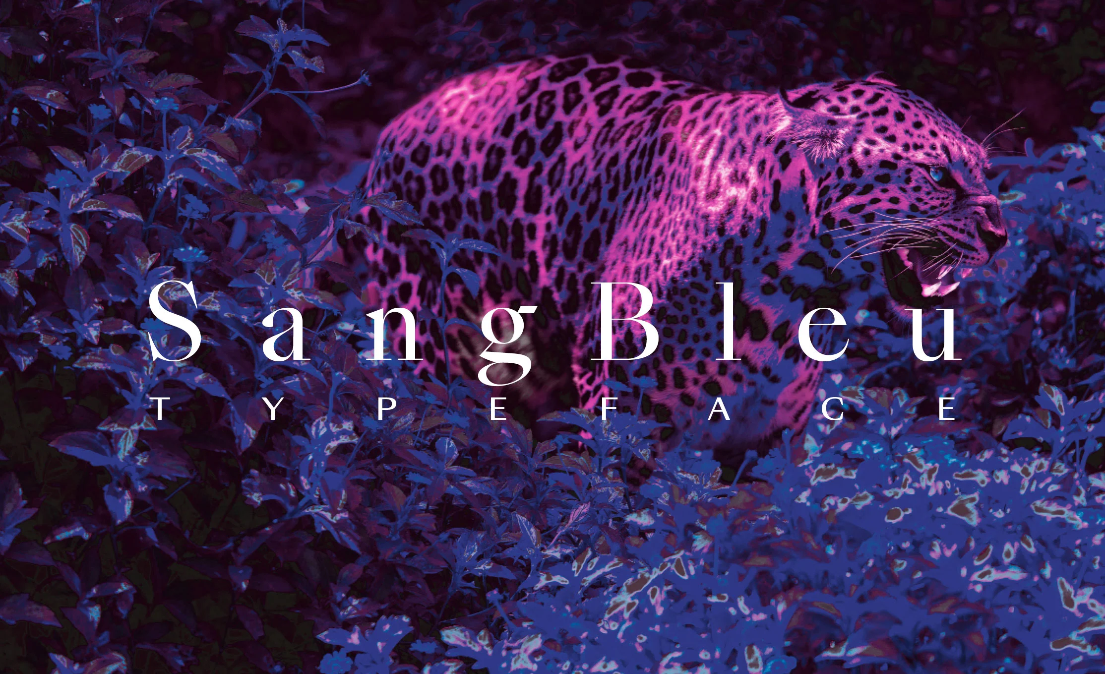
Swiss Typefaces, perhaps best known for creating future-forward, modern type designs such as Simplon and Euclid, dropped a major collection of typefaces this week in the form of SangBleu. SangBleu is a font collection that encompasses 5 different styles built on the same chassis making a total of 45 new fonts. Empire, Kingdom, Republic, Versailles, and Sunrise each have a different typographic genre in their sights and each seem to exude the same brash spirit and ambition. It’s really a masterful work.

If the name seems a little familiar, you’re not wrong. Swiss Typefaces had released a family under the same name a few years back, but the release this week is intended to completely replace it.
“The new SangBleu supersedes our previous typeface of the same name, which, together with Romain, has been discontinued. It is not an update, but a completely new design, consisting of five full-featured collections: Empire, Kingdom, Republic, Versailles, and Sunrise. Each one comes in four or five weights, all of which are accompanied by matching italics. At 45 styles in total, it is our most ambitious release so far.”

It’s sharp, it’s packed with attitude, and aims to be the “Everything Font” collection you reach for no matter what you’re designing. Will SangBleu’s performance live up to the foundry’s track record of popular fonts? Only time will tell. Learn more about the entire SangBleu Collection at Swiss Typefaces.
TDC63 Judges Choice

The Type Directors Club has published their Judges’ choices for best in show from the TDC 63 and 2017 Typeface Design Competitions. The choices do not disappoint. This year there were a total of eleven judges that came on to pick their favorite pieces from both competitions. Judge Berton Hasebe’s selection (and pictured above) of Salvaje, originally designed by Cristian Vargas as a Type Media project, is a particularly nice pick. Read more from the Type Directors Club, or wait for these results to be published in the next Type Directors Club Annual.
Release: The Minotaur Lombardics

In case you haven’t seen any type this week that fills that void of ‘weirdness’, Production Type is prepared to help you out. This week saw the release of 6 new fonts from Production Type: Minotaur Lombardic and Minotaur Sans Lombardic. The two sets are the latest additions to Production Type’s decisively weird (and decisively awesome) Minotaur Collection—fonts designed exclusively with straight lines.
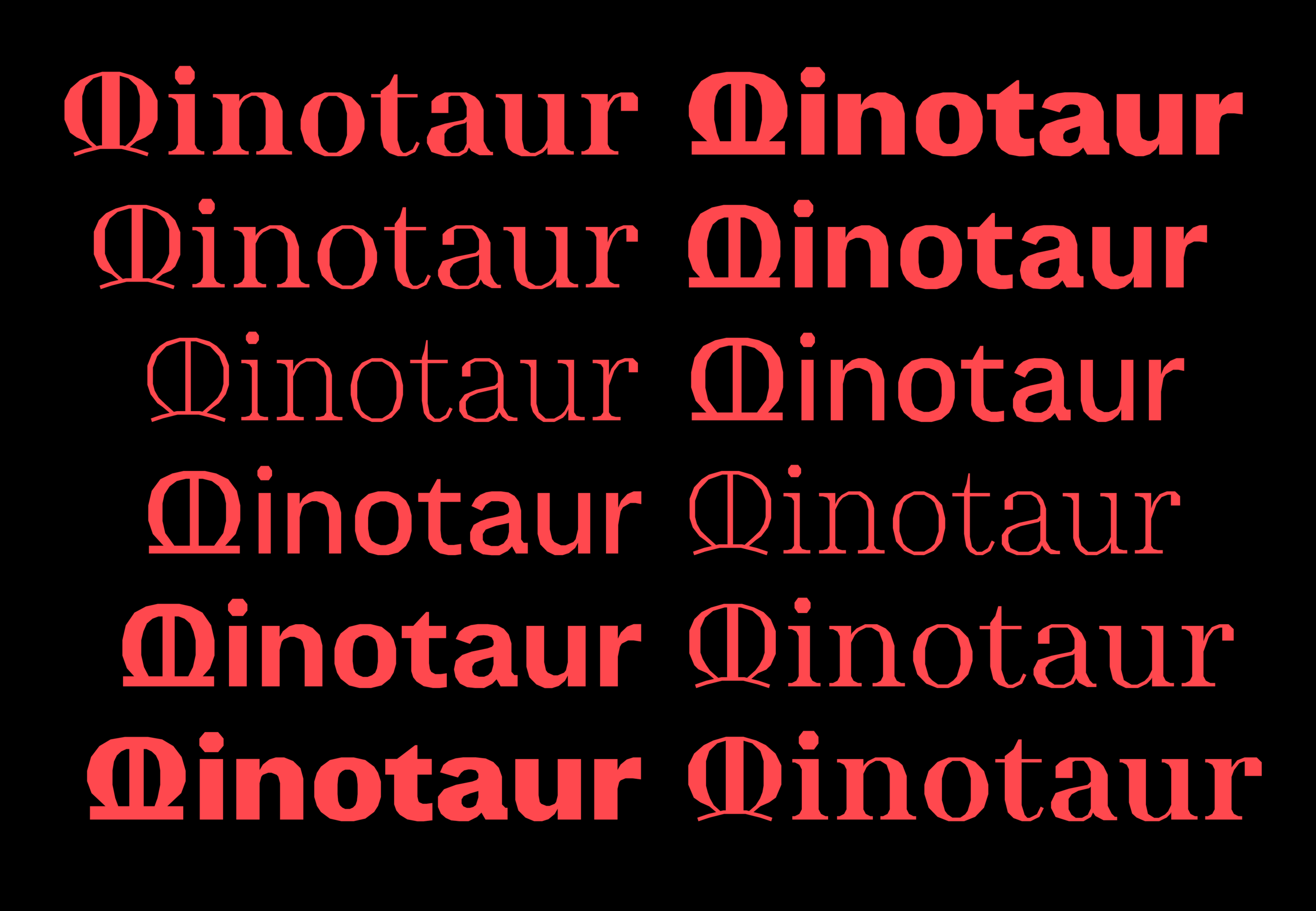
So, what does Lombardic Mean? Well, the Lombardic Style is one of expressive Capitols and letterforms not afraid to expose their origins in the pen. The fact that Production Type saw a need to throw these styles into the Minotaur Collection says a lot about the disruptive nature of the foundry and designers.
Explore what the heck is going on with these captivating fonts from Production Type.

Week 42
Say Hello to IBM Plex
IBM has an all new face, rolled out by the large Technology and Business giant this week. IBM Plex is their first bespoke typeface, built specifically to drive the company away from the Helevetican crutch they’d been dependent on for decades. (This actually might be the the most interesting part: the clear cultural statement moving away from Helvetica and into types that represent more contemporary design perspectives.)

Plex was designed by Mike Abbink—the man behind major Corporate typefaces for clients such as USA Today, GE, and NBC Universal—and independent type founders Bold Monday with an expert touch for the needs of the global company but also the possibilities of the future with three versions: Plex Sans, Serif, and a quirky Mono. Keen readers may note that this type face has been out in the world for a few months now. IBM and the typeface designers decided to put it out in the world for free. You can discover more about the typeface and download the collection in this helpful instructional page.
Need more? This IBM “Eyes On” video clip shows a little process behind the development of IBM Plex. (The IBM Plex feature is really in the first 5 minutes of this video.)
Now You See It, Now You Don’t.

Can you believe it’s been over two years since we saw the last book release form the eponymous Pentagram Designer? The wait is over, as you can now pre-order Michael Bierut’s latest book Now You See It, Now You Don’t, a collection of essays on design—to be published Nov. 7. If you’re new to design and typography, this book will enlighten you. If you are a seasoned professional, this book will bring you back home. You will be able to purchase the book pretty much anywhere, but we recommend your local book shop.
A New Colophon Specimen for Visuelt

Wind of the latest type specimen from Colophon Foundry flowed through the office this week, and thgouht it was worth a mention here. Colophon has always had incredibly high-quality specimens, and engaging ones at that. You can snag your copy from this limited edition here.

The Mohawk Quarterly Issue Number 13

Disruption is an inescapable word these days, used to talk about everything from the latest tech out of Silicon Valley to marketing toilet paper. Mohawk Paper investigates what this means in the latest issue of their in-house magazine/newspaper The Mohawk Quarterly. Lucky number 13 is packed with beautiful moments only possible in print, visual inspiration for designers and creatives of all types, stirring writing, and not to mention a deep showcase of what’s possible in print on several Mohawk Papers. Discover more about The Mohawk Quarterly and order a copy here.

Note: Mohawk did not pay for this write up. We just think that anything pushing the bounds of print and typography is worth a mention.
A Good Read: “Behind Simoncini’s Glasses”

This piece by Antonio Cavedoni on Francesco Simoncini is insightful, well put together, and just plain ol' fascinating. Learn more about the type designer and mid-century Italian mogul on Medium.
Never Use Futura
Books about singular typefaces have long relished in the dark and dusty shelves of old libraries and private collections. That is to say, they rarely see a tremendous amount of use. ‘Never Use Futura’ by Doug Thomas aims to break that mould. As more of a cultural study of the famous typeface with lengthy and storied history, Doug is able to approach and present Futura in a way that you may not have considered before.
The book’s publisher Princeton Architectural Press puts it this way: “Never Use Futura is illuminating, sometimes playful, reading, not just for type nerds, but for anyone interested in how typefaces are used, take on meaning, and become a language of their own.” We’re sold. The book is available now through PA Press or on Amazon.
Paul Sahre is the Two-Dimensional Man

Paul Sahre is one of the design world’s favorite characters, having worked for all the “fun” clients and creating some incredible work over his 30+ year career (so far). He’s written a book about it all. Stories from his life and experience told in the witty way Paul Sahre does. This one is worth picking up if only for the insight into his process and work, but there’s so much more than that. Pick up the book from Abrams Press.

FPO is Closing Shop

Underconsideration’s blog FPO, devoted to the craft and art of printed matter, is shuddering, and we’re only a little bit bummed. (Kidding, we’re very bummed.) FPO, or For Print Only, was a beacon of light for print nerds and students the world over, in a time where the world was becoming more and more digital every day. The blog felt as though there was “a certain repetition in the content — which is not a critique on the quality of the work but a reflection of the type of projects being put out into the world — that we feel does not match the early output of the blog.” The archives of over 2,400 posts will remain online to access. FPO, you will be missed!