THIS WEEK FROM THE DESK

ATypI is underway in Warsaw, Poland this week, and right out of the gate there was some earth shattering news for the font industry: Variable Fonts. Open Type Variable Fonts are the collective promise of the industry's future on the web. Through an unprecedented level of collaboration of big players like Apple, Google, Adobe, and Microsoft, Variable fonts will allow for entire families to be packed into one font file for faster rendering online and new forms of expression through type in design. There's still lots to read about and learn about this new format, but it is going to be very exciting. Read John Hudson's release details here


Studied, crafted, and sharp, Greg's first release—Robinson—with Commercial Type went out this week. Great work, Greg, I look forward to seeing how this is used out there in the real world. 


Lucas Sharp debuted his new foundry Sharp Type on Village this week, with the headliner being Sharp Sans—the public version of the type he developed for Hillary Clinton's election campaign. It's extensive, with lots of hidden alternate character gems. Check out the extensive write up and buy on Village.


An absolutely fantastic short read on the power of design from the New York Times Magazine, with a special focus on Design's role in the "recent bathroom kerfuffle". Share this with your friends. Design is an understanding that can be harnessed by everyone for better. 
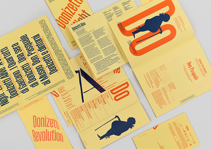

Loving the typographically focused identity for Teatro Donizetti, based in Bergamo, Italy. Way to get a third color from the paper. Read and see more on It's Nice That


TWFTDKyle Read Comment
THIS WEEK FROM THE DESK

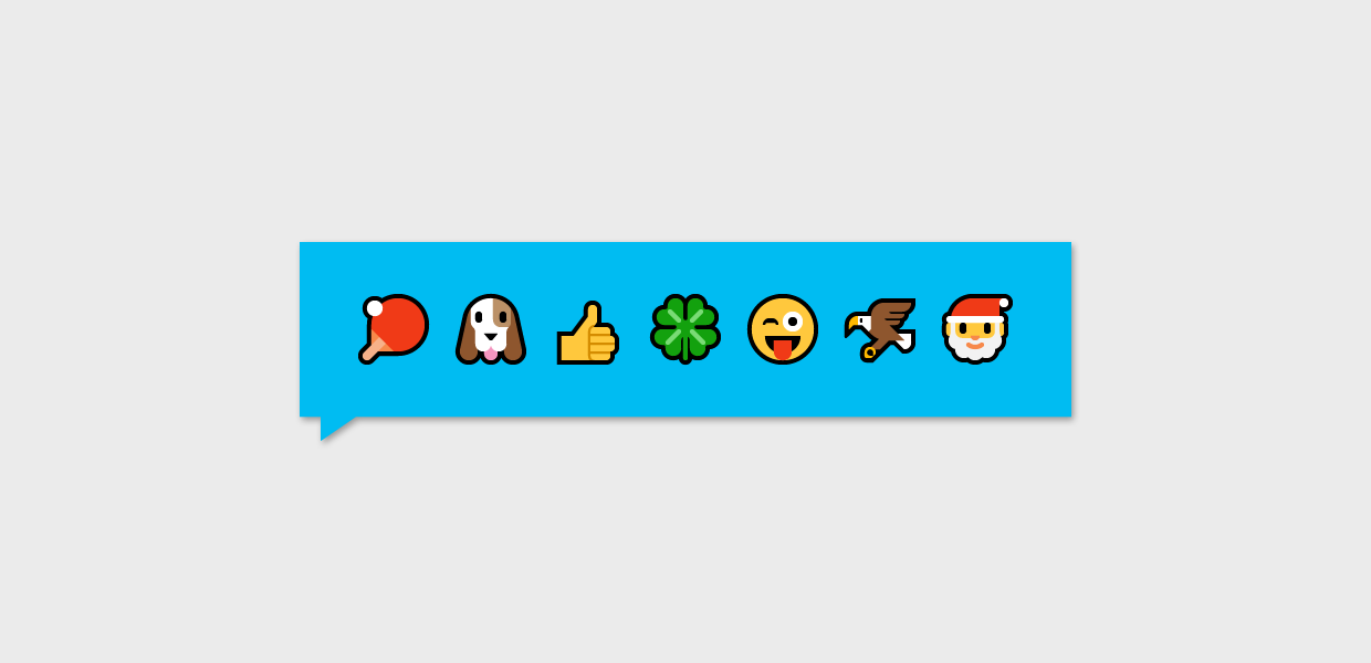
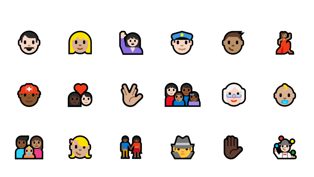
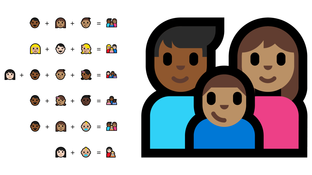
Every once in a while, the conversation on emojis gets stirred up again. This time, it's Microsoft's turn, releasing their new approach to Emoji's, designed by Always With Honor.

It's refreshing to see some new and fresh approaches to emojis from Microsoft, especially their new family maker feature... Lots of info worth checking out on both the Microsoft blog and AWH site. 


Newly Crowned by Print Magazine's 15 under 30, the Yarza Twins have been on everyone's radar including ours. Batavier, their latest type revival is an interesting study in uncovering a quirky display face from history and raising it to make a statement in today's font landscape. 


This is a detailed yet interesting read from Richard Fink on the case of wether webfonts are good or bad. (via A List Apart.)


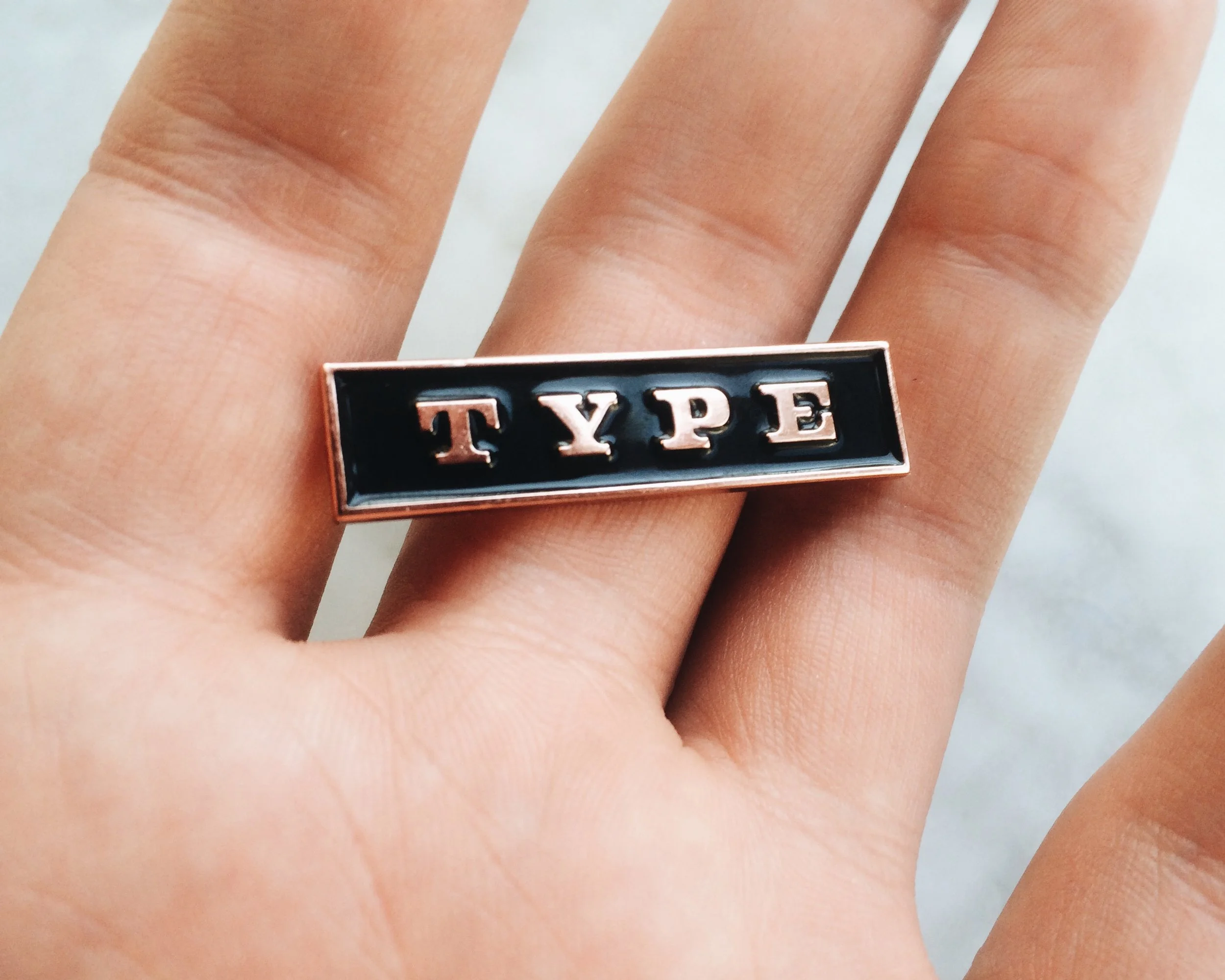
Type Pin
Sale Price: $5.00 Original Price: $10.00

TYPE. 

We love it, you love it, no shame in making everyone else aware of it with this sleek bar pin. Black enamel surrounds hand drawn copper T-Y-P-E, mounting firmly with a double pin back. Wear this pin boldly, for the love of Type. 

We put the new Type Pins up in the Badson Shop this week. Handsome, Smart, Nerdy... type nerds, rejoice! 


TWFTDKyle ReadComment
THIS WEEK FROM THE DESK

This week, we published our full report on what went down at TypeCon this year in Seattle. Themes, ideas, and big takeaways. In case you missed it, check out our full post on Medium.


Nina's long awaited ‘subtly stressed' type family has been released this week. It aims to contest the ideas that reverse stressed types can't be used in modern design capacities. (need proof? check out the type in use on the web with this fun travelogue site) I hope this one runs far and wide because its a beaut, and available through Monokrom. Congrats Nina! 


This video, created by designer Diana Ovezea, highlights an hour's worth of her type design process on the computer. It's a good peek into a workflow that takes months if not years for some designers. 


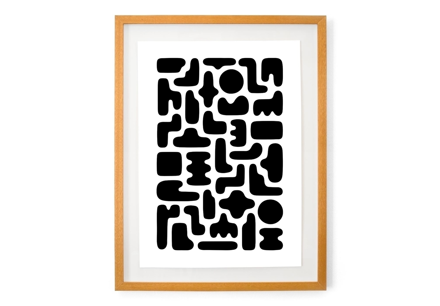
Love this print by Dan Covert. There are a LOT more on his site too. 


A thought provoking write-up on 3D Printing's role in design went up recently on the How Design Blog. It shows some good examples of 3D printed typography in use, among other products like cars and cameras. (My personal favorite being the "On Such a Full Sea" Cover by Helen Yentus, pictured above.) I want there to be more examples moving into the future, there's some real potential for design here. 


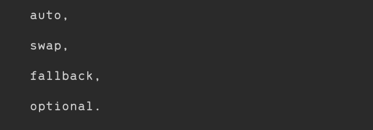
This Medium article from the Web Designer Depot has some good things about new progress in making basic font-display properties in CSS more dynamic. Although only available for a few browsers, perhaps this can improve web typography just a little more. 


Thomas Jockin is expanding his fantastic community building workshop series from New York to the West Coast... San Francisco. Do sign up if you're in the SF area with a need to be a part of something. 


TWFTDKyle ReadComment
THIS WEEK FROM THE DESK

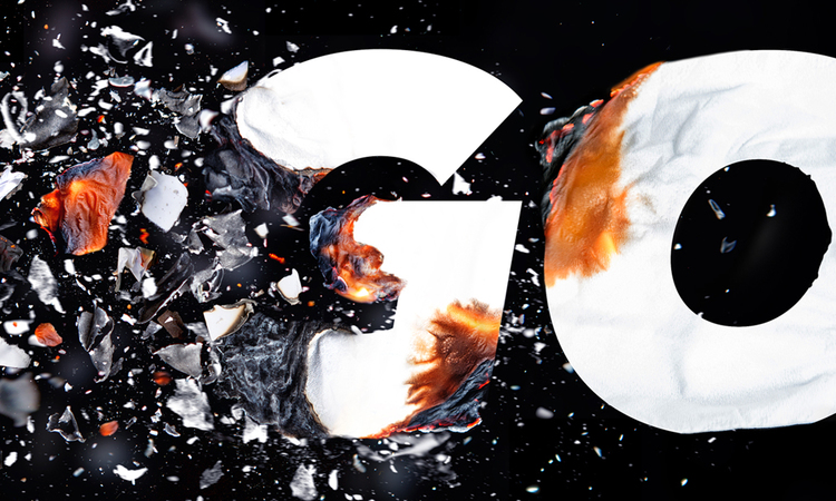
The big news this week is that TypeCon 2016 is happening in Seattle, WA. We're here in the PNW City by the Bay to meet and greet, and share in the ideas, thoughts, and good times. We'll have a formal write up of our experience at the conference after it all wraps up on Sunday, but if you're not in town and curious about what's going on, follow #typecon2016 on all channels to see what's happening. 

P.S. How excellent is the identity system for the conference by MuirMcNeil this year? Bloody brilliant. 


Danielle Evans is profiling designers, illustrators, and digital artists working in the field of dimensional typography on her blog. It's insightful, interesting, and presents some beautiful work. Check out the most recent posts here


Spend a few long moments with this extensive web experience of the Bauhaus and Harvard's relationship. There is a lot to look at from typography, painting, and object design, to architecture, essays, and archived photographs all coming together to tell a fascinating story. 


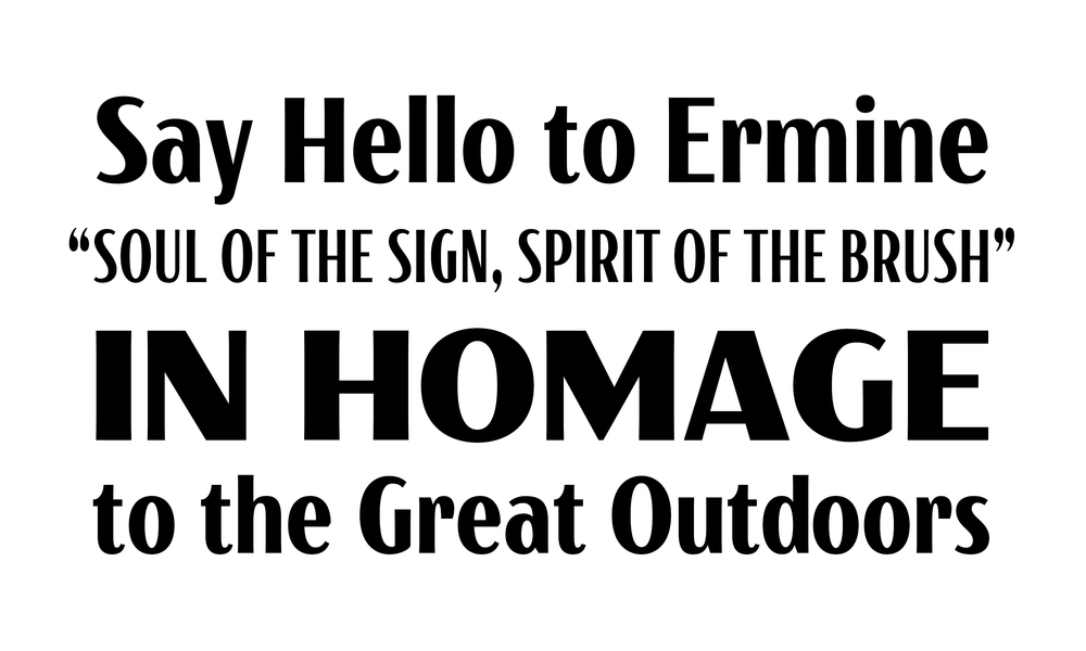
Everyone seems to have jumped on board the celebration train this week as the National Park Service turned 100 years old. We're pretty excited about it because the posters used to promote the park system in the 30's and 40's inspired our own tribute to the perks in Ermine. Posters, parks, anything NPS is featured this week, did you capitalize? 


TWFTDKyle ReadComment
THIS WEEK FROM THE DESK

Matt Willey continues to be a strong source of inspiration for the Studio, so it was a treat to read this AIGA Eye on Design interview with him on his history of creating beautiful custom types for a slew of beautiful publications, complete with lots of type samples and sample spreads. 


Ed Benguiat's Stranger Things

This has been making the rounds for a few weeks now, but it is really great to see a type legend get some newfound recognition form a main stream audience. Read the Fast Company article on the use of ITC Benguiat in the title sequence. Also, Kudos to the designers for Stranger Things for going to the real source of their inspiration, and not just making a knock off version of it. 


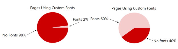
Type on the web is changing, this quick read gives a fun taste of the current climate, how fonts are being handled online, and the real reasons why "Type is Fragile". 


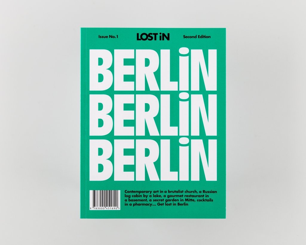
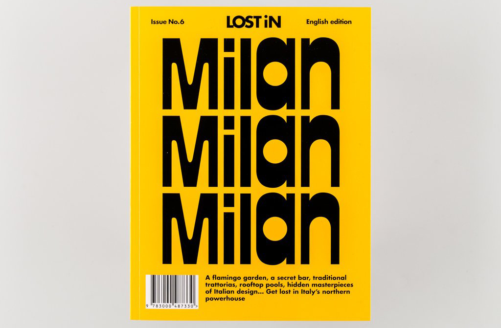
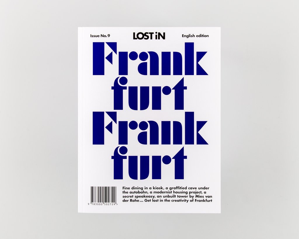
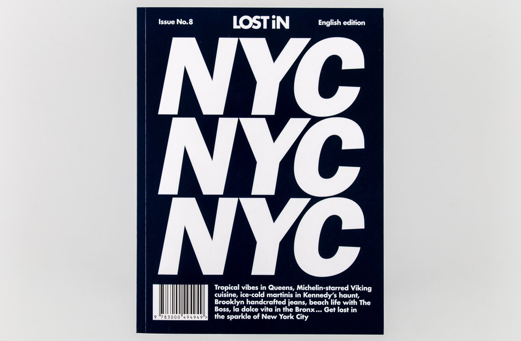
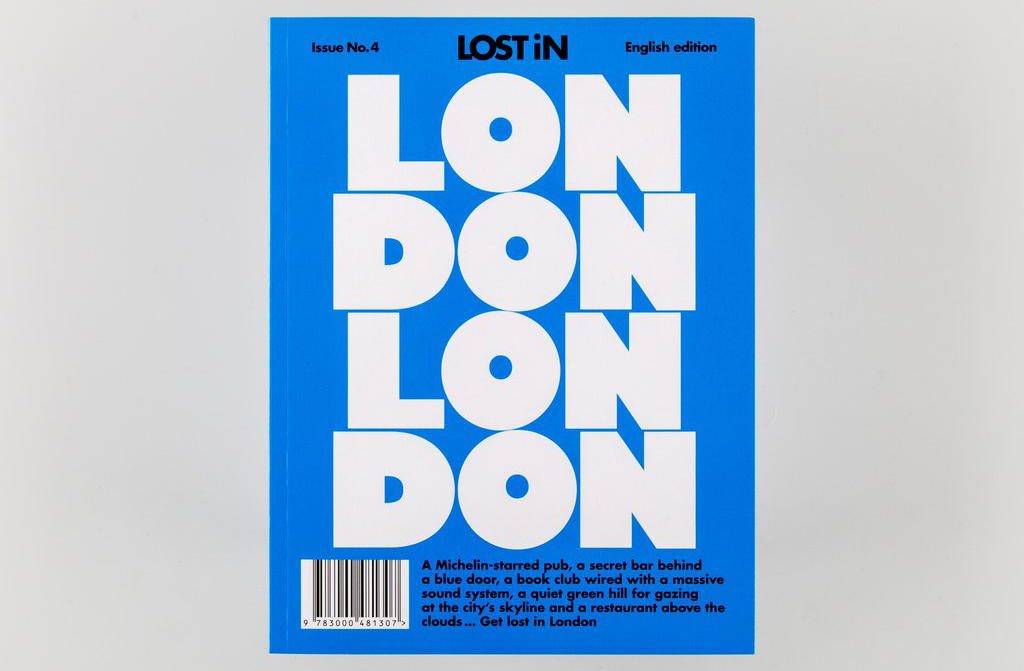
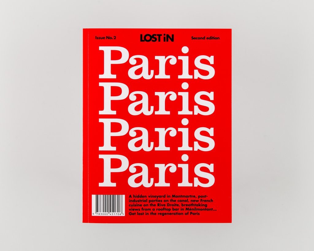
These location inspired typographic covers for a selection of global cities is fun and well executed. Love these. Read more via It's Nice That.

The full history of Dance Ink Magazine, recently revived by designer Abbott Miller, is on full display here in a xylophone filled barrage of 90's design dripping with type and image. It's an older video, but it manages to float across the desk again this week to much delight. There's something magnetic about the designs in these pages, something that's not yet played out.


Kyle ReadComment
THIS WEEK FROM THE DESK

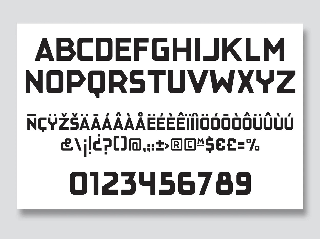
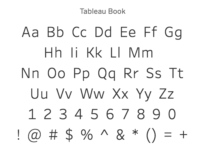
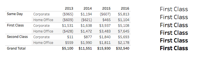
Frere-Jones Type has created a custom typeface made specifically for Data Visualizations and clear readong of dense numbers. No details on their site yet, but there are some nice in-use examples on the Tableau site write-up. 


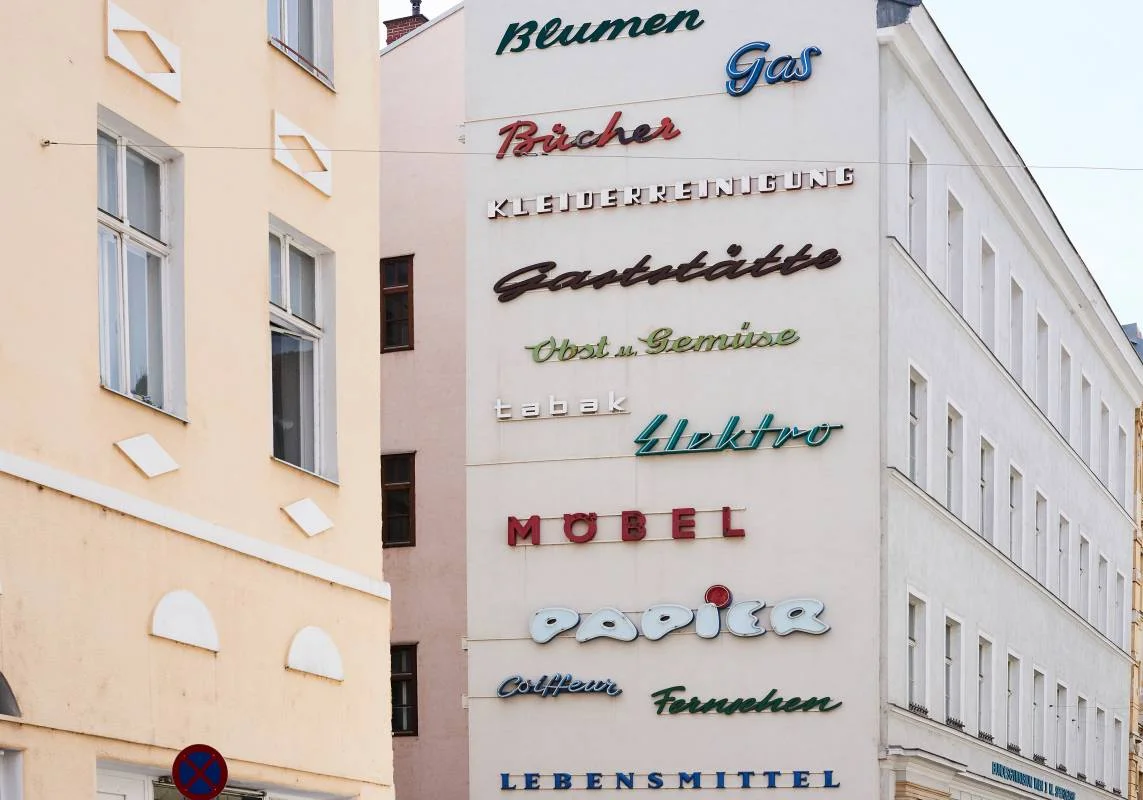
Monocle Magazine published this great quick look at some interesting urban signage from Neon Signs in Warsaw to Street signs in Vienna. 


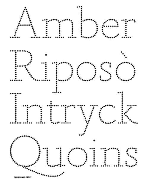
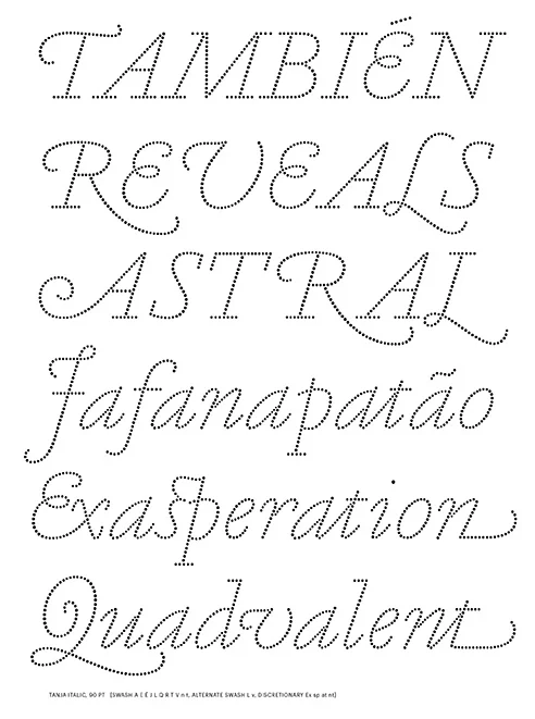
This Print Magazine article published in March of this year floated past the desk again this week, and prods the asking of another question that's good to ponder every now and again: "how can type embody relatable human traits in new and original ways?". Tanja, by Commercial Type, certainly is pretty. 


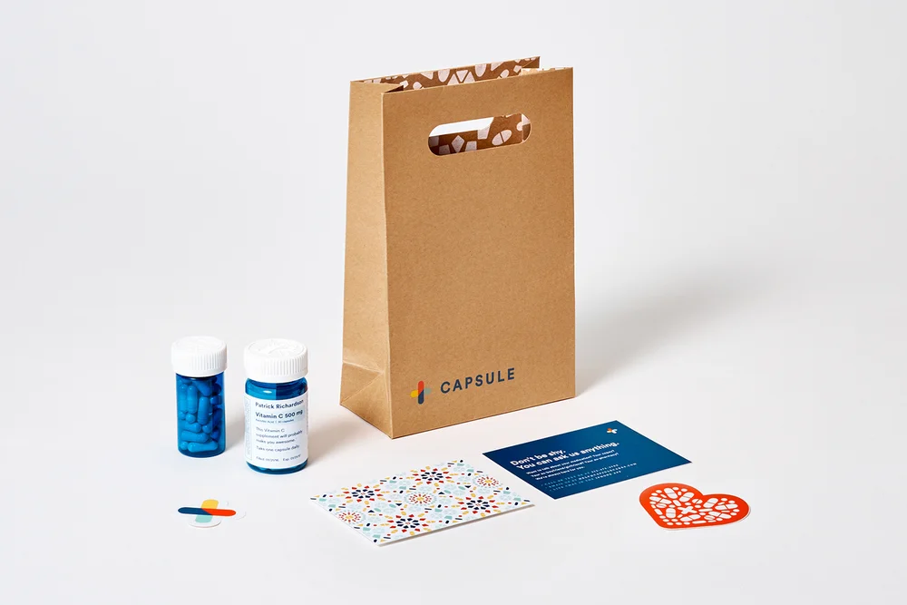
Franklyn has been killing it lately with new projects on their beautiful site. This one for Capsule, and online Pharmacy, is proof to me that good design can be applied to even the most unglamorous of services. 


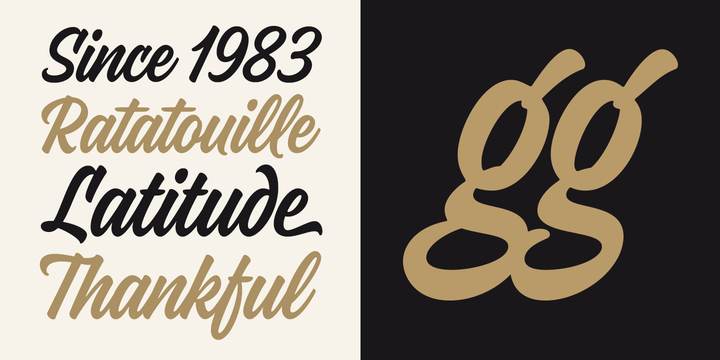
Normally, I steer clear of brush script typefaces, but this one from Mika Melvas caught my eye this week. Pick it up at MyFonts.


Kyle ReadComment