Posts in TWFTD
This Week From the Desk

If you haven't heard already, TYPE magazine—an all new publication from the minds of Roger Black and Editor Doug Wilson—launched their web blog this week. TYPE is a place for people curious about fonts to learn and explore more about what's happening in the typography Industry. It's a great addition to your morning blog roll, with insightful and specialized content produced daily. Explore TYPE here


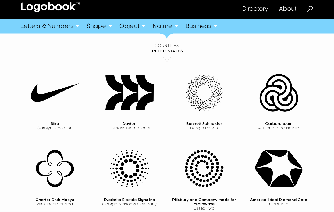
This week, Svizra launched a new project called Logobook. You know all those previous collections of logos in print that you couldnt quite get tour hands on? This online and free collection seems to be everything you were missing. What an awesome resource. Learn more about the Project in this interview with It's Nice That


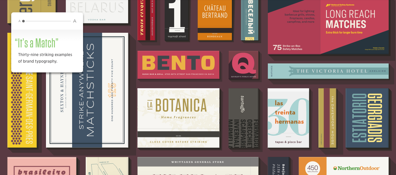
I'm not sure how everyone else feels, but personally, I think the 'design in use' H&Co. emails are great. This one that went out this week about Matchbooks is cheeky and fun and such an amazing way to utilize their deep catalog. 


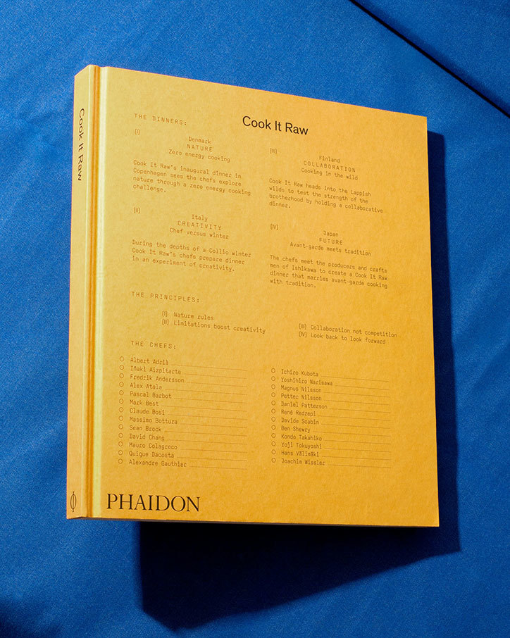
If you're looking for a way to get a little more book jacket design into your Instagram feed, @knopfjackets is perfect. Old, new, and everything in between. Follow along for a tour of great book covers. 


TWFTDKyle ReadComment
This Week From the Desk

The Scintillating Work of Ryu Mieno

It's Nice That featured the work of Ryu Mieno, and it could not have come soon enough. His typographically heavy and inspired work is rich and engaging.  See everything from posters to hats on his site


Neil Summerhour of Positype has been making fonts for a long long time, and has thusly stocked up a deep catalog of retail fonts. Finally, Positype has released a new website on which to experience and buy them. The site is clean, modern, and filled with the incredible variety of type the foundry has produced over the years. Bravo, Neil! 


Monocle Magazine (empire, really) has been doing it's thing for 10 years. To mark the occasion, the Media company has redesigned the print issue, recommitted itself to its radio and conference programming, and positioned itself to be a world leader in media content. Gotta love Monocle. Check out their 10th Anniversary speed review video


Lost Type Co-op dropped 3 new font families this week that all seem to feature corners over curves. Chromaletter by Dan Gneiding, and Muskeg and BLKLTR by recent Type@Cooper West grad Dave Bailey continue to add to the repetoire filled with personality Lost Type is becoming known for. See all the new fonts here


TWFTDKyle ReadComment
This Week From The Desk

If you're looking for something to really pick up your hope in the future of type design, have a visit to the TypeMedia 2016 site. Its a great site PACKED with juicy new type projects completed by the 12 students there. My favorite part is the fact that each one feels truly original, and not just a derivation of a historical style or something that's been done before. So much character in these characters. 


Matt Willey has released his latest type creation Blakey Slab, of which all profits will be donated to the ACLU. I'm not positive if this face is exactly the same as the one he developed for the NYTMag on hollywood stars, but it looks to be. Another great editorial type tool from a man who rarely misses.  Buy a license here.


Spotted this new branding project from Two Times Elliot for new prescription glasses retailer Cubitts. It's smart. It's sharp, its everything you'd want your glasses to be. This project is a good example of simplicity with character. See more on their site. 


You can download all 8 Issues of the famous Dada Publication (1917-1921). Its true historical eye candy for your digital collection. (Thanks for linking, Swissmiss)


The Typographics Conference is back! The website offering the schedule, registration, and a retro type vibe (OHM) is up, and looks great. I hope the tote bags light up. Get Early-bird Registration now. 


TWFTDKyle ReadComment
This Week From The Desk

Meet Sherman

This is a great project released this week. Pentagram's work for Syracuse University needed a bookish and smart looking type family, and Goudy seemed to work well, so they turned to Chester Jenkins to develop a forgotten Goudy design for the modern era. Its sharp, its friendly, its intelligent, and looks damn fine on orange. 


Positype has thrown a hat into the neutral sans ring with their latest family release Aago. Its a family of 54 fonts that aren't COMPLETELY devoid of personality despite the marketing comparisons to Helvetica and Arial. I think it has more to do with DIN an humanist sans faces than anything else. Either way, you can explore Aago on your own via MyFonts. 


Everyone who knows me, and even if you don't (if you don't, let this be your informing), knows that I have a soft spot for print, especially if its unconventionally made or bound. Structure is a publication that looks gorgeous and is singing my song. Full of sexy photography of furniture and graphic texture, this is a printed object that has jumped to the top of my want list. See the full feature on BP&O.


Ideo's deep think tank has produced a vision of a whole new future to think about. Circular Design. It's not necessarily an original idea, but it IS the most thorough and useful presentation of it I've ever seen in their Circular Design Guide. I'm convinced this is worth its weight in gold, I can't wait to employ these ideas, and the site is kind of amazing


Need. This. Book.


“Fonts just fall out of the sky. People don’t think about the thousands of hours of craftsmanship that go into building them. We’d like to make that more accessible to the clients and students who come here. The type industry shouldn’t be a closed door.”
– James Fooks-Bale

This is something I know a lot of folks in the type industry have been thinking about. How do we start expanding the industry to new markets and opportunities without losing the heart and craft of it all? This article from the AIGA does a good job of highlight Monotype's view of the issue and what can start to be done about it. Also, I wish my name was Fooks-Bale.


An absolutely captivating short from the New York Times that has stuck with me all week. I dare you to look away. 


TWFTDKyle ReadComment
This Week from the Desk

Tazugane Gothic was released this week as a "Japanese Humanist Sans Serif Face". This is the first Japanese font family for Monotype. It's a sharp looking offering in 10 weights that continues the trend of globalization for Monotype. View the full family page here


The famed design and object trade show held in Paris every year happened this week. It was filled with the cutting edge of everything from furniture to jewelry to pencils to kitchens.... the list goes on.  It's worth taking a look at the exhibitors, articles and highlights coming out of the international affair. 


Kaibosh, an eyewear brand designed by Snask, now has the top spot for best original branding project of the year. There's so much to this, it's fun, and effective design. Love it. Brand New's profile shows it best


Its a symphony of parts! Typofonderie's Prosaic is a constructed sans serif family in 9 weights and italics that offers a welcome counterweight to the foundry's broad and traditional French repertoire. It's introduced to us as a "postmodern vernacular sans serif" with some images of it's theories to boot. It feels very designed, digital almost, but I think that's where its charm comes from. 


A closer look a the work of Spencer Fenton. Slick is right. (via It's Nice That)


RoandCo Tumblr

If you're looking for a new superbly curated stream of images, look no further, RoandCo is here. 


TWFTDKyle ReadComment
THIS WEEK FROM THE DESK

Briefcase Type released a new sans this week: BC Novatica. It's a handsome sans of generous proportions and minute digital details. It features a few rather radical letterforms like the lowercase n alternates. Check out the full face on their site here! 


Thomas Jockin has started publishing a little video series he calls "Fontributes" focused on typography-related curiosities posted with accompanying Medium articles. Its really more of a visual podcast. This one on The Role of Lowercase in Typefaces is a good start. 


Scott Dadich's Makin' Moves, and Movies.

Famed design editor writer and figurehead Scott Dadich made news recently for leaving Wired completely to pursue new projects.  Well, It didn't take him long thereafter to announce that he was starting a firm... 


...And if that wasn't enough, he dropped this news-bomb this week; he's got a show premiering on Netflix in February about profiles in design. He, along with a full Wired crew, pulled together some very good names to evaluate the state and power of design. Yes please. Watch the trailer for the show above.


Mark Simonson Joins TypeNetwork

The legendary Mark Simonson has joined the growing community of independent foundries, presenting his entire library of fonts from the prolific Proxima Nova to his more character-packed lesser known fonts. This is a good get for Type Network. 


The lauded and exquisite Ikko Tanaka (1930-2002) would have turned 87 over the weekend, and it's been noticed in the design world. I think Tanaka's work has been having a little more resurgence in the past few years as it was so far ahead of its time to begin with. AIGA's Eye on Design took a moment to recognize the designer's work with this post of poster pick by Steven Heller. There are a lot of go-to examples of Tanaka's work out there, but this book poster is a studio favorite. 


"In a landmark decision announced in Tokyo yesterday the Japan Sanitary Equipment Industry Association – a consortium of nine major plumbing manufacturers that includes Toto, Panasonic and Toshiba – agreed to standardise the iconography used on control panels for toilets."

I'm all for clearer iconography, I think this is a pretty good, and entertaining, move. Thanks for the lighthearted pick-me-up news story! via It's Nice That.


Release: Kinetic Type by NM Type

NM Type, also known as María Ramos and Noel Pretorius, released a very handsome sans geared towards the art world. It seems like 'just another sans' at first but with a closer look it quickly becomes clear that this is much more than that. It showcases some original character design, and looks as though it was designed with multi-media in mind. Plus, the mini-site makes for a very well made presentation. Visit Kinetic Type. 


TWFTDKyle ReadComment