I wanted to take a moment out of this week to highlight one of the more interesting realms of type classification that has been a total mystery to me. I'm calling them Quirky Literary Fonts, but I'm sure we can do better than that. This is a post about a few perplexing types created in the last 25 years that seem to be in a club of their own.
What does a typeface have to be all about to gain membership in this odd club? I'm talking about types that seem to break the rules of traditional pen-based type design with unbalanced serif shapes, strangely frankenstein-ed weight proportions and structures, and characters injected with so much personality they look like they might run off into lettering. These types usually get swept into larger categories such as 'Serif' or 'Book' types. I've seen them described as "Old-style French", "Bookish Type", "Text Type", or even just "Weird Type". Nobody seems to know what bucket to put these misfit toys into when to comes time to show off the playroom.
Here's a list of shining examples. Let's start with the basics:

Perhaps one of the most iconic examples of this strange category of types is Diogenes. Diogenes has a chassis of a text face, the structure of a scotch-roman, the stylings of a display Didot, and it's built like a racehorse. It seems that a strange amalgamation of some of the best bits and pieces from other well established type design styles were summoned together to make a type that quite delightful to read. It's The Avengers of literary types.
How does a type that seems like it shouldn't work, work? Ludwig Ubele says that "individual characters are distinct and strong, the serifs are fine and sharp." It's aerodynamic at small reading sizes, but at larger sizes it just seems strange.


Check out the great Mini Site here where you can try it out and see it in action.

I remember when Dapifer was released, I looked at the letterforms and inadvertently murmured "You can do that?".
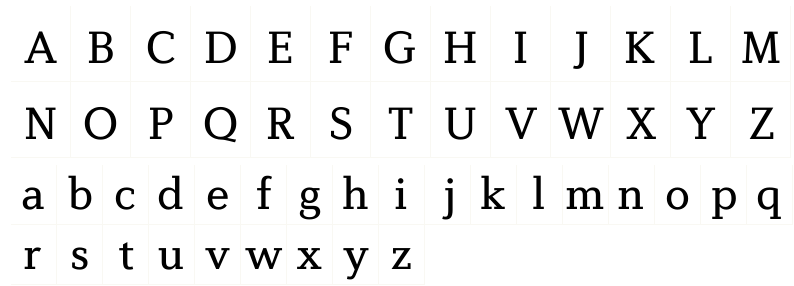
Dapifer is a scientific experiment gone right in the type world. Isolated, some of these characters look like they shouldn't exist, or especially not play nice with the other letterforms on the playground, but they do somehow. Despite all this, Dapifer is a wonderfully elegant solution to personality on the page and feeling of publishing tradition.

Dapifer is strongly rooted in readability, but like a rebellious teenager appears to be trying to break free of the rules imposed upon it. Take a look at the Roman Cap T, the way the left terminal defiantly skews out, or the lower Cap E serif, or the hyphen. Each character has found a way to say "Oh yeah? Sorry but not sorry." Dapifer is the type equivalent to those cats that look you in the eye as they defy your statements of 'no' and go ahead and knock things off tables anyway.

I admire Dapifer's ability to butt up against the walls that we know as traditional type design; bowing them out into to other universes we sense must exist but can't know for sure. It shows us that there is still progress to be made in the world of original type design. Worlds left to conquer still. We could use more Dapifers out there.

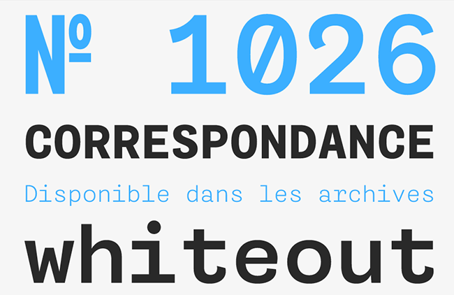
Diverda Serif from Linotype makes this list because it is very deliberate about what makes it the way it is. "The x-heights of Diverda Serif’s characters are low, and the differences between curved, square, and triangular elements are very clear." Perhaps it's this strict utilization of specific shapes for specific anatomical purposes that gives it such a 'back to the drawing board' vibe.

I'm not familiar with how well this font has sold, but it's been noted in several anthologies, catalogs, and other articles as being a strong contender for corporate use. I think the real strength in Diverda is that it was arrived at by a process concerned primarily with legibility. These Quirky Literary Types might all have this in common, springing from a place where design aesthetics are secondary to artifacts of function. Maybe Legible Types is a good name for this genre?
Diverda is a very strong type that shows off its strange details proudly. You can buy a copy of Diverda Serif, and learn more about its origins on MyFonts.

FF Scala may be the most famous typeface family on this list. In fact, it may even be a Poster-child for this genre, whatever genre it shapes out to be. Scala was created in 1990 by Martin Majoor. I'm not sure which came first, the massive trend of experimentation in letterforms in the 90's, or Martin just being a maverick and creating something wildly different, but FF Scala was extremely popular when it was debuted because of its off-beat typographic details like the squared serifs in the caps, the flag shaped terminals in the lowercase c and a, that strangely severed bowl of the lowercase b, and the sharp angular texture you get when set in longer running text. These were just what the weird designers in the 90s were looking for.

Any way you slice it, FF Scala has been a real flagship type for Font Shop, and it seems strange because it's not like any other top seller from the well known font distributor. The other interesting fact to note, is that there haven't been any other font families that have come to challenge FF Scala's reign as quirky top seller in the 25 years its been on the scene. Why is this? Is it that Scala has executed the strange forms in the most efficient or perfect way? Is it that FF Scala's details are so hard to classify that it's put in a category of its own and no one knows how to approach designing a worthy protege to carry it's quirky torch? These are all good questions for which this author can offer no potential answers.

I like that this typeface has had such a storied history in type culture so far, because it shows how a typeface of this genre can be an enduring tool for designers. Pick up FF Scala at FontShop here.

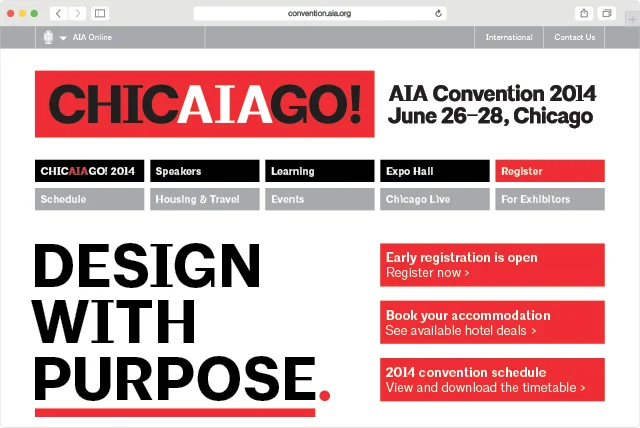
Now, this typeface created for the American Institute of Architects is a truly extreme example of the themes we've been outlining in this post. Its on this list because it is being used rather successfully by a major US institution, and they weren't shy to go with something that bucks the Geo-sans trend in a truly weird way.

"The custom font, AIArchitype, was designed by Bierut and Pentagram designer Hamish Smyth, and drawn by type designer Jeremy Mickel. Crafted from a hybrid of two classic sans serif fonts, Akzidenz Grotesk and Trade Gothic, it is intended to combine neutrality and distinctiveness." states Pentagram. This is the only example of a Sans on this list that embodies the seemingly nonsensical reasoning for weight variation in a typeface. Throughout all the strange features here, like the deliberately thin middle bars on the E and F, the crossbar on the f, and that very distinctive cap I, it still works as a Display face for the brand. Through its uniqueness, Pentagram has been able to carve out a new progressive voice for the institution to speak with.

But what is it about this typeface that actually works? By all traditional theory of type design, these letterforms should have been edited out early on in the process and labeled as 'wrong'. Or at least that's what most modern foundries would have done. This is not a typeface that adheres to the law of the pen, nor is it a typeface that adheres to the laws of geometry per se. I believe that this typeface is successful becuase a few innovative folks decided to break a few rules and come up with something unique, fun, daring, and a little evocative.
The other reason I like this typeface so much is because it makes me uncomfortable. I've learned to take notice when my instinct is to initially reject something because it means I'm probably going to end up loving it in the end. It means that there's something new and great about it that's worth exploring and digesting.
This typeface is not for sale, but there are some great insights into its process and production on the Pentagram site here.
So that's that.
It's a joy to pull together a little playlist of fonts that may not be getting the recognition they deserve, but even more than that, this is a puzzle. This is a puzzle Ive been turning over in my brain for a few years now that I'd love to get more discussion on.
Please note, I do not claim to have any agenda for creating a new category of type classification here. I haven't done very much scholarly research into the history of these letterforms, or have any background in source material these quirky fonts may be drawing from... but I'm all ears!
If anyone out there has more insight, more types to add to this list, or more information on strangely built text types like these throughout history, I'd love to hear and see more. Get in touch!