...On Monospaced Fonts

Lately, I've been in a monospaced mood.

There are about a million monospaced fonts out there.* I don't know if entry level type designers just think it's easy to make one due to the fact that spacing is super easy or what, but everyone and their mom seems to be releasing monospaced fonts.

We've compiled a list of five monospaced fonts we've found to be either incredibly reliable, a fresh addition to the font database, robust and clear, just flat out fun, great for a specific design style, or innovative for the genre. There are a few well known font families here, as well as a few newcomers you may not have heard of yet. We've included links to the foundries that made them and ways to discover more. 

There are lots of font reviews and recommendations for monospaced fonts out there, but these are ours. 


Range Mono

Range Mono from Griffin Moore at Pilgrim Fonts is one of those fonts that will continue to fly under the radar unless someone brings a little attention to it.

Range Mono is the girl standing in the corner at the party perhaps too shy to shake new hands, but is remarkably interesting and a total surprise once you can say hi. With its softer curves and paired down features, range Mono is a clean and tidy monospace. It comes offered in four weights, and a "code mode" so it's perfect for projects where you're looking for the monospaced style but not making it the main feature of the design. The font has a pretty clean trial site to try it out to boost. 


Founders GrotesK Mono

Screen Shot 2015-06-29 at 11.46.37 AM.png

Founders Grotesk Mono, hailing from the now wonderfully known Founders Grotesk Family by Klim Type Foundry, is an absolutely perfect workhorse monospace. Since it springs from the Founders Grot Family, it is rooted firmly in a more traditional typographic tradition and bucks the default 'computer-y' feel most monospaced fonts usually have. 

As a display font, FGM is striking; especially in the bolder weights. Its quirks really come out in the most pleasant ways. In a typesetting role, it has a fantastic consistency in color and weight that's just so easy to use and to read. One of my favorite considerations taken in this font is the set of monospaced fractions. A top notch use of Open Type Features.

Overall, if you're looking for a fresh modern update for a clean and reliable workhorse mono, look no further than Founders Grotesk Mono. I suggest going to the source at purchasing the full family of weights on Klim's site, or  buying a license over at Village, where you can try it out, download an extensive PDF Specimen, and learn more about it. 


Isonorm Monospaced

Isonorm Monospaced makes the list not necessarily for its charming design quirks, robust functionality, or supreme originality, but because it gets to the core of what a fun and basic monospaced font can be.We also love it for it's oblique italic. Here's how FontFont describes the origins of Isonorm Monospaced: 

"The “Isonorm” letters were developed by the International Standards Organization (ISO) in 1980. Their design is simply geometric. All of the strokes have rounded endings. These “Isonorm” letters have always been primarily used for drafting purposes by architects and engineers." I personally like these simply constructed letterforms for the airy color they leave on the page while remaining strong for longer readings. It comes with an italic is not a true italic but an oblique version of the upright fonts. Not many monospaced fonts dare to include an 'italic' version, so we put Isonorm Monospaced on this list for it's daring to go for it.

Head over to FontFont to discover both weights and the fun oblique. 


Martha
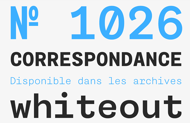
Martha Martha Martha!

Many monospaced fonts adhere to the cold, digital roots monospaced fonts came from. Martha however, breaks out of that mold with truly energetic style. Martha comes from Type Media grads Alexandre Saumier Demers and ɉtienne Aubert Bonn and their new foundry enterprise, Coppers and Brasses

Martha does a good job balancing out the structure a monospaced font requires and the dynamism in weight and style to make it unique. The lighter weight has a great color on the page which helps it break out of sole 'code-y' uses and would make for a fresh type choice in any other project. They describe the design as grotesque monospaced letterforms. My favorite part? ...the "ridiculously complete" character set including small caps. This font family has legs. 


Input

Always save the best for last, right?

Input has proven to be one of the most extensive, most well thought out, most versatile, and best marketed monospaced fonts I've seen so far. Crafted by David Jonathan Ross (@djrrb) at Font Bureau, Input is a font family designed specifically for coding. He describes the catalyst for his monospaced opus as taking "its aesthetic cues from monospaced fonts and pixel fonts designed for consoles and screens, but casts off the technical limitations that constrained them." 

DJR's commitment to process in the creation of this family is evident. It comes in "both monospaced and proportional fonts, all with a large range of widths, weights, and styles for richer code formatting." Input deploys some pretty fantastic marketing strategies to help you really get an idea of what is involved and what it can do for you including this specially devoted site and tutorials on how to replace your system font in Yosemite with Input — a move I highly suggest. Input Monospaced makes a climactic appearance on this list, but the monospace is only half of the full Input picture. The Input site has so so much more on all of the ins and outs of the rest of the family.

You can pick up the font for personal use for free, and what I think is a VERY good price for publishing and web uses over on the mini site here


*Note, a million is an estimation and a pretty terrible one at that.
BADSON BOARDS No. 2

“It is not the strongest of the species that survive, nor the most intelligent, but the one most responsive to change.”

        — CHARLES DARWIN

Kyle ReadComment
Badson Boards No.1

We tend to have so much stuff just hanging around.

By 'we' I mean designers and artists in general, and by 'stuff' I mean all those postcards, scraps of paper, knick-knacks, images, tchotchkes, and collected ephemera we just can't bear to part with for some weird reason.

Well, we've decided to do something about it. To keep our art direction and mood-board-creating muscles in shape, we're launching weekly installments of Badson Boards: Simple collections of the the things we love but can't get rid of.  

Welcome to what we're hoping will be a new ritual here at Badson. Check back every week. Happy Collecting. 

#badsonboards


...On Launching.

Badson has officially launched.

What does it mean to 'Launch' something? Where does this term come from? I'm quite taken by the visual of having something you built begin to float or fly before your very eyes as if a spirit has possessed your creation. That's not quite launching though, so surely that can't be it. You could assume in this modern age that the term might spring from the space program, launching rockets into the sky and beyond, starting an immense adventure into the unknown. Could this term be so recently added into the vernacular?

And how did it get into the way we talk about the web? Everyone always says "Oh, when are you launching?" or "We have the product launch scheduled for Thursday." There are no rockets, no physical objects being hurled across the room. To launch in the web world must be an abstract term reappropriated from somewhere. Where did all this launch talk come from?

Well, it's not rockets, but something a little more home-bound... Ships. Ceremonial ship launches have been a tradition in almost every culture with access to water since the ancient Greeks. Back in a time when superstition ruled the day, and the ship was something that was placed in very high cultural regard, the first time a new ship would be put in the water and used was a very ceremonial affair. Drinking of wine, olive branch wreaths, anointing the boat in water and wine, feasts to commemorate the occasion... all in order to put a boat in the water.

The tradition of sending a new ship on its mission, or launching it, has continued throughout history. The early Ottoman Empire took on the notion that their ships were subject to the Gods and spirits of the ocean and would 'bless' the boats for protection before using them. The early Catholic countries of Europe dove into their own religion for these superstitions and came up with baptizing a boat before launching it into the water, literally placing it under the Lord's protection and servitude. 

This lineage of superstitions surrounding the launch of new boats and ships continued into the 20th century in the form of smashing a bottle of champagne against the hulls of new ships before they were cast into the water surrounding the iron shipyards. There's something reassuring to us humans that we've done something to sign our initials and to change the orders of fate. The fate of the tools we use, the machines we build, and ultimately ourselves.

This brings us to the digital age. Ships are no longer at the height of technology, nor the most consuming projects we can muster. We build computers, businesses, and ways to remain connected now. Isn't it a bit strange that we talk about the web today as if it were still attached to the physical world around us? The things we put on the internet are our ships; the things we create that we wish could have a little more protection, or things that we wish we could do everything for to ensure their survival and success. 

The first instances of the term 'launching' used in the context of websites was in the nineties in the throngs of the booming tech bubble. Amazon, Google, AOL, these were the ships of their day, and since you can't physically smash a bottle of bubbly over the ones and zeros of these digital creations, simply referring to these companies and websites in such a way was the next most natural thing. 

I enjoy the fact that superstition remains, connecting us to those feelings of ambition and anticipation of cultures that have come before us. The term 'launching a website' is infused with the connotation that we care about these ones and zeros, and that we're deeply vested in it's success. I'll take it. 

-----------------

So yes, Badson has launched. 

In 2015, it seems so easy to get a business off the ground, get a fantastic website up with beautiful photography of your product, and get the word out to everyone on the internet that you've arrived. But, it's actually still remarkably difficult to launch something as comprehensive as a new business, never mind a Type Foundry and Design Studio attached at the hip. So in my own words, I'd like to sincerely thank you. Thank you for making a stop at the new Badson website. Thank you for being here as I smash a proverbial bottle of Moët over this bundle of code and cast this ship into the water. 

If you haven't already had a look around, please, poke, prod, discover what Badson is and has to offer you, and get in touch about it. This blog will act as a place where topics, perspectives and ideas can be delved into more deeply. There's a shop where you can find only beautiful things. And, from the selected branding and design projects of the Studio, to the Type Foundry's pages of retail and commissioned typeface work, I hope you can see the ground work laid for many, many things to come. I'm hoping Badson can be a place to present all of the varied endeavors planned for the future. I have only immense excitement for what's in store and what we can define the future of design and culture to be. 

Enough with the heady stuff, happy sailing!

Kyle Read Comment